data |>
  foo() |>
bar()5 Data Analysis and Visualization
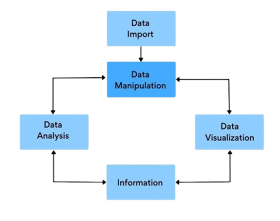
In Lab 5, we will explore the fundamental aspects of data analysis and visualization using R. This lab is designed to enhance your proficiency in handling real-world datasets by importing them into R, performing insightful analyses, and creating compelling visualizations. We’ll start by introducing the pipe operator |>, a powerful tool that streamlines your code and makes data manipulation more intuitive. Next, we’ll dive into the dplyr package, learning how to efficiently manipulate data using functions like select(), filter(), mutate(), arrange(), and summarise(). Finally, we’ll harness the capabilities of ggplot2 to visualize data, enabling you to uncover patterns and communicate findings effectively. These skills are essential for any data analyst or scientist, as they form the backbone of data-driven decision-making and storytelling.
By the end of this lab, you will be able to:
Apply the Pipe Operator
|>for Streamlined Coding
Use the pipe operator to chain multiple functions together, enhancing code readability and efficiency.Manipulate Data Using
dplyrFunctions
Employdplyrverbs such asselect(),filter(),arrange(),mutate(), andsummarise()to perform common data manipulation tasks effectively.Analyze Datasets to Extract Insights
Conduct exploratory data analysis to understand data distributions, identify patterns, and detect anomalies.Create Visualizations with
ggplot2
Develop a variety of plots—including scatter plots, histograms, boxplots, and bar charts—to visualize data and reveal underlying trends.Communicate Findings Effectively
Present analysis results in a clear and insightful manner, using visualizations to enhance understanding.
By completing Lab 5, you will be well-equipped to tackle more complex data analysis challenges, making significant strides in your journey to becoming a proficient data professional.
5.1 Introduction
Welcome to the fifth chapter of R Programming Fundamentals: A Lab-Based Approach. In this Lab, we delve into the powerful capabilities of R for data analysis and visualization. R is not just a programming language; it’s a comprehensive environment designed for statistical analysis, data modeling, and creating stunning visualizations. Its extensive package ecosystem and active community make it a top choice for data professionals worldwide.
5.2 Experiment 5.1: The Pipe Operator <%>
One of the most effective tools in R for simplifying your code is the pipe operator. Traditionally, the <%> operator from the magrittr package has been widely used for this purpose. However, starting from R version 4.1.0, R introduced a native pipe operator |>. This operator allows you to express a sequence of operations in a more intuitive and readable manner by chaining functions together in a linear and logical flow, rather than nesting functions within functions. In this lab, we will be using the base pipe operator |>, which functions similarly to the magrittr |> operator.
Imagine you have data frame, data and you want to perform multiple operations on it, such as applying functions foo and bar in sequence. With the pipe operator, you can write:
Instead of the nested approach:
bar(foo(data))
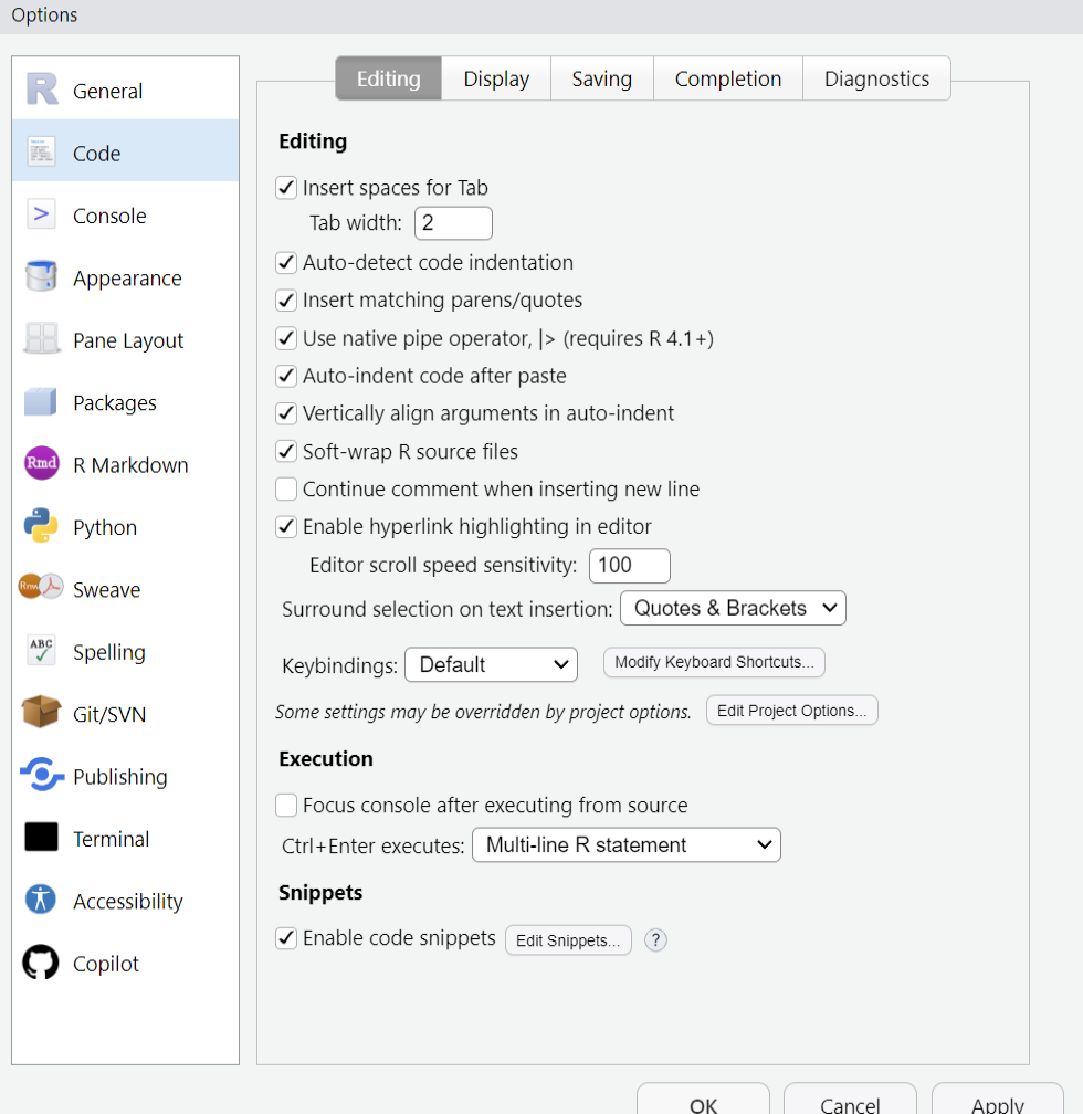
How to configure native pipe operator
To configure RStudio to insert the base pipe operator |> instead of %>% when pressing Ctrl/Cmd + Shift + M, navigate to the Tools menu, select Global Options…, then go to the Code section. In the Code options, check the box labeled Use native pipe operator, |> (requires R 4.1+).
How Does the Pipe Operator Work?
The pipe operator automatically passes the output of the previous function as the first argument to the next function. If a function takes multiple arguments, the piped data is placed as the first argument:
# Without pipe

function(argument1, argument2)

# With pipe

argument1 |> function(argument2)
Example 1:
Let’s see the pipe operator in action:
iris |> head()This is equivalent to:
head(iris)Using the pipe operator focuses on the flow of data transformations, making your code more readable and maintainable.
Example 2:
Here’s another example combining multiple functions:
This sequence is equivalent to the nested version:
By piping, you avoid deeply nested functions and enhance code clarity.
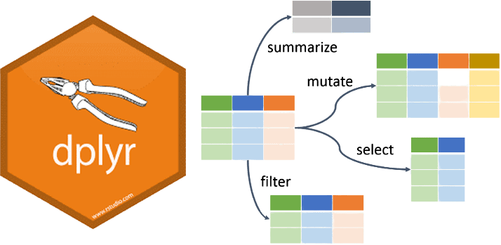
5.3 Experiment 5.2: Data Manipulation with dplyr
Data comes in all shapes and sizes, and often, it’s not in the ideal format for analysis. This is where data manipulation comes into play. Data manipulation is a fundamental skill in data analysis, and dplyr provides a powerful set of tools to transform and summarize your data efficiently. The dplyr package, part of the tidyverse, is designed to make data manipulation in R more intuitive and efficient.
5.3.1 Why Use dplyr?
Simplicity: Provides straightforward functions that are easy to learn and remember.
Efficiency: Optimized for performance, handling large datasets swiftly.
Readability: Code written with dplyr is often more readable and easier to maintain.
Integration: Works seamlessly with other tidyverse packages like ggplot2 and tidyr.
5.3.2 Getting Started
First, ensure you have the dplyr package installed and loaded. If you haven’t installed it yet, you can install the tidyverse, which includes dplyr.
# Install the tidyverse package (if not already installed)
install.packages("tidyverse")

# Load the tidyverse package
library(tidyverse)
5.3.3 Core dplyr Verbs
The core functions in dplyr are often referred to as “verbs” because they correspond to actions you can perform on your data. These verbs are:
select(): Choose variables (columns) based on their names or column positions.mutate(): Create new columns or modify existing ones.filter(): Select rows based on specific conditions.arrange(): Reorder rows based on column values.summarise(): Reduce multiple values down to a summary statistic.
Additional useful functions include:
rename(): Rename columns.distinct(): Find unique rows.count(): Count unique values of a variable.group_by(): Group data by one or more variables for grouped operations.
When summarise() is paired with group_by(), it allows you to get a summary row for each group in the data frame.
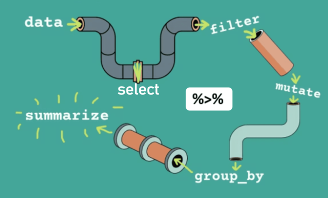
5.3.4 Using Pipes with dplyr functions
When combined with the pipe operator, dplyr functions create a seamless workflow as shown in Figure 5.4:
5.3.5 Example Datasets
We’ll start our exploration by working with two fascinating datasets: the penguins dataset from the palmerpenguins package1 and the msleep dataset from the ggplot2 package. These datasets provide rich, real-world data that will help you practice and apply data manipulation in this book.
The penguins Dataset
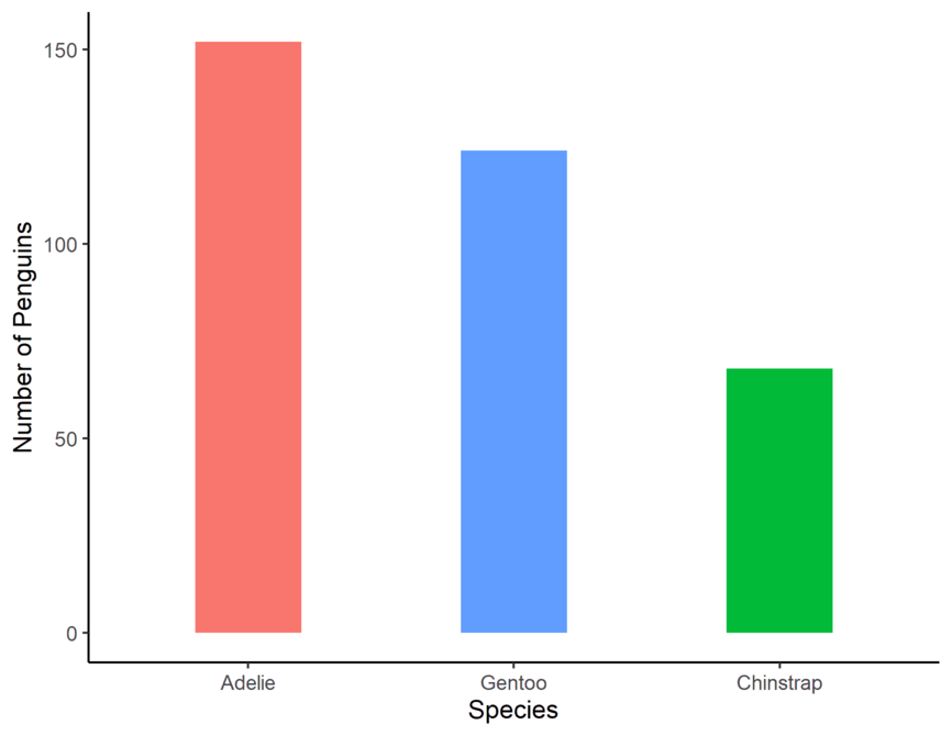
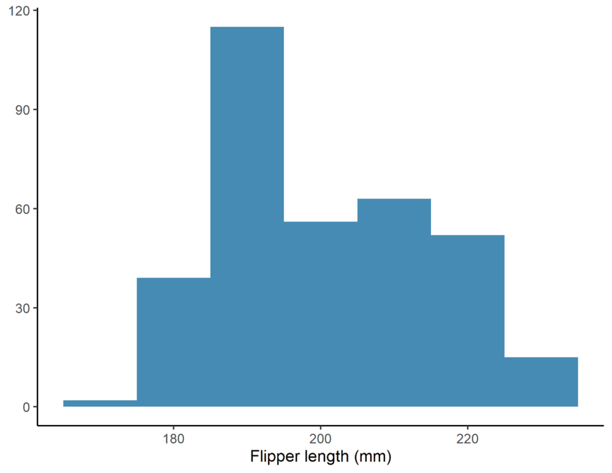
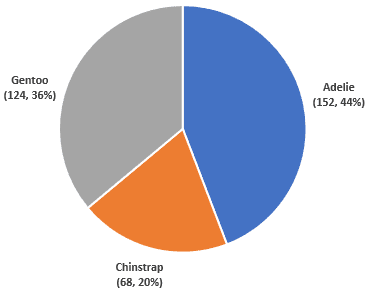
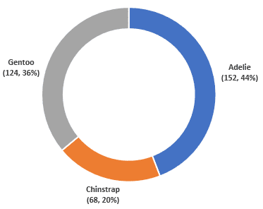
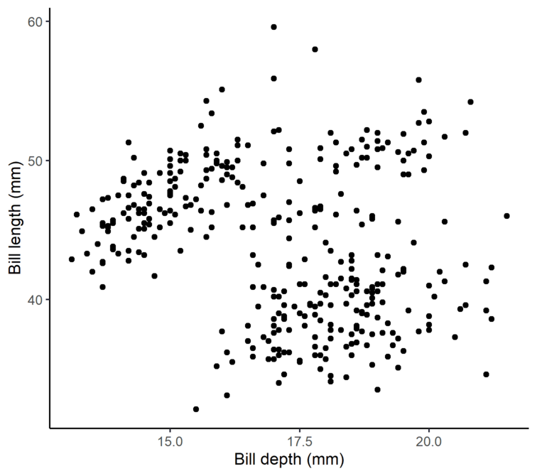
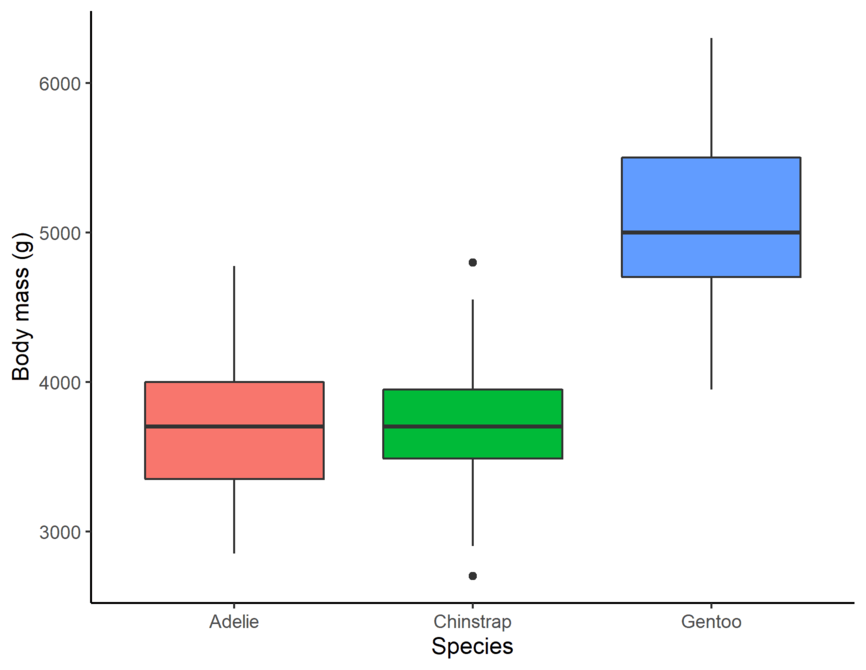
The penguins dataset2 contains detailed body measurements for 344 penguins from three different species—Adélie, Chinstrap, and Gentoo—found on three islands in the Palmer Archipelago of Antarctica. This dataset includes variables such as:
- Species: The penguin species.
- Island: The island where each penguin was observed.
- Bill Length and Depth: Measurements of the penguin’s bill (beak).
- Flipper Length: The length of the penguin’s flippers.
- Body Mass: The weight of the penguin.
- Sex: The gender of the penguin.
The msleep Dataset
Our second dataset, msleep, comes from the ggplot2 package and contains information on the sleep habits of 83 different mammals. This dataset includes 11 variables, such as:
- Name: The common name of the mammal.
- Sleep Total: Total amount of sleep per day (in hours).
- Sleep REM: Amount of REM sleep per day.
- Sleep Cycle: Length of the sleep cycle.
- Brain Weight: The brain weight of the animal.
- Body Weight: The body weight of the animal.
- Conservation Status: The conservation status of the species.
Example: using select()
Purpose: Select specific columns from a data frame.
Example: select
Petal.LengthandPetal.Widthfrom theirisdata frame.
As you can see, we have selected Petal.Length and Petal.Width from the iris dataframe
Example: Using mutate()
Purpose: Add a new variable or modifies an existing one
Example: Add a new column
Petal.Ratiothat is the ratio ofPetal.WidthtoPetal.Length.
In this second example, we will be using ggplot2’s built-in dataset msleep, and we are changing the sleep data from being measured in hours to minutes.
Example: Using filter()
Purpose: Filters rows based on their values.
Example: Filter
irisdataframe where species is “setosa”.
This returned only the rows where the Species column is “setosa”.
Filter with multiple conditions:
filter iris dataframe where species is setosa and Petal.Length is greater 1.5.
Example: Using arrange()
- Purpose: Arranges rows by values of a column (default is ascending order).
Ascending order:
Descending order:
Example: Using summarise()
summarise() (or summarize() in American English):
Purpose: Reduces data to a single row by computing summary statistics.
Example: Find the average sepal length for each species, ignoring any missing values.
The code cell produced a single row with the average Sepal.Length.
Example: Using group_by() and summarise()
Purpose: Groups the data by one or more columns and is usually used in combination with summarise() to compute group-wise summaries. That is, it allows you to split the data frame by one or more variables, apply functions to each group, and then combine the output. You can also use the group_by() verb to operate within groups of rows with mutate() and summarize().
Example: Compute the average Sepal Length separately for each species.
Example: Using rename()
Purpose: Rename columns.
Example: Change the column name
Sepal.LengthtoSepal_LengthandSpeciestoCategoryin theirisdataset.
renamed_iris <- iris |> rename(Sepal_Length = Sepal.Length, Category = Species)

renamed_iris |> head()
Note
data |> rename(new_name = old_name) will rename the old_name column to new_name.
Further Resources on dplyr
For a deeper dive into dplyr, I highly recommend exploring the comprehensive series by Suzan. Start with “Data Wrangling Part 1: Basic to Advanced Ways to Select Columns” and continue through to “Part 4” for valuable insights into data manipulation using dplyr.
5.3.6 Exercise 5.1: Analyzing the Penguins Dataset
Let’s put your skills into practice with a modified penguins dataset. First, you’ll need to create a new RStudio project called Experiment 5.1.
-
Importing and Inspecting Data
Download the penguins dataset.
Import the data into R.
Use
glimpse(penguins)to get an overview.How many rows and columns are there?
-
Filtering Data
How many penguins are from the
Biscoeisland?Extract data for penguins with a body mass greater than 4,500 grams.
-
Arranging Data
Arrange the data in descending order based on flipper length.
Find the top 5 penguins with the highest body mass.
-
Selecting and Mutating
Select only the columns
species,island, andsex.Remove the
sexcolumn from the dataset.-
Convert the flipper length from millimeters to meters and create a new column
flipper_length_mTo convert millimeters to meters, you simply divide the number of millimeters by 1,000. Here’s the conversion formula:
\[\text{flipper\_length\_m} = \frac{\text{flipper\_length\_mm}}{1000}\]
-
Create a new column
BMIcalculated as:\[\text{BMI} = \frac{\text{body\_mass\_g}}{{\text{flipper\_length\_m}}^2}\]
-
Summarizing and Grouping
Calculate the average body mass of all penguins.
Group the data by
speciesand find the average body mass for each species.
-
Combining Operations
- Filter penguins from the Dream island and summarize the average bill length for each species from this island.
5.4 Experiment 5.3: Data Visualization
Data visualization is the art and science of representing data through graphical means, such as charts, graphs, and maps. By transforming numerical or textual information into visual formats, data visualization allows us to see patterns, trends, and insights that might be difficult or impossible to detect in raw data. It brings data to life, telling stories that are easily understood and can be quickly communicated to others.

In today’s data-driven world, the ability to visualize data effectively is becoming an essential skill across various industries—including data science, finance, education, and healthcare. As we grapple with an ever-growing volume of complex and varied data, visualization provides the tools we need to make sense of it all and to share our findings in a compelling way.
Visual representations are more effective than descriptive statistics or tables when it comes to analyzing data. They enable us to:
Identify Patterns and Trends: Spot relationships within the data that might not be immediately apparent.
Understand Distributions: See how data is spread out, where concentrations or gaps exist.
Detect Outliers: Quickly identify data points that deviate significantly from the rest of the dataset.
Communicate Insights: Present data in a way that is accessible and engaging to diverse audiences.
By leveraging data visualization, we enhance our ability to analyze complex datasets and to communicate our findings effectively.
5.4.1 Importance of Data Visualization
Data visualization plays a crucial role in the data analysis process for several reasons:
Simplifies Complex Data: Large datasets can be overwhelming when presented in raw form. Visualization condenses and structures this data, making it understandable at a glance. For example, a line chart can succinctly display trends over time that would be difficult to discern from a table of numbers.
Reveals Patterns and Trends: Visual tools help us identify relationships within the data, such as correlations between variables or changes over time. This can lead to new insights and hypotheses. For instance, a scatter plot might reveal a positive correlation between hours studied and exam scores.
Supports Decision Making: Visual evidence provides a compelling basis for conclusions and recommendations. Decision-makers can grasp complex information quickly and make informed choices. A well-designed dashboard can highlight key performance indicators, aiding strategic planning.
Engages the Audience: Visuals are inherently more engaging than raw numbers or text. They capture attention and can make presentations more persuasive. Using colorful charts and interactive elements can enhance audience understanding and retention of information.
Facilitates Communication: Visualization transcends language barriers and can communicate complex ideas simply. It enables collaboration across teams and disciplines by providing a common visual language.
5.4.2 Choosing the Right Visualization
Selecting the appropriate type of visualization is essential to effectively communicate your data’s story. Here are some considerations to guide your choice:
-
Define Your Objective
-
What Do You Want to Communicate?
Are you aiming to compare values, show the composition of something, understand distribution, or analyze trends over time?
Clarify the key message or insight you wish to convey.
-
-
Understand Your Data
-
Data Relationships
Identify the types of variables you have (categorical, numerical, time-series).
Determine if you are exploring relationships between variables, distributions, or looking for outliers.
-
-
Know Your Audience
-
Audience Understanding
Consider the background and expertise of your audience.
Will they understand complex visualizations, or is a simpler chart more appropriate?
Tailor your visualization to their needs and expectations.
-
-
Consider Practical Constraints
-
Medium of Presentation
Will the visualization be presented digitally, in print, or verbally?
Interactive visualizations may not translate well to static formats.
-
Data Quality and Quantity
Large datasets may require aggregation.
Poor quality data may limit the types of visualizations you can use.
-
-
Aesthetics and Clarity
-
Visual Appeal
Use color, shape, and size effectively to enhance comprehension without overwhelming the viewer.
Avoid clutter by keeping designs clean and focused.
-
-
Ethical Representation
-
Accuracy and Honesty
Ensure scales are appropriate and do not mislead.
Represent data truthfully to maintain credibility.
-
By thoughtfully considering these factors, you can choose a visualization that not only presents your data effectively but also resonates with your audience.
5.4.3 Types of Data Visualization Analysis
Data visualization can be categorized based on the number of variables you are analyzing:
-
Univariate Analysis
Definition: Examining one variable at a time.
Purpose: Understand the distribution, central tendency, and spread of a single variable.
-
Common Visualizations:
Histograms: Show frequency distribution.
Boxplots: Display median, quartiles, and potential outliers.
Bar Charts: Represent categorical data counts.
Example: Analyzing the distribution of ages in a population using a histogram.
-
Bivariate Analysis
Definition: Studying the relationship between two variables.
Purpose: Explore associations, correlations, and potential causations.
-
Common Visualizations:
Scatter Plots: Show relationships between two numerical variables.
Line Charts: Depict trends over time or ordered categories.
Heatmaps: Represent data in a matrix form with color encoding.
Example: Investigating the relationship between advertising spend and sales revenue using a scatter plot.
-
Multivariate Analysis
Definition: Analyzing more than two variables simultaneously.
Purpose: Understand complex interactions and higher-dimensional relationships.
-
Common Visualizations:
Bubble Charts: Add a third variable to a scatter plot through size or color.
Multidimensional Scatter Plots: Use color, shape, and size to represent additional variables.
Parallel Coordinates Plot: Visualize high-dimensional data by plotting variables in parallel axes.
Example: Evaluating factors affecting customer satisfaction by analyzing service quality, price, and brand reputation together.
Understanding the type of analysis you need guides the selection of appropriate visualization techniques, ensuring that you capture the necessary insights from your data.
5.4.4 Common Data Visualization Techniques
While there are hundreds of different graphs and charts available, focusing on the core ones will equip you with the tools needed for most day-to-day analytical tasks.
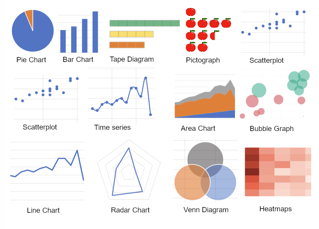
Let’s explore some of the most commonly used data visualization techniques.
Bar Chart
A bar chart represents categorical data with rectangular bars, where the length of each bar is proportional to the value it represents. Bars can be plotted vertically or horizontally.
When to Use:
Comparing quantities across different categories.
Showing rankings or frequencies.
Displaying discrete data.
Example Uses:
Comparing sales figures across different regions.
Showing the number of students enrolled in various courses.
Visualizing survey responses by category.
Key Features:
Categories on one axis (usually the x-axis for vertical bars).
Values on the other axis (usually the y-axis for vertical bars).
Bars are separated by spaces to emphasize that the data is discrete.
Histogram
A histogram displays the distribution of a numerical variable by grouping data into continuous intervals, known as bins. It shows the number of data points that fall within each bin.
When to Use:
Understanding the distribution of continuous data.
Identifying patterns such as skewness, modality, or outliers.
Assessing the probability distribution of a dataset.
Example Uses:
Displaying the distribution of ages in a population.
Showing the frequency of test scores among students.
Analyzing the spread of housing prices in a market.
Key Features:
Continuous data on the x-axis, divided into bins.
Frequency or count on the y-axis.
Bars are adjacent, indicating the continuous nature of the data.
Circular charts
A circular chart is a type of statistical graphic represented in a circular format to illustrate numerical proportions. A pie chart and a doughnut chart are examples of circular charts. Each slice or segment represents a category’s contribution to the whole, making it easy to visualize parts of a whole in a compact form.
When to Use:
Showing parts of a whole.
Representing percentage or proportional data.
Comparing categories within a dataset where the total represents 100%.
When there are a limited number of categories (ideally less than six).
Example Uses:
Displaying market share of different companies.
Illustrating budget allocations across departments.
Showing survey results for single-choice questions.
Comparing population distributions across different regions.
Key Features:
The circle represents 100% of the data.
Slices or segments are proportional to each category’s percentage.
Includes both solid circles (pie chart) and circles with a hollow center (doughnut chart).
Effective for highlighting significant differences between categories.
Note
Circular charts can become difficult to interpret when there are many small or similarly sized slices. In such cases, alternative visualizations like bar charts or stacked charts might be more effective. Additionally, a doughnut chart allows for extra data or labeling in the center space, offering more flexibility in design.
Scatter Plot
A scatter plot uses Cartesian coordinates to display values for typically two variables for a set of data. Each point represents an observation.
When to Use:
Exploring relationships or correlations between two continuous numerical variables.
Detecting patterns, trends, clusters, or outliers.
Example Uses:
Examining the relationship between hours studied and exam scores.
Analyzing the correlation between advertising spend and sales revenue.
Investigating the association between temperature and energy consumption.
Key Features:
One variable on the x-axis, another on the y-axis.
Points plotted in two-dimensional space.
Can include a trend line to highlight the overall relationship.
Box and Whisker Plot
A box plot summarizes a data set by displaying it along a number line, highlighting the median, quartiles, and potential outliers.
When to Use:
Comparing distributions across different categories.
Identifying central tendency, dispersion, and skewness.
Highlighting outliers in the data.
Example Uses:
Comparing test scores between different classrooms.
Analyzing the spread of salaries across industries.
Visualizing the distribution of delivery times from various suppliers.
Key Features:
Box shows the interquartile range (IQR), from the first quartile (Q1) to the third quartile (Q3).
Line inside the box indicates the median.
Whiskers extend to the minimum and maximum values within 1.5 * IQR.
Points outside the whiskers represent outliers.
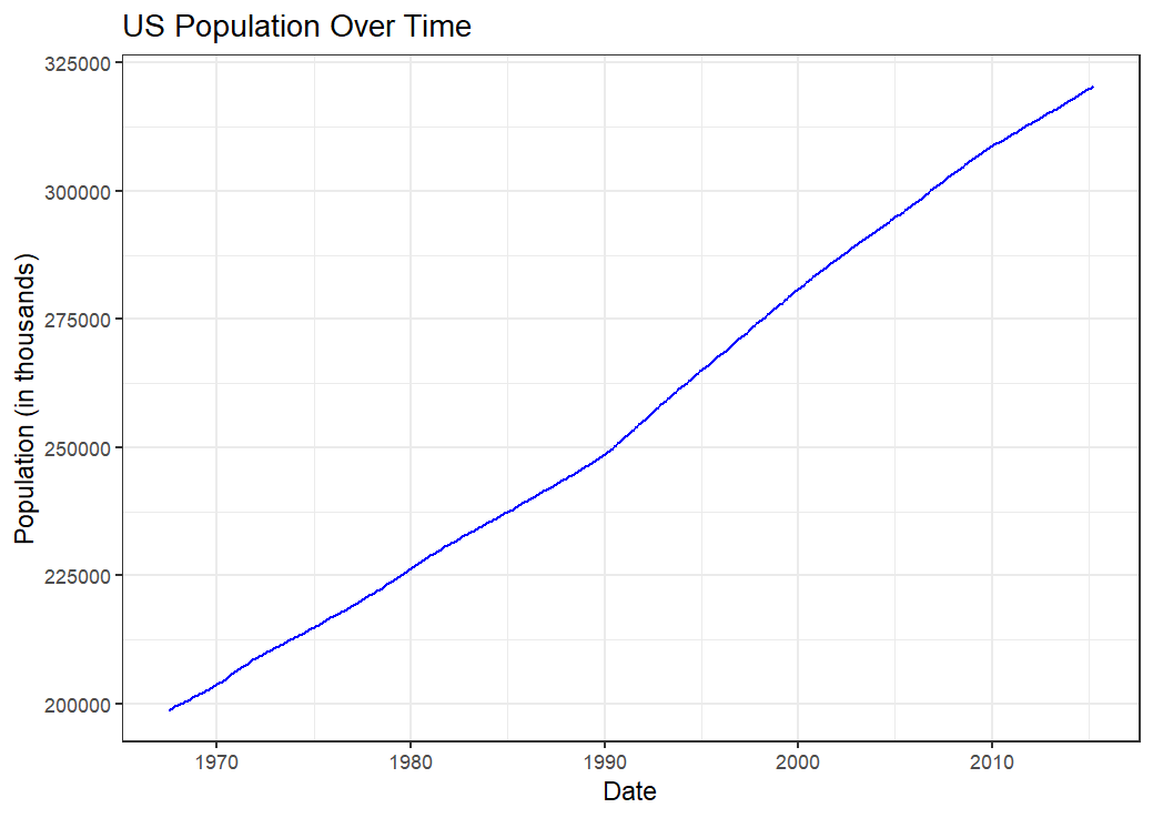
Line Chart
A line chart displays information as a series of data points called ‘markers’ connected by straight line segments. It is commonly used to visualize data that changes over time.
When to Use:
Tracking changes or trends over intervals (e.g., time).
Comparing multiple time series.
Showing continuous data progression.
Example Uses:
Monitoring stock prices over time.
Showing temperature changes throughout the day.
Visualizing website traffic trends.
Key Features:
Time or sequential data on the x-axis.
Quantitative values on the y-axis.
Lines can represent different categories or groups.
Areas chart
An area chart is similar to a line chart but with the area below the line filled in. It emphasizes the magnitude of values over time.
When to Use:
Showing cumulative totals over time.
Visualizing part-to-whole relationships.
Comparing multiple quantities over time.
Example Uses:
Displaying total sales over months.
Visualizing population growth.
Comparing energy consumption by source over time.
Key Features:
Time or sequential data on the x-axis.
Quantitative values on the y-axis.
Areas can be stacked to show cumulative totals.
These core visualization techniques form the foundation of data storytelling. By mastering them, you’ll be equipped to handle most day-to-day data visualization tasks effectively4. Remember that the key to successful data visualization is not just the choice of chart type but also clarity, accuracy, and the ability to convey the intended message to your audience.
5.4.5 Data Visualization with ggplot2
R has several systems for making graphs, but ggplot2 is one of the most elegant and versatile tools for creating high-quality visualizations. The ggplot2 package, part of the tidyverse, is built upon the principles of the Grammar of Graphics, a systematic approach to describing and constructing graphs. This grammar provides a coherent framework for building a wide variety of statistical graphics by mapping data variables to visual properties. The following are the advantage of ggplot:
Advantages of Using ggplot2
Let’s explore the key benefits that make ggplot2 a preferred choice for data visualization in R.
Consistency and Grammar: The structured approach makes it easier to build complex plots by adding layers.
Customization: Nearly every aspect of the plot can be customized to suit your needs.
Extension:
ggplot2is extensible, allowing for additional packages likeggthemes,ggrepel, andplotlyfor interactive graphics.Professional Quality: Produces publication-ready graphics suitable for reports, presentations, and academic papers.
5.4.5.1 Understanding the Grammar of Graphics
At its core, the Grammar of Graphics breaks down a graphic into semantic components:
Data: The dataset to be visualized.
-
Aesthetics (
aes()): Mappings between data variables and visual properties, such as position (x,y), color, size, shape, and transparency. For example:x: variable on the x-axis.y: variable on the y-axis.fill: fill color for areas like bars or boxes.color: color of points, lines, or areas.size: size of points or lines.shape: shape of points.alpha: transparency level.group: identifies series of points with a grouping variablefacet: create small multiples
Geometric Objects (or geoms): These are the fundamental visual components in ggplot2 that define the type of plot being created. They determine how data points are visually represented by specifying the form of the plot elements. Each
geomfunction corresponds to a particular type of visualization, enabling users to create a wide variety of plots to suit their analytical needs. Examples includegeom_point()for a scatter plot,geom_line()for a line chart,geom_bar()for a bar chart,geom_histogram()for a histogram,geom_boxplot()for a boxplot, andgeom_violin()for a violin plot.
Other Layers:
Additional layers enhance or modify your plot, allowing for customization and refinement:
Statistical Transformations (
stats): Computations applied to the data before plotting, such as summarizing or smoothing data. For instance,stat_smooth()adds a smoothed line to a scatter plot.Scales: Control how data values are translated into aesthetic values, such as the range and breaks of axes, or the mapping of data values to colors.
Coordinate Systems: Define the space in which the data is represented, such as Cartesian coordinates (
coord_cartesian()), polar coordinates (coord_polar()), or flipped coordinates (coord_flip()- to swap the x and y axes).Facets: Create multiple panels (small multiples) split by one or more variables to display different subsets of the data by using
facet_wrap()orfacet_grid().Themes: Customize the non-data components of the plot, like background, gridlines, text, and overall appearance, using functions like
theme_minimal(),theme_bw(),theme_classic(), or by modifying elements withtheme().Labels: Titles, axis labels, legend titles, and other annotations can be added to a plot by using
labs().
5.4.6 Building Plots with ggplot2
To create a plot using ggplot2, you start with the ggplot() function, specifying your data and aesthetic mappings. You then add layers to the plot using the + operator. Each layer can add new data, mappings, or geoms, allowing for intricate and customized visualizations. The basic structure of a ggplot2 plot can be represented as:
ggplot(data = <DATA>, aes(<MAPPINGS>)) +
  <GEOM_FUNCTION> + <OTHER_LAYERS>
Tip
Please see Section 5.4.5.1 for a breakdown of each component of this structure.
Creating a Scatter Plot with geom_point()
Suppose you want to visualize the relationship between engine displacement and miles per gallon in the mtcars dataset:
library(tidyverse)

ggplot(data = mtcars, aes(x = disp, y = mpg)) +
  geom_point() +
  labs(
    title = "Engine Displacement vs. Miles Per Gallon",
    x = "Displacement (cu.in.)",
    y = "Miles per Gallon"
  ) +
  theme_minimal()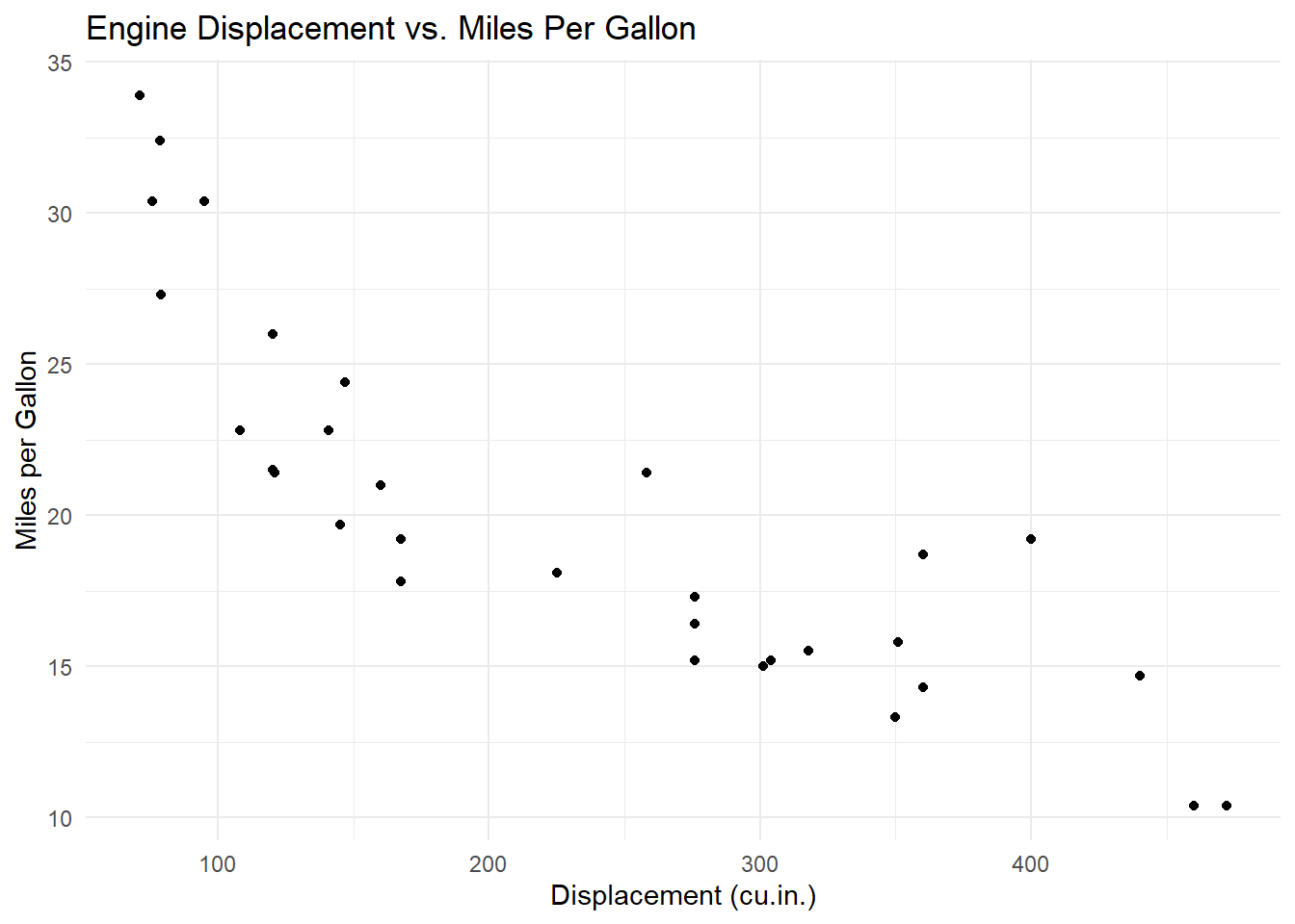
In this example:
Data:
mtcarsAesthetics:
x = disp,y = mpgGeometric Object:
geom_point()adds points to represent each car.Labels:
labs()adds a title and axis labels.Theme:
theme_minimal()provides a clean, minimalist background.
Customizing Aesthetics and Geoms
You can map additional variables to aesthetics to add more dimensions to your plot:
ggplot(data = mtcars, aes(x = disp, y = mpg, color = factor(cyl))) +
  geom_point(size = 3) +
  labs(
    title = "Engine Displacement vs. MPG by Cylinder Count",
    x = "Displacement (cu.in.)",
    y = "Miles per Gallon",
    color = "Cylinders"
  ) +
  theme_classic()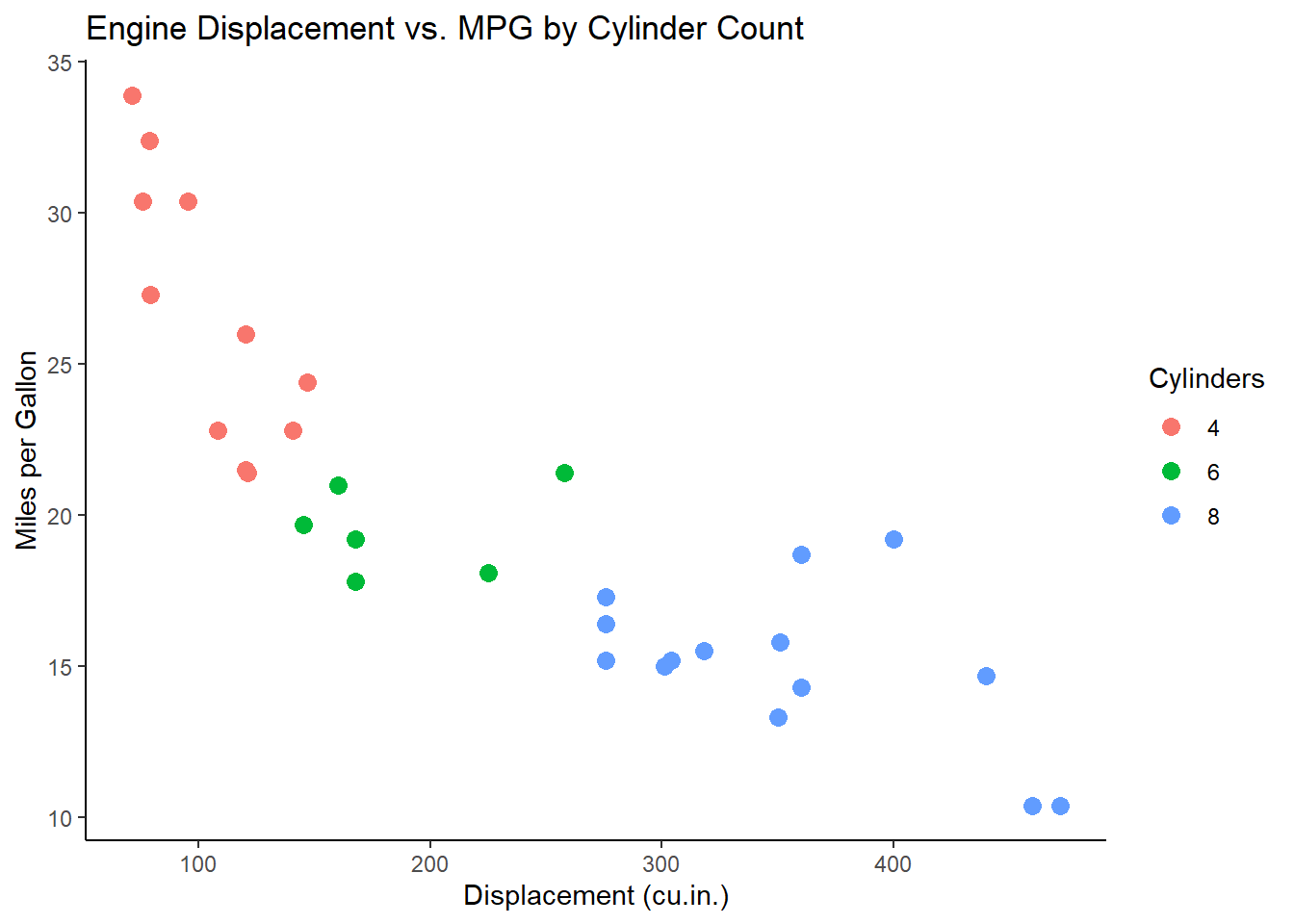
Here, the color aesthetic maps the number of cylinders (cyl) to different colors, allowing you to distinguish groups within the data.
Faceting for Multi-Panel Plots
Faceting splits your data into subsets and displays them in separate panels:
ggplot(data = mtcars, aes(x = disp, y = mpg)) +
  geom_point() +
  facet_wrap(~gear) +
  labs(
    title = "Engine Displacement vs. MPG Faceted by Gear Count",
    x = "Displacement (cu.in.)",
    y = "Miles per Gallon"
  ) +
  theme_light()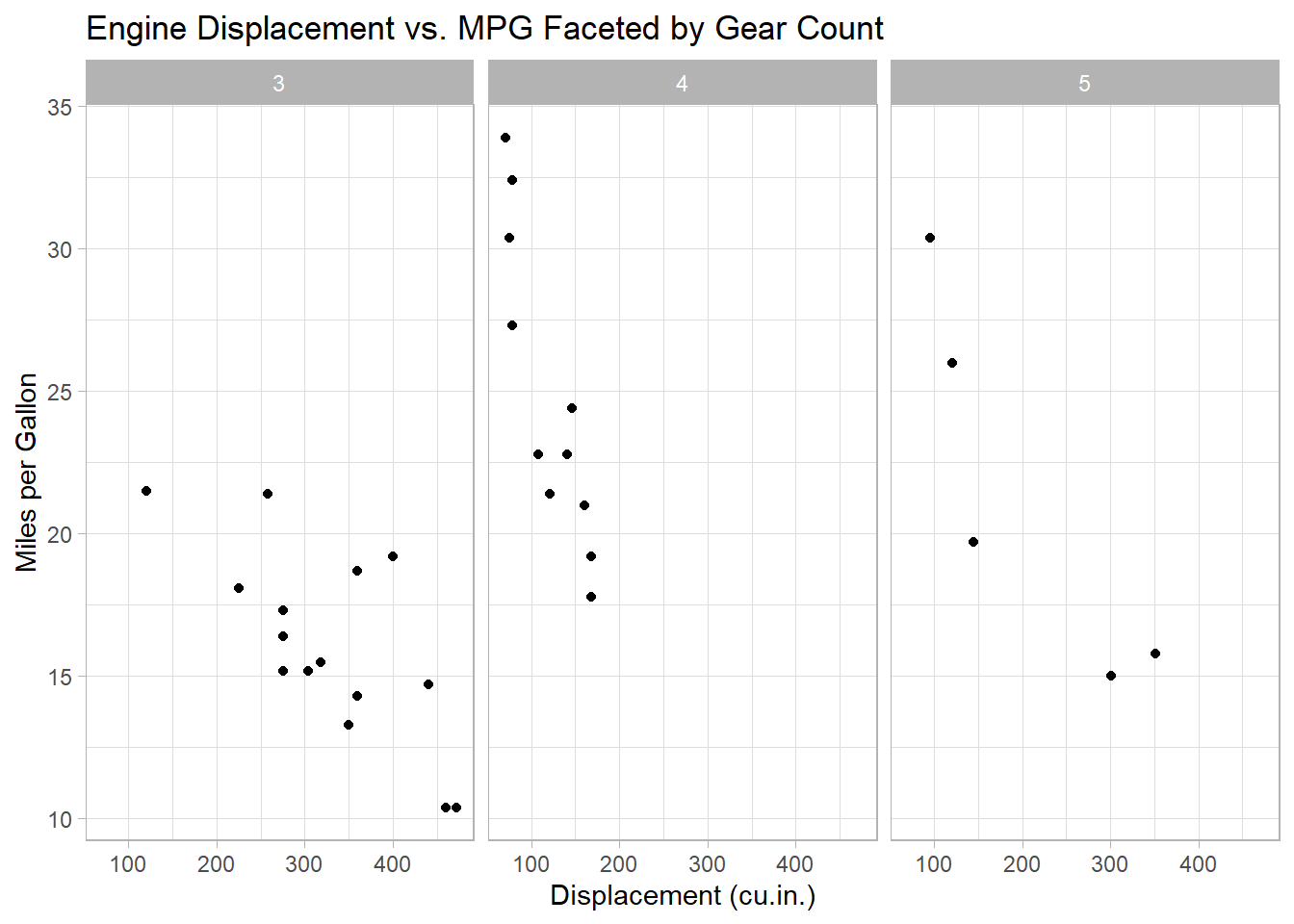
This code creates a scatter plot for each unique value of gear, allowing for easy comparison across groups.
Incorporating Statistical Transformations
You can add statistical summaries or models to your plots:
ggplot(data = mtcars, aes(x = disp, y = mpg)) +
  geom_point() +
  geom_smooth(method = "lm", se = FALSE, color = "blue") +
  labs(
    title = "Linear Regression of MPG on Displacement",
    x = "Displacement (cu.in.)",
    y = "Miles per Gallon"
  ) +
  theme_bw()
#> `geom_smooth()` using formula = 'y ~ x'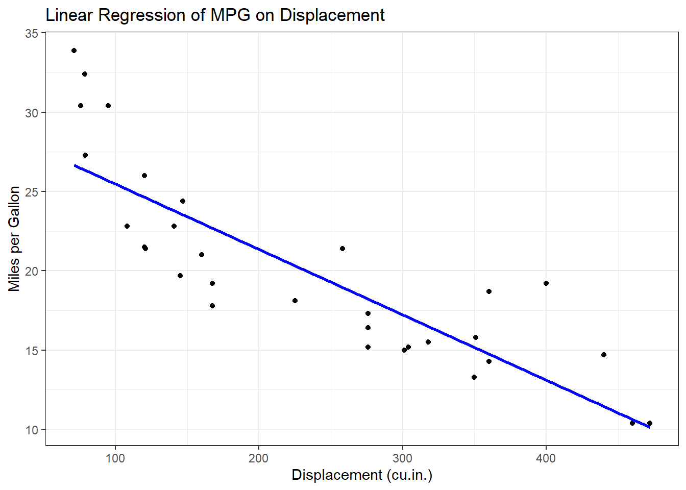
The geom_smooth() function adds a linear regression line to the scatter plot, providing insight into the trend.
Creating a Histogram with geom_histogram()
Suppose you want to a histogram of the Sepal.Length in the iris dataset:
# You can also start with the data frame and then pipe with ggplot

iris |> ggplot(aes(x = Sepal.Length)) +
  geom_histogram(binwidth = 0.5, fill = "steelblue", color = "black") + # binwidth determines the width of the bins
  labs(
    title = "Distribution of Sepal Lengths",
    x = "Sepal Length (cm)",
    y = "Frequency"
  ) +
  theme_minimal()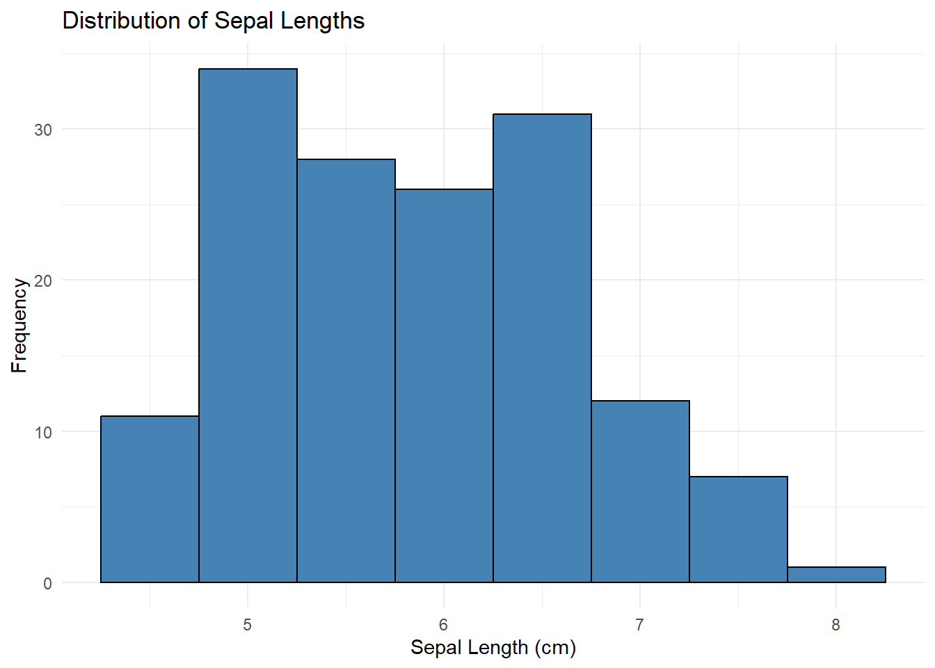
In this example:
Data:
irisAesthetics:
x = Sepal.LengthGeometric Object:
geom_histogram()creates a histogram withbinwidth = 0.5, where each bar represents the frequency ofSepal.Lengthvalues. Thefillparameter sets the bar color to “steelblue” andcoloroutlines each bar in black.Labels:
labs()adds a title and axis labels.Theme:
theme_minimal()provides a clean, minimalist background.
Creating a Boxplot with geom_boxplot()
Create a boxplot of sepal length by species:
iris |> ggplot(aes(x = Species, y = Sepal.Length, fill = Species)) +
  geom_boxplot() +
  labs(
    title = "Sepal Length by Species",
    x = "Species",
    y = "Sepal Length (cm)"
  ) +
  theme_bw()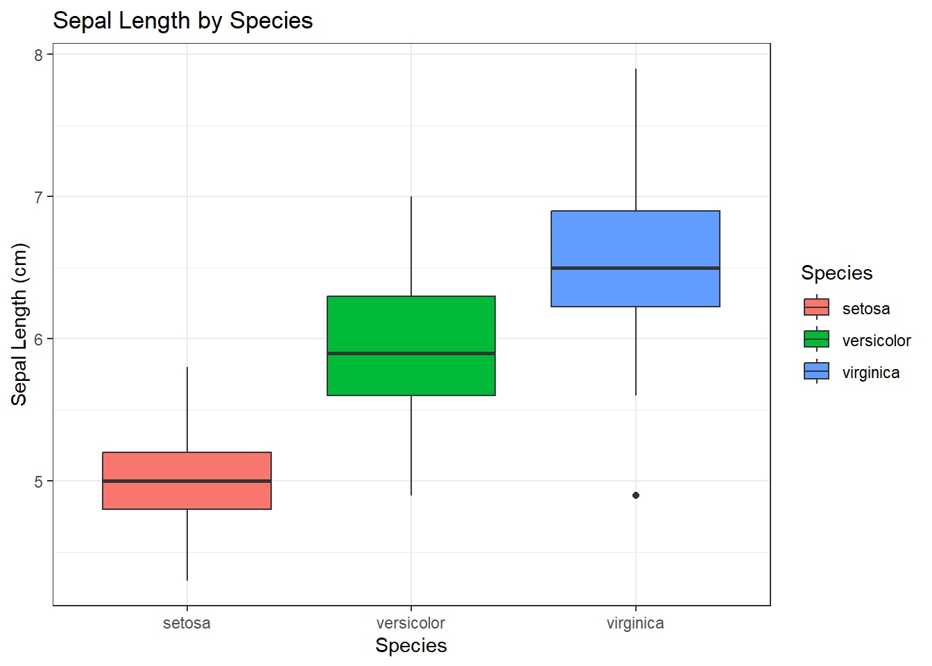
In this example:
Data:
irisAesthetics:
x = Species,y = Sepal.Length,fill = SpeciesGeometric Object:
geom_boxplot()creates a box plot to visualize the distribution ofSepal.Lengthfor eachSpecies. Thefillparameter colors the boxes based on the species.Labels:
labs()adds a title and axis labels.Theme:
theme_bw()applies a theme with a white background and black grid lines, giving the chart a classic look.
Creating a Bar Chart with geom_bar()
Visualize the count of cars by the number of carburetors:
mtcars <- mtcars |> mutate(carb = as.factor(carb))

mtcars |> ggplot(aes(x = carb, fill = carb)) +
  geom_bar(show.legend = FALSE) +
  labs(
    title = "Bar Chart of 'carb' in mtcars",
    x = "Number of Carburetors",
    y = "Number of Cars"
  ) +
  theme_minimal()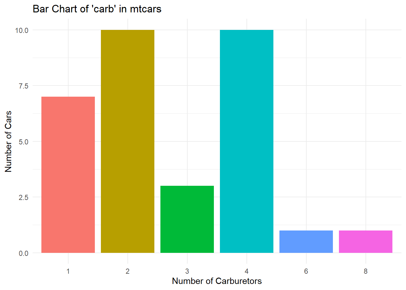
In this example:
Data:
mtcars, with thecarbcolumn converted to a factor usingmutate().Aesthetics:
x = carb,fill = carbto color the bars based on the different levels of carb.Geometric Object:
geom_bar()creates a bar chart showing the count of cars for each value ofcarb. Theshow.legend = FALSEparameter hides the legend.Labels:
labs()adds a title and axis labels.Theme:
theme_minimal()provides a clean, minimalist background.
Creating a Line Chart with geom_line
Using the economics dataset in ggplot2 package, create a line plot to visualize the trend of unemployment over time. Specifically, plot date on the x-axis and unemploy (the number of unemployed individuals) on the y-axis. Color the line blue and apply the theme_bw() theme to give the plot a clean, professional look.
economics %>%
  ggplot(aes(x = date, y = unemploy)) +
  geom_line(color = "blue") +
  labs(
    title = "Unemployment Trends Over Time",
    x = "Date",
    y = "Number of Unemployed Individuals"
  ) +
  theme_bw()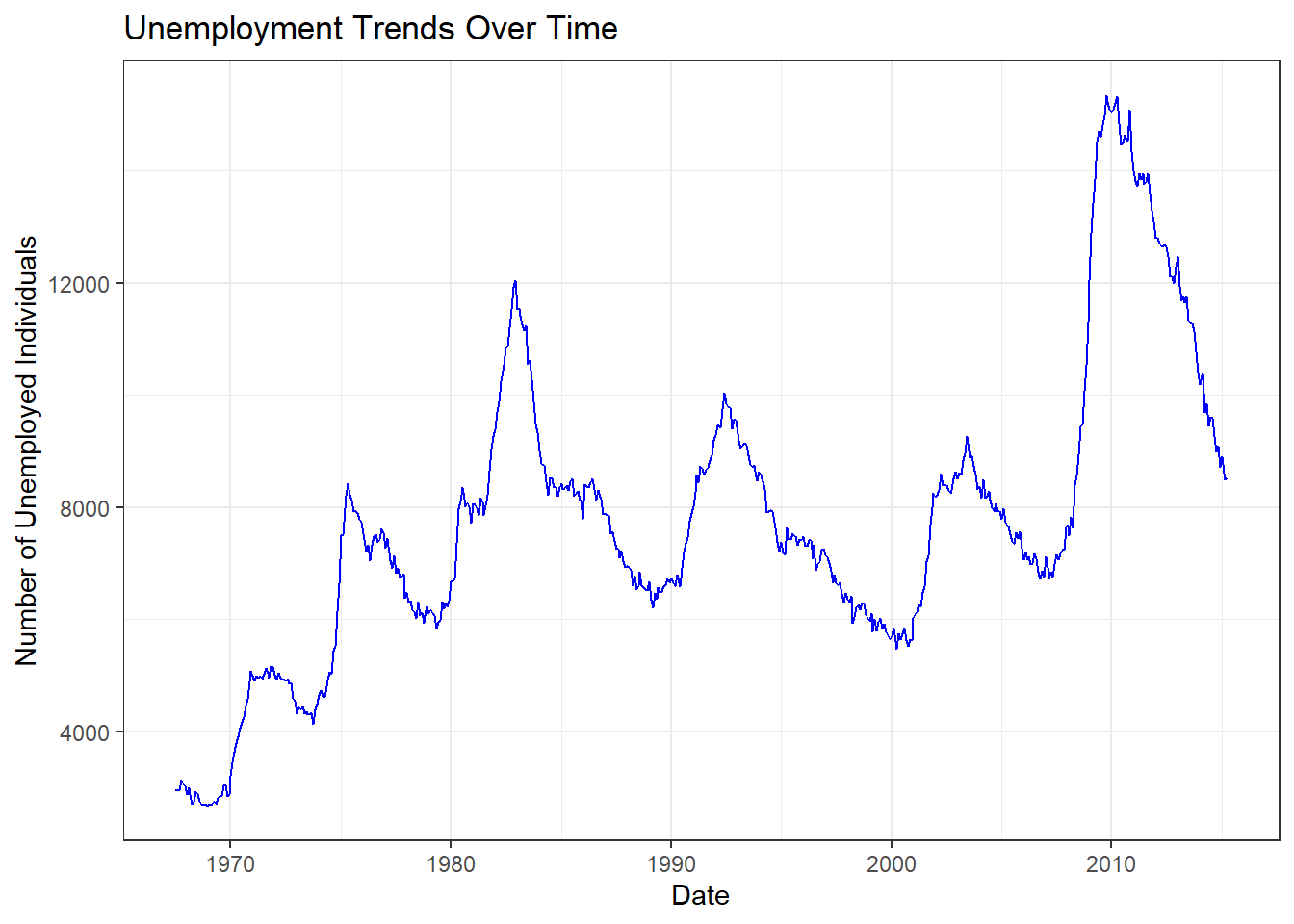
In this example:
Data: US economic time series data
Aesthetics:
x = date, y = unemployplots unemployment over time.Geometric Object:
geom_line(color = "blue")creates a line chart to show the trend of unemployment, with the line colored blue.Labels:
labs()adds a title and axis labels, specifying “Unemployment Trends Over Time” for the title, “Date” for the x-axis, and “Number of Unemployed Individuals” for the y-axis.Theme:
theme_bw()applies a black-and-white theme for a clear and classic look.
Creating an Area Chart with geom_area
Using the same economics data, create an area plot that displays the number of unemployed individuals over time.
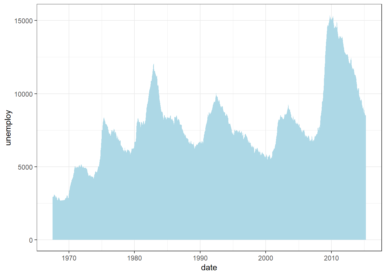
In this example:
Data: US economic time series data
Aesthetics:
x = date,y = unemployto set the x-axis as the date and the y-axis as the unemployment count.Geometric Object:
geom_area()creates an area chart showing the trend of unemployment over time. Thefill = "light-blue"parameter colors the area with a light blue shade.Labels: None are explicitly added here, so the default axis labels (
dateandunemploy) will be used.Theme:
theme_bw()applies a theme with a white background and black grid lines, giving the chart a classic look.
5.4.7 Saving your plots
Once you’ve created a meaningful and visually appealing plot in R using ggplot2, you might want to save it as an image file to include in reports, presentations, or share with others. The ggsave() function is a convenient tool that allows you to export your plots to a variety of formats such as PNG, PDF, JPEG, and more.
Let’s walk through the process of creating a plot and then saving it using ggsave().
diamonds |> ggplot(aes(x = cut, y = carat, fill = color)) +
  geom_col(position = position_dodge()) +
  labs(x = "Quality of the cut", y = "Weight of the diamond") +
  ggthemes::theme_economist()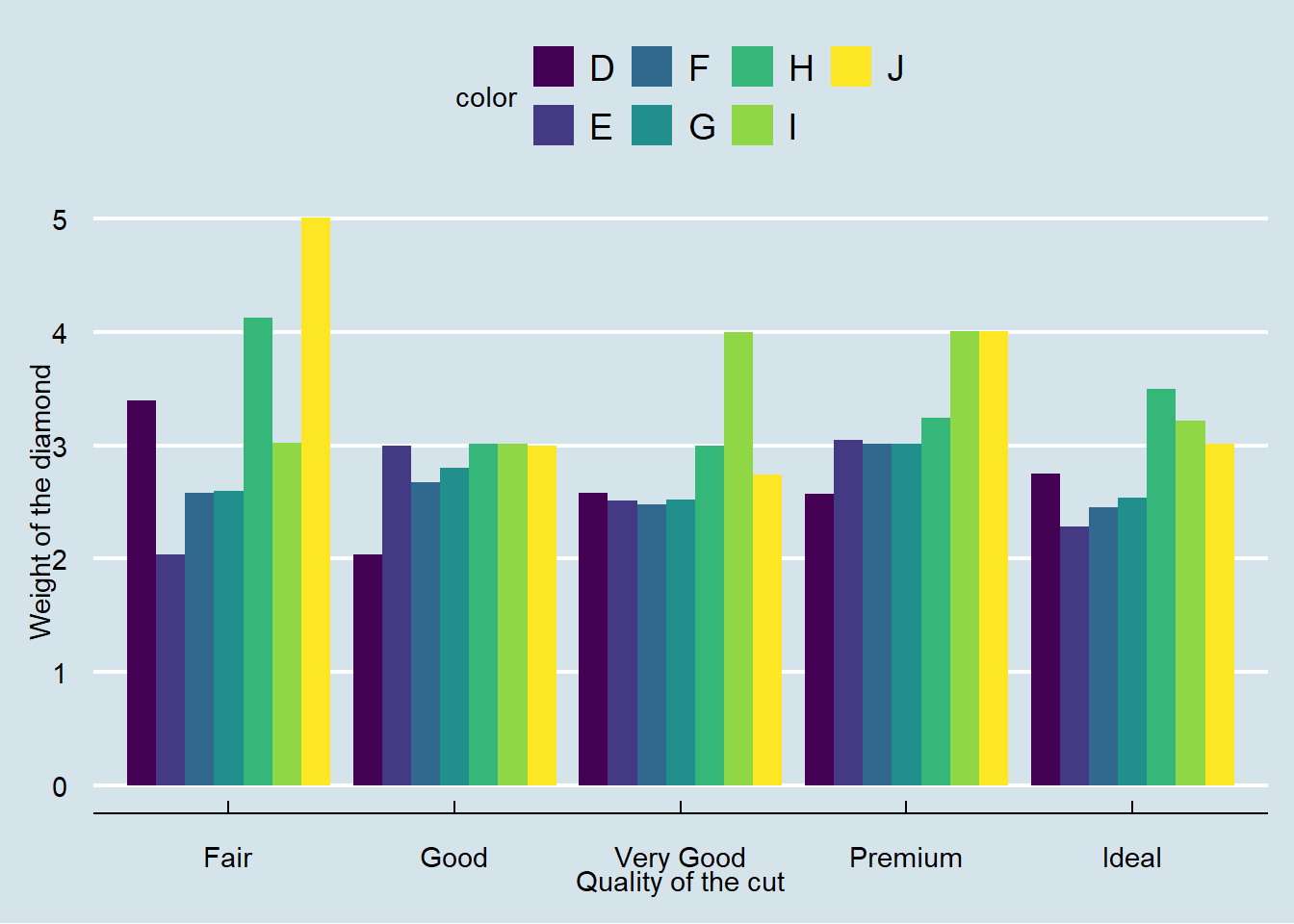
ggsave(filename = "diamonds-plot.png")#> Saving 7 x 5 in imageExplanation:
filename = "diamonds-plot": Specifies the name of the output file and the format (in this case, PNG).By default,
ggsave()saves the most recently created plot.The plot is saved in your current working directory.
Customizing the Output
For reproducible results and to ensure your plots have consistent dimensions, it’s a good practice to specify the size and resolution when saving your plots.
ggsave(
  filename = "diamonds-plot.png",
  width = 8, # Width in inches
  height = 6, # Height in inches
  units = "in", # Units for width and height (can be "in", "cm", or "mm")
  dpi = 300 # Resolution in dots per inch
)Explanation:
widthandheight: Set the size of the image.units: Specify the units of measurement.dpi: Controls the resolution; 300 dpi is standard for high-quality images.
Note
The ggsave() function has many additional arguments that allow for fine-tuned control over the saved image. To explore all the options, you can refer to the official documentation:
?ggsave5.4.8 Exercise 5.2: Data Analysis and Visualization with Medical Insurance Data
For this exercise, you will use Rstudio Project, call it Experiment 5.2 and medical insurance data. These questions and tasks will give you hands-on experience with the key functionalities of dplyr and ggplot2, reinforcing your learning and understanding of both data manipulation and visualization in R.
-
Data Manipulation using
dplyr:Download medical insurance data
Import the data into R.
How many individuals have purchased medical insurance? Use
dplyrto filter and count.What is the average estimated salary for males and females? Use
group_by()andsummarise().How many individuals in the age group 20-30 have not purchased medical insurance? Use
filter().Which age group has the highest number of non-purchasers? Use
group_by()andsummarise().For each gender, find the mean, median, and maximum estimated salary. Use
group_by(),summariseand appropriate statistical functions.
-
Data Visualization using
ggplot2:Create a histogram of the ages of the individuals. Use
geom_histogram().Plot a bar chart that shows the number of purchasers and non-purchasers. Use
geom_bar().Create a boxplot to visualize the distribution of estimated salaries for males and females. Use
geom_boxplot().Generate a scatter plot of age versus estimated salary. Color the points by their “Purchased” status. This will give insights into the relationship between age, salary, and the decision to purchase insurance. Use
geom_point().Overlay a density plot on the scatter plot created in (d) to better understand the concentration of data points. Use
geom_density_2d().
-
Combining
dplyrandggplot2:Filter the data to only include those who haven’t purchased insurance and then create a histogram of their ages.
Group the data by gender and then plot the average estimated salary for each gender using a bar chart.
For each age, calculate the percentage of individuals who have purchased insurance and then plot this as a line graph against age.
5.5 Summary
In Lab 5, you have acquired essential skills in data analysis and visualization using R:
The Pipe Operator
|>: You learned how to use the pipe operator from themagrittrpackage to streamline your code. This operator allows you to chain multiple functions together, making your code more readable and intuitive by focusing on the flow of data through a sequence of operations.Data Manipulation with
dplyr: You explored the core functions of thedplyrpackage—such asselect(),filter(),mutate(),arrange(), andsummarise()—to efficiently manipulate and transform datasets. These functions enable you to select specific columns, filter rows based on conditions, create new variables, sort data, and compute summary statistics.Data Visualization with
ggplot2: You discovered how to create a variety of visualizations using theggplot2package, which is based on the Grammar of Graphics. You practiced generating scatter plots, histograms, boxplots, and bar charts to explore and present data visually, enhancing your ability to identify patterns and insights.Integrating Data Analysis and Visualization: You learned how to combine data manipulation and visualization techniques to create a seamless analytical workflow. By preparing data with
dplyrand visualizing it withggplot2, you improved your capacity to tell compelling stories with data.
These advanced skills are crucial for any data analyst or scientist, as they enable you to work effectively with real-world datasets, extract meaningful insights, and communicate your findings through clear and impactful visualizations. Congratulations on elevating your R programming proficiency and advancing your expertise in data analysis and visualization!
If you haven’t installed it yet, you can do so with
install.packages("palmerpenguins")and load it usinglibrary(palmerpenguins).↩︎Horst AM, Hill AP, Gorman KB (2020). palmerpenguins: Palmer Archipelago (Antarctica) penguin data. R package version 0.1.0. https://allisonhorst.github.io/palmerpenguins/. doi: 10.5281/zenodo.3960218.↩︎
For additional insights on data visualization techniques not covered in this book, please refer to the articles by Harvard Business School, DataCamp and Polymer.↩︎
For additional insights on data visualization techniques not covered in this book, please refer to the articles by Harvard Business School, DataCamp and Polymer.↩︎