
7 Data Visualisation
7.1 Introduction
In Lab 7, we embark on an exploration into the transformative realm of data visualisation using R. Our approach is twofold. First, we introduce ggplot2—a powerful package built on the Grammar of Graphics that enables you to craft professional, layered, and highly customisable visualisations. Second, we examine Base R graphics, a built-in solution that requires no additional packages and is perfectly suited for quick, exploratory plots. Although ggplot2 offers exceptional flexibility and elegance, Base R graphics remain indispensable for rapid analysis; they are straightforward, intuitive, and ideally suited to simple or preliminary visualisations.
Through this lab, you will learn how to effectively map data variables to visual properties, build complex plots with ggplot2, and harness the power of R’s native plotting functions. This dual approach empowers you to choose the most appropriate method for your analytical needs.
7.2 Learning Objectives
By the end of this lab, you will be able to:
Understand the Grammar of Graphics Framework:
Grasp how ggplot2’s structured, layered approach enables the step-by-step construction of complex plots.Create a Range of Visualisations with ggplot2:
Develop scatter plots, bar charts, histograms, boxplots, and more to represent your data effectively.Customise Visual Elements in ggplot2:
Adjust themes, colours, labels, scales, and facets to enhance both clarity and visual appeal.Utilise Base R Graphics for Exploratory Analysis:
Construct quick, function-based plots using built-in functions such asplot(),hist(),boxplot(),barplot(), andpie(), and apply customisations directly through graphical parameters.Integrate Data Manipulation with Visualisation:
Combine data preparation tools likedplyrwith both ggplot2 and Base R graphics to develop seamless and insightful workflows.
By completing this lab, you will become proficient in visualising data and communicating your findings effectively. Let us now transform raw data into impactful stories!
7.3 What is Data Visualization?
Data visualisation is both an art and a science—it is the practice of representing data through graphical means, such as charts, graphs, and maps. By transforming numerical or textual information into visual formats, we can uncover patterns, trends, and insights that might be hidden in raw data. This process breathes life into data, turning abstract numbers into compelling stories that are easy to understand and share.
In today’s data-driven world, the ability to visualise data effectively is an essential skill across various industries—be it data science, finance, education, or healthcare. As the volume and complexity of data continue to grow, visualisation provides the means to make sense of it all and to share insights in a compelling and accessible manner.
Visual representations often prove more effective than descriptive statistics or tables for analysing data, as they allow us to:
Identify Patterns and Trends: Spot relationships within the data that may not be immediately apparent.
Understand Distributions: Clearly see how data is spread out, where concentrations or gaps exist.
Detect Outliers: Quickly identify data points that deviate markedly from the rest of the dataset.
Communicate Insights: Present findings in a manner that is both engaging and easy for diverse audiences to grasp.
By leveraging data visualisation, we enhance our capacity to analyse complex datasets and to communicate our discoveries with clarity.
7.4 Importance of Data Visualisation
Data visualisation plays a pivotal role in the analytical process for several reasons:
Simplifies Complex Data:
Large datasets can be overwhelming when viewed in their raw form. Visualisation distils and structures this data, rendering it comprehensible at a glance. For instance, a line chart can succinctly illustrate trends over time that would be challenging to discern from a mere table of numbers.Reveals Patterns and Trends:
Visual tools help in identifying relationships within the data, such as correlations between variables or changes over time. This often leads to the generation of new insights and hypotheses—for example, a scatter plot may reveal a positive correlation between hours studied and exam scores.Supports Decision Making:
Visual evidence provides a persuasive basis for conclusions and recommendations. Decision-makers can rapidly grasp complex information and make informed choices, especially when key performance indicators are highlighted on a well-designed dashboard.Engages the Audience:
Visuals are naturally more engaging than raw numbers or text. They capture attention and enhance the persuasiveness of presentations by effectively conveying complex information in a digestible format.Facilitates Communication:
Visualisation transcends language barriers and simplifies the communication of intricate ideas. It fosters collaboration across disciplines by providing a common visual language.
7.5 Choosing the Right Visualization
Selecting the appropriate type of visualisation is critical for effectively communicating your data’s story. Consider the following factors:
Define Your Objective:
Determine whether you want to compare values, illustrate composition, understand distribution, or analyse trends over time.Understand Your Data:
Identify whether your variables are categorical, numerical, or time-series, and decide whether you are interested in relationships between variables, distributions, or outliers.Know Your Audience:
Tailor your visualisation to the background and expertise of your audience—ensure that the chosen visualisation is neither too complex nor overly simplistic.Consider Practical Constraints:
Think about the medium of presentation (digital, print, or verbal), and assess data quality and quantity. Large datasets may need aggregation, and lower-quality data may restrict the types of visualisations available.Aesthetics and Clarity:
Employ colour, shape, and size judiciously to enhance comprehension without overwhelming the viewer. Avoid clutter by keeping designs clean and focused.Ethical Representation:
Ensure that scales and representations are accurate and truthful, maintaining credibility and avoiding misleading interpretations.
By carefully weighing these considerations, you can select visualisations that not only effectively present your data but also resonate with your audience.
7.6 Types of Data Visualisation Analysis
Data visualisation can be broadly classified into three categories based on the number of variables analysed: univariate, bivariate, and multivariate.
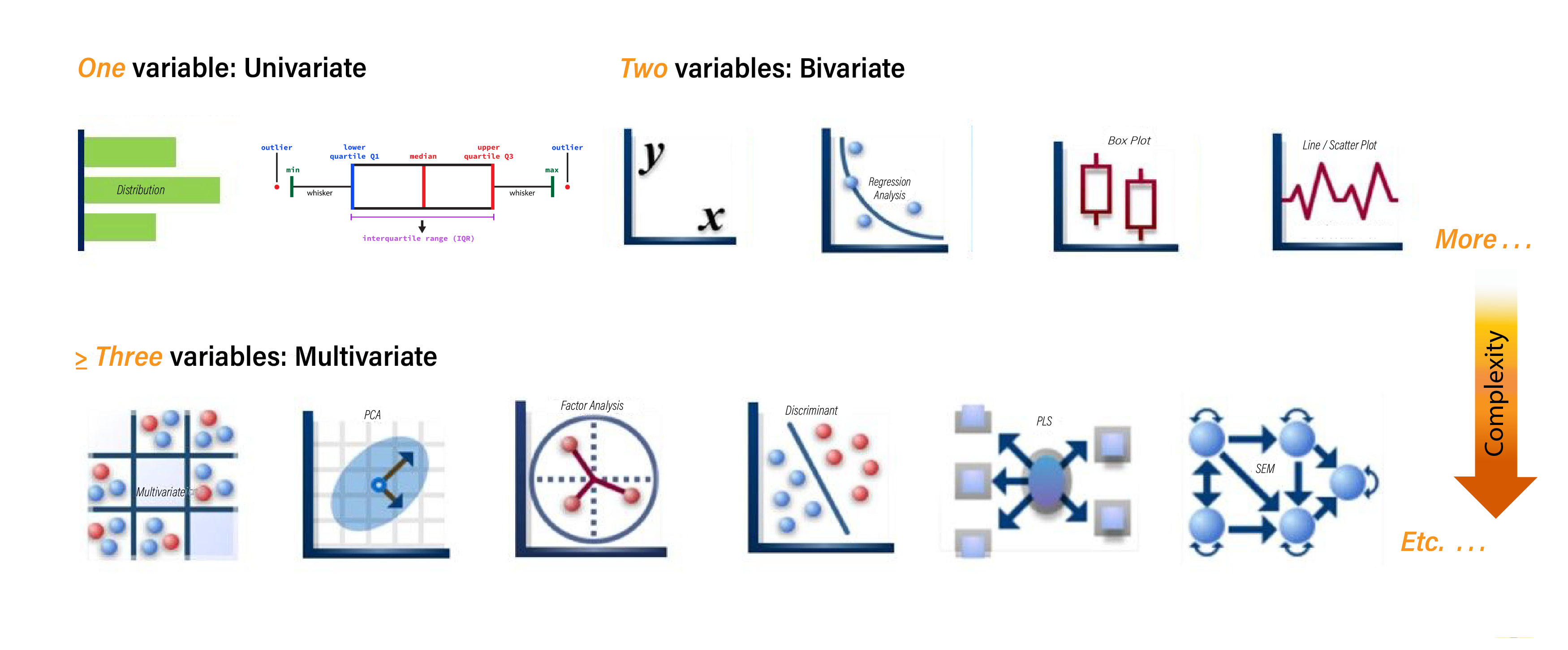
Each category offers a unique lens through which to interpret your data, allowing you to uncover different insights.
Univariate Analysis
Univariate analysis involves examining a single variable at a time. This approach helps you understand the distribution, central tendency, and variability of the data. For example, you might create a histogram to explore the age distribution within a population. This visualisation will reveal patterns such as skewness, clustering, and the presence of outliers, enabling you to gain a clear understanding of the variable’s overall behaviour.Bivariate Analysis
Bivariate analysis focuses on exploring the relationship between two variables. This type of analysis is particularly useful for identifying associations or correlations between variables. For instance, a scatter plot can be used to investigate the relationship between advertising spend and sales revenue. By plotting one variable against the other, you can observe trends, clusters, or even potential causal relationships, providing deeper insight into how the variables interact.Multivariate Analysis
Multivariate analysis extends beyond two variables to examine the interplay among three or more variables simultaneously. This approach is invaluable when dealing with complex data sets where multiple factors may be influencing an outcome. For example, a bubble chart or parallel coordinates plot might be employed to evaluate factors affecting customer satisfaction by analysing service quality, price, and brand reputation all at once. This holistic view helps you capture the multidimensional nature of your data, revealing intricate relationships that might otherwise go unnoticed.
Understanding the type of analysis you wish to perform will guide you in selecting the most appropriate visualisation techniques to extract the insights you need.
7.7 Common Data Visualization Techniques
While there is an abundance of graphs and charts, mastering the core types will equip you with the essential tools for most analytical tasks.
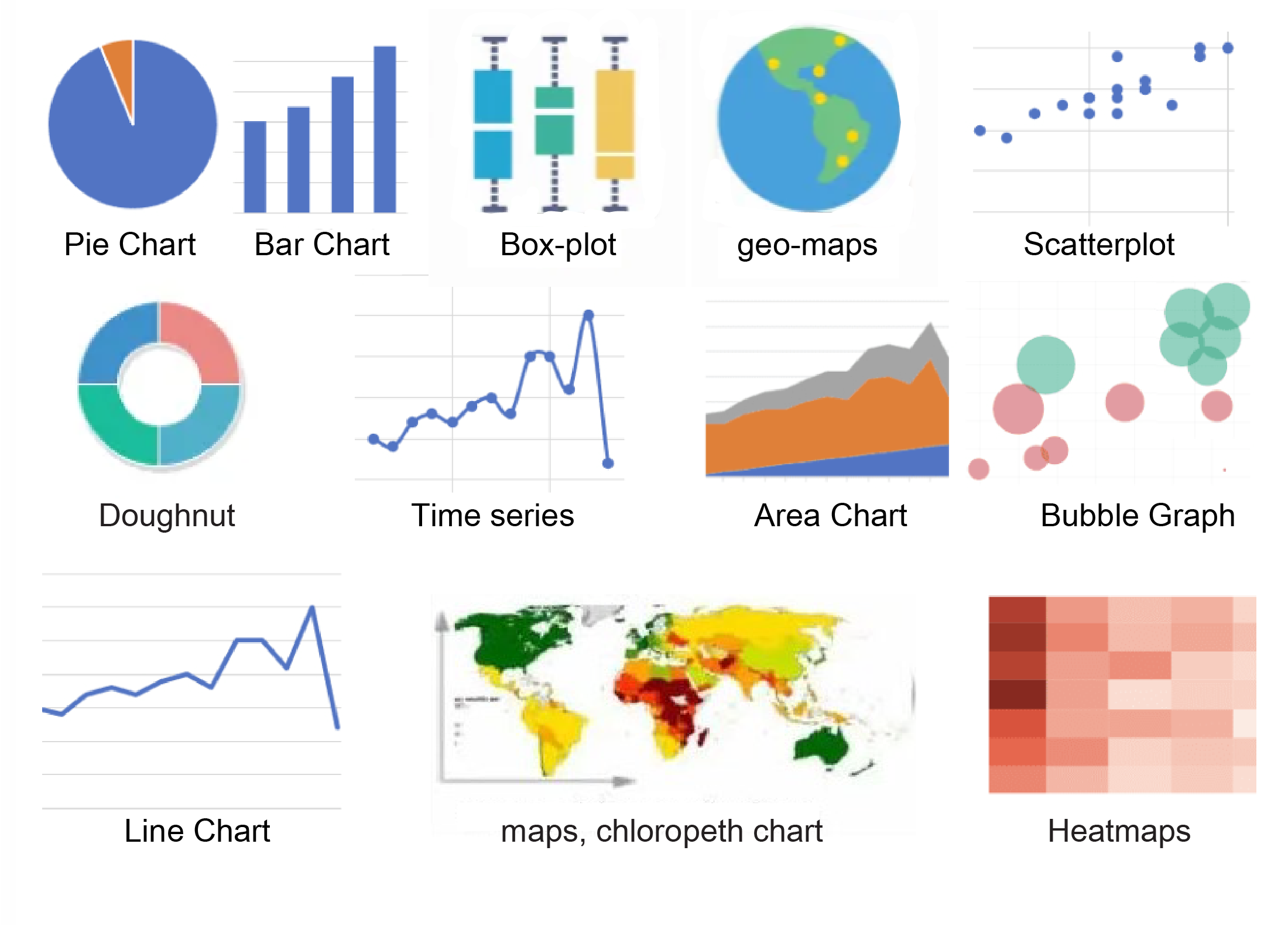
Let’s now explore some of the most frequently used visualisation techniques.
7.7.1 Bar Chart
A bar chart represents categorical data using rectangular bars, with the length of each bar proportional to the corresponding value. Bars can be plotted vertically or horizontally.
When to Use:
Comparing quantities across different categories.
Illustrating rankings or frequencies.
Displaying discrete data.
Example Uses:
Comparing sales figures across regions.
Showing student enrolment numbers across courses.
Visualising survey responses by category.
Key Features:
Categories typically appear on the x-axis, while values are on the y-axis.
Bars are spaced to emphasise that the data is discrete.
7.7.2 Histogram
A histogram groups continuous data into bins, displaying the frequency of data points within each bin.
When to Use:
Understanding the distribution of continuous data.
Identifying patterns such as skewness, modality, or outliers.
Assessing the probability distribution of a dataset.
Example Uses:
Displaying the distribution of ages in a population.
Showing the frequency of test scores among students.
Analysing the spread of housing prices.
Key Features:
The x-axis represents the continuous data divided into bins.
The y-axis indicates frequency or count.
Adjacent bars reflect the continuous nature of the data.
7.7.3 Circular charts
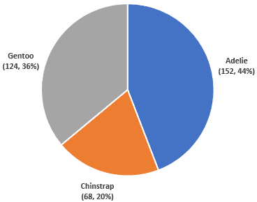
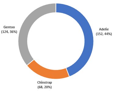
A circular chart is a type of statistical graphic represented in a circular format to illustrate numerical proportions. A pie chart (Figure 7.6 (a)) and a doughnut chart (Figure 7.6 (b)) are examples of circular charts. Each slice or segment represents a category’s contribution to the whole, making it easy to visualize parts of a whole in a compact form.
When to Use:
Showing parts of a whole.
Representing percentage or proportional data.
Comparing categories within a dataset where the total represents 100%.
When there are a limited number of categories (ideally less than six).
Example Uses:
Displaying market share of different companies.
Illustrating budget allocations across departments.
Showing survey results for single-choice questions.
Key Features:
The circle represents the entire dataset.
Slices are proportional to each category’s contribution.
Doughnut charts provide additional central space for extra labelling or data.
Note
Circular charts can be challenging to interpret with many small or similarly sized slices. In such cases, consider using bar charts or stacked charts for clarity.
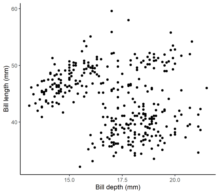
7.7.4 Scatter Plot
A scatter plot uses Cartesian coordinates to display values for two numerical variables. Each point represents an observation, allowing you to explore relationships or correlations between variables.
When to Use:
Exploring relationships or correlations between two continuous variables.
Detecting patterns, trends, clusters, or outliers.
Example Uses:
Examining the relationship between study hours and exam scores.
Analysing the correlation between advertising spend and sales revenue.
Investigating associations between temperature and energy consumption.
Key Features:
One variable is plotted on the x-axis, and another on the y-axis.
Data points are distributed in two-dimensional space.
A trend line can be added to highlight the overall relationship.
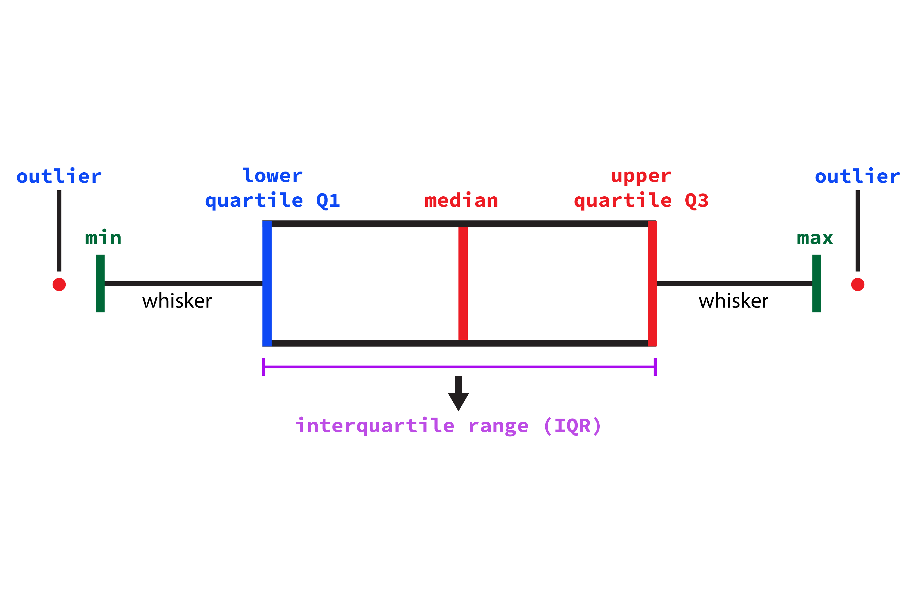
7.7.5 Box and Whisker Plot
A box plot summarises a dataset by displaying its median, quartiles, and potential outliers along a number line.
When to Use:
Comparing distributions across different categories.
Identifying central tendency, spread, and skewness.
Highlighting outliers.
Example Uses:
Comparing test scores across classrooms..
Analysing the spread of salaries in different industries
Visualising delivery times from various suppliers.
Key Features:
The box shows the interquartile range (IQR), from the first quartile (Q1) to the third quartile (Q3).
The line inside the box indicates the median.
Whiskers extend to the minimum and maximum values within 1.5 \(\times\) IQR.
Points outside the whiskers represent outliers.
7.7.6 Line Chart
A line chart displays information as a series of data points called ‘markers’ connected by straight line segments. It is commonly used to visualise data that changes over time.
When to Use:
Tracking changes or trends over intervals (e.g. time).
Comparing multiple time series.
Showing continuous data progression.
Example Uses:
Monitoring stock prices.
Showing temperature changes throughout the day.
Illustrating website traffic trends.
Key Features:
The x-axis represents time or sequential data.
The y-axis shows quantitative values.
Different lines may represent various categories or groups.
7.7.7 Areas chart
An area chart is similar to a line chart but fills the area below the line, emphasising the magnitude of values over time.
When to Use:
Showing cumulative totals over time.
Visualizing part-to-whole relationships.
Comparing multiple quantities over time.
Example Uses:
Displaying total sales over months.
Visualising population growth.
Comparing energy consumption by source.
Key Features:
Time or sequential data on the x-axis.
Quantitative values on the y-axis.
The area beneath the line is filled, highlighting cumulative magnitude.
Tip
These core visualisation techniques form the foundation of data storytelling. Mastering them equips you with the tools necessary for most day-to-day analytical tasks. Remember, successful data visualisation is not only about selecting the right chart type, but also about achieving clarity, accuracy, and effective communication of your intended message.
7.8 Experiment 7.1: Data Visualization with ggplot2
R offers several systems for making graphs, but ggplot2 stands out as one of the most elegant and versatile tools for creating high-quality visualisations. As part of the tidyverse, ggplot2 is built upon the principles of the Grammar of Graphics—a systematic framework for describing and constructing graphs. This approach enables you to map data variables to visual properties in a coherent manner, allowing for the creation of a wide variety of statistical graphics.
Advantages of Using ggplot2
Let’s explore the key benefits that make ggplot2 a preferred choice for data visualisation in R.
Consistency and Grammar: Its structured, layered approach simplifies the process of building complex plots.
Customisation: Nearly every aspect of a plot can be tailored to your specific needs.
Extension:
ggplot2is highly extensible, with additional packages such asggthemes,ggrepel, andplotlyavailable for further customisation and interactivity.Professional Quality: It produces publication-ready graphics that are ideal for reports, presentations, and academic papers.
7.8.1 Understanding the Grammar of Graphics
At its core, the Grammar of Graphics breaks down a graphic into semantic components:
Data: The dataset to be visualised.
-
Aesthetics (
aes()): The mappings between data variables and visual properties such as position, colour, size, shape, and transparency. For example:x: Variable on the x-axisy: Variable on the y-axisfill: Fill color for areas like barscolor: Colour of points, lines, or areassize: Size of points or linesshape: Shape of pointsalpha: Transparency levelgroup: Grouping variable for series of pointsfacet: For creating small multiples
-
Geometric Objects (or geoms): These are the visual building blocks in ggplot2 that define the type of plot being created. They determine how data points are visually represented by specifying the form of the plot elements. Each
geom_function corresponds to a specific type of chart, allowing you to create a diverse range of plots. Examples include:geom_point()for a scatter plotgeom_smooth()for adding trend lines or smoothing curves on a scatter plotgeom_bar()for a bar chartgeom_col()for bar charts using precomputed valuesgeom_histogram()for a histogramgeom_boxplot()for a boxplotgeom_violin()for a violin plotgeom_freqpoly()for a frequency polygongeom_line()for a line chartgeom_area()for an area chart
Other Layers:
Additional layers enhance or modify your plot, allowing for customization and refinement:
Statistical Transformations (
stats): Computations applied to the data before plotting, such as summarising or smoothing data. For example,stat_smooth()adds a smoothed line to a scatter plot.Scales: These control how data values are translated into aesthetic values, including axis ranges and colour gradients.
Coordinate Systems: Define the space in which the data is plotted, such as Cartesian coordinates (
coord_cartesian()), polar coordinates (coord_polar()), or flipped coordinates (coord_flip()- to swap the x and y axes).Facets: Create multiple panels (small multiples) by splittting the data based on one or more variables, using
facet_wrap()orfacet_grid().Themes: Customise non-data elements like backgrounds, gridlines, and text using prebuilt themes such as
theme_minimal(),theme_bw(), ortheme_classic(), or by modifying individual elements withtheme().Labels: Add titles, axis labels, legend titles, and annotations with the
labs()function.
7.8.2 Building Plots with ggplot2
To create a plot using ggplot2, start with the ggplot() function, specifying your data and aesthetic mappings, then add layers with the + operator. For example:
ggplot(data = <DATA>, aes(<MAPPINGS>)) +
  <GEOM_FUNCTION> +
  <OTHER_LAYERS>
Alternatively, you can use the pipe operator:
data |> ggplot(aes(<MAPPINGS>)) +
  <GEOM_FUNCTION> +
  <OTHER_LAYERS>
Tip
For a detailed breakdown of ggplot2 components, refer to Section 7.8.1.
7.8.3 Example Datasets
We begin our visualisation journey using five widely recognised datasets: mtcars, iris, diamonds, economics, and heart.
- The
mtcarsDataset
The built-in mtcars dataset contains information on fuel consumption and various automobile design and performance features for 32 car models from the 1973–74 era. It is ideal for exploring relationships such as those between weight, horsepower, and fuel efficiency.
#> Rows: 32
#> Columns: 11
#> $ mpg  <dbl> 21.0, 21.0, 22.8, 21.4, 18.7, 18.1, 14.3, 24.4, 22.8, 19.2, 17.8,…
#> $ cyl  <dbl> 6, 6, 4, 6, 8, 6, 8, 4, 4, 6, 6, 8, 8, 8, 8, 8, 8, 4, 4, 4, 4, 8,…
#> $ disp <dbl> 160.0, 160.0, 108.0, 258.0, 360.0, 225.0, 360.0, 146.7, 140.8, 16…
#> $ hp   <dbl> 110, 110, 93, 110, 175, 105, 245, 62, 95, 123, 123, 180, 180, 180…
#> $ drat <dbl> 3.90, 3.90, 3.85, 3.08, 3.15, 2.76, 3.21, 3.69, 3.92, 3.92, 3.92,…
#> $ wt   <dbl> 2.620, 2.875, 2.320, 3.215, 3.440, 3.460, 3.570, 3.190, 3.150, 3.…
#> $ qsec <dbl> 16.46, 17.02, 18.61, 19.44, 17.02, 20.22, 15.84, 20.00, 22.90, 18…
#> $ vs   <dbl> 0, 0, 1, 1, 0, 1, 0, 1, 1, 1, 1, 0, 0, 0, 0, 0, 0, 1, 1, 1, 1, 0,…
#> $ am   <dbl> 1, 1, 1, 0, 0, 0, 0, 0, 0, 0, 0, 0, 0, 0, 0, 0, 0, 1, 1, 1, 0, 0,…
#> $ gear <dbl> 4, 4, 4, 3, 3, 3, 3, 4, 4, 4, 4, 3, 3, 3, 3, 3, 3, 4, 4, 4, 3, 3,…
#> $ carb <dbl> 4, 4, 1, 1, 2, 1, 4, 2, 2, 4, 4, 3, 3, 3, 4, 4, 4, 1, 2, 1, 1, 2,…
Before visualisation, it is important to transform the data appropriately. For example, we will convert variables such as carb, cyl, and vs to factors because they represent categorical information rather than continuous numerical values. Converting these variables to factors ensures they are treated as discrete categories during analysis and visualisation, allowing for more accurate grouping and comparison.
- The
irisDataset
The built-in iris dataset includes measurements of sepal length, sepal width, petal length, and petal width for 150 iris flowers, representing three different species. This classic dataset is widely used for classification and clustering tasks.
iris |> glimpse()#> Rows: 150
#> Columns: 5
#> $ Sepal.Length <dbl> 5.1, 4.9, 4.7, 4.6, 5.0, 5.4, 4.6, 5.0, 4.4, 4.9, 5.4, 4.…
#> $ Sepal.Width <dbl> 3.5, 3.0, 3.2, 3.1, 3.6, 3.9, 3.4, 3.4, 2.9, 3.1, 3.7, 3.…
#> $ Petal.Length <dbl> 1.4, 1.4, 1.3, 1.5, 1.4, 1.7, 1.4, 1.5, 1.4, 1.5, 1.5, 1.…
#> $ Petal.Width <dbl> 0.2, 0.2, 0.2, 0.2, 0.2, 0.4, 0.3, 0.2, 0.2, 0.1, 0.2, 0.…
#> $ Species <fct> setosa, setosa, setosa, setosa, setosa, setosa, setosa, s…- The
diamondsDataset
Provided by ggplot2, the diamonds dataset includes detailed information on nearly 54,000 diamonds, such as carat, cut, colour, and clarity, prices. It is a valuable resource for exploring the relationships between diamond quality factors and price.
diamonds |> glimpse()#> Rows: 53,940
#> Columns: 10
#> $ carat <dbl> 0.23, 0.21, 0.23, 0.29, 0.31, 0.24, 0.24, 0.26, 0.22, 0.23, 0.…
#> $ cut <ord> Ideal, Premium, Good, Premium, Good, Very Good, Very Good, Ver…
#> $ color <ord> E, E, E, I, J, J, I, H, E, H, J, J, F, J, E, E, I, J, J, J, I,…
#> $ clarity <ord> SI2, SI1, VS1, VS2, SI2, VVS2, VVS1, SI1, VS2, VS1, SI1, VS1, …
#> $ depth <dbl> 61.5, 59.8, 56.9, 62.4, 63.3, 62.8, 62.3, 61.9, 65.1, 59.4, 64…
#> $ table <dbl> 55, 61, 65, 58, 58, 57, 57, 55, 61, 61, 55, 56, 61, 54, 62, 58…
#> $ price <int> 326, 326, 327, 334, 335, 336, 336, 337, 337, 338, 339, 340, 34…
#> $ x <dbl> 3.95, 3.89, 4.05, 4.20, 4.34, 3.94, 3.95, 4.07, 3.87, 4.00, 4.…
#> $ y <dbl> 3.98, 3.84, 4.07, 4.23, 4.35, 3.96, 3.98, 4.11, 3.78, 4.05, 4.…
#> $ z <dbl> 2.43, 2.31, 2.31, 2.63, 2.75, 2.48, 2.47, 2.53, 2.49, 2.39, 2.…- The
economicsDataset
This dataset, also from ggplot2, comprises US economic time series data, including variables like unemployment, personal savings rate, and inflation over several decades. It is excellent for time series analyses and exploring economic trends.
economics |> glimpse()#> Rows: 574
#> Columns: 6
#> $ date <date> 1967-07-01, 1967-08-01, 1967-09-01, 1967-10-01, 1967-11-01, …
#> $ pce <dbl> 506.7, 509.8, 515.6, 512.2, 517.4, 525.1, 530.9, 533.6, 544.3…
#> $ pop <dbl> 198712, 198911, 199113, 199311, 199498, 199657, 199808, 19992…
#> $ psavert <dbl> 12.6, 12.6, 11.9, 12.9, 12.8, 11.8, 11.7, 12.3, 11.7, 12.3, 1…
#> $ uempmed <dbl> 4.5, 4.7, 4.6, 4.9, 4.7, 4.8, 5.1, 4.5, 4.1, 4.6, 4.4, 4.4, 4…
#> $ unemploy <dbl> 2944, 2945, 2958, 3143, 3066, 3018, 2878, 3001, 2877, 2709, 2…- The
heartDataset
Derived from the Framingham Heart Study, the heart dataset contains 5,209 observations with 17 variables that capture essential cardiovascular health information. Variables include participant status, cause of death (if applicable), age at CHD diagnosis, sex, age at the start of observation, height, weight, blood pressure measurements, metropolitan relative weight, smoking habits, serum cholesterol, and categorical statuses for cholesterol, blood pressure, weight, and smoking. This dataset is ideal for exploring risk factors associated with heart disease. The heart.xlsx file is available in the r-data directory. If you do not have it yet, you can download it from Google Drive.
library(readxl)
library(janitor)
heart <- read_xlsx("r-data/heart.xlsx", sheet = 1)
heart <- heart |> clean_names()
heart |> glimpse()
#> Rows: 5,209
#> Columns: 17
#> $ status <chr> "Dead", "Dead", "Alive", "Alive", "Alive", "Alive", "Al…
#> $ death_cause <chr> "Other", "Cancer", NA, NA, NA, NA, NA, "Other", NA, "Ce…
#> $ age_ch_ddiag <dbl> NA, NA, NA, NA, NA, NA, NA, NA, NA, NA, NA, 57, 55, 79,…
#> $ sex <chr> "Female", "Female", "Female", "Female", "Male", "Female…
#> $ age_at_start <dbl> 29, 41, 57, 39, 42, 58, 36, 53, 35, 52, 39, 33, 33, 57,…
#> $ height <dbl> 62.50, 59.75, 62.25, 65.75, 66.00, 61.75, 64.75, 65.50,…
#> $ weight <dbl> 140, 194, 132, 158, 156, 131, 136, 130, 194, 129, 179, …
#> $ diastolic <dbl> 78, 92, 90, 80, 76, 92, 80, 80, 68, 78, 76, 68, 90, 76,…
#> $ systolic <dbl> 124, 144, 170, 128, 110, 176, 112, 114, 132, 124, 128, …
#> $ mrw <dbl> 121, 183, 114, 123, 116, 117, 110, 99, 124, 106, 133, 1…
#> $ smoking <dbl> 0, 0, 10, 0, 20, 0, 15, 0, 0, 5, 30, 0, 0, 15, 30, 10, …
#> $ age_at_death <dbl> 55, 57, NA, NA, NA, NA, NA, 77, NA, 82, NA, NA, NA, NA,…
#> $ cholesterol <dbl> NA, 181, 250, 242, 281, 196, 196, 276, 211, 284, 225, 2…
#> $ chol_status <chr> NA, "Desirable", "High", "High", "High", "Desirable", "…
#> $ bp_status <chr> "Normal", "High", "High", "Normal", "Optimal", "High", …
#> $ weight_status <chr> "Overweight", "Overweight", "Overweight", "Overweight",…
#> $ smoking_status <chr> "Non-smoker", "Non-smoker", "Moderate (6-15)", "Non-smo…We transformed the variable smoking_status as ordered factor:
Creating Visualisations with ggplot2
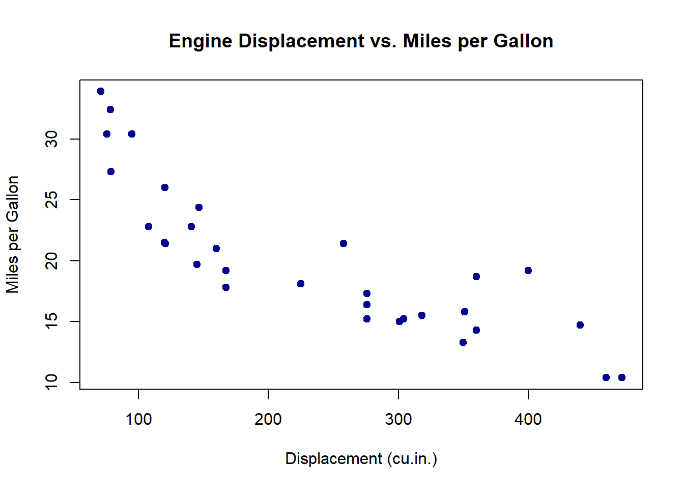
7.8.4 Creating a Scatter Plot
Suppose you wish to explore the relationship between engine displacement and miles per gallon using the mtcars dataset. You can create a scatter plot as follows:
ggplot(data = mtcars, aes(x = disp, y = mpg)) +
  geom_point() +
  labs(
    title = "Engine Displacement vs. Miles Per Gallon",
    x = "Displacement (cu.in.)",
    y = "Miles per Gallon"
  ) +
  theme_minimal()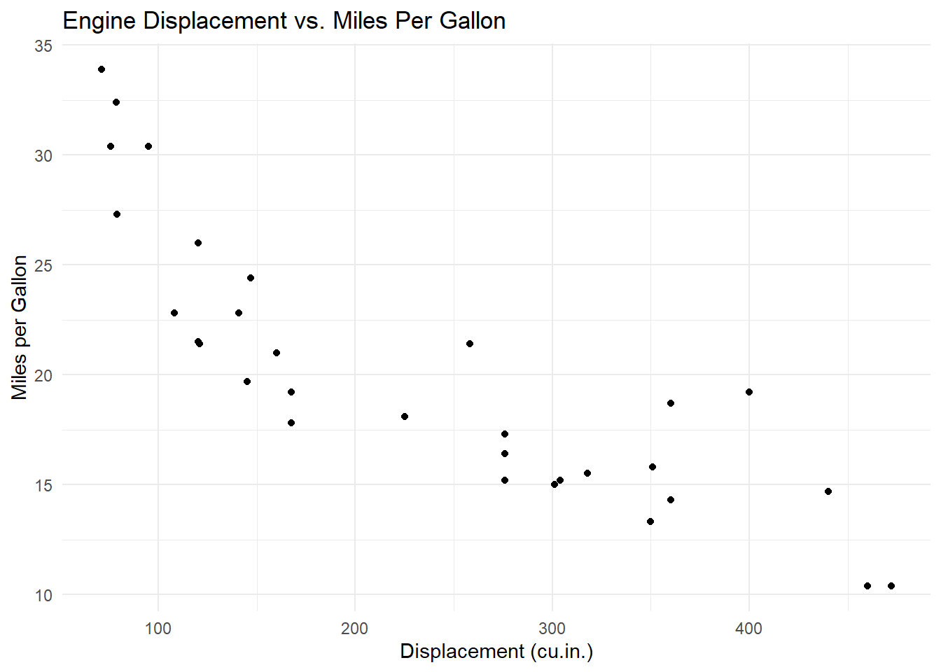
In this example:
Data:
mtcarsAesthetics:
x = disp,y = mpgGeometric Object:
geom_point()adds points to represent each car.Labels:
labs()adds a title and axis labels.Theme:
theme_minimal()provides a clean, minimalist background.
Interpretation
The scatter plot clearly shows an inverse relationship: cars with higher displacement generally have lower fuel efficiency (mpg).
7.8.4.1 Customizing Aesthetics and Geoms
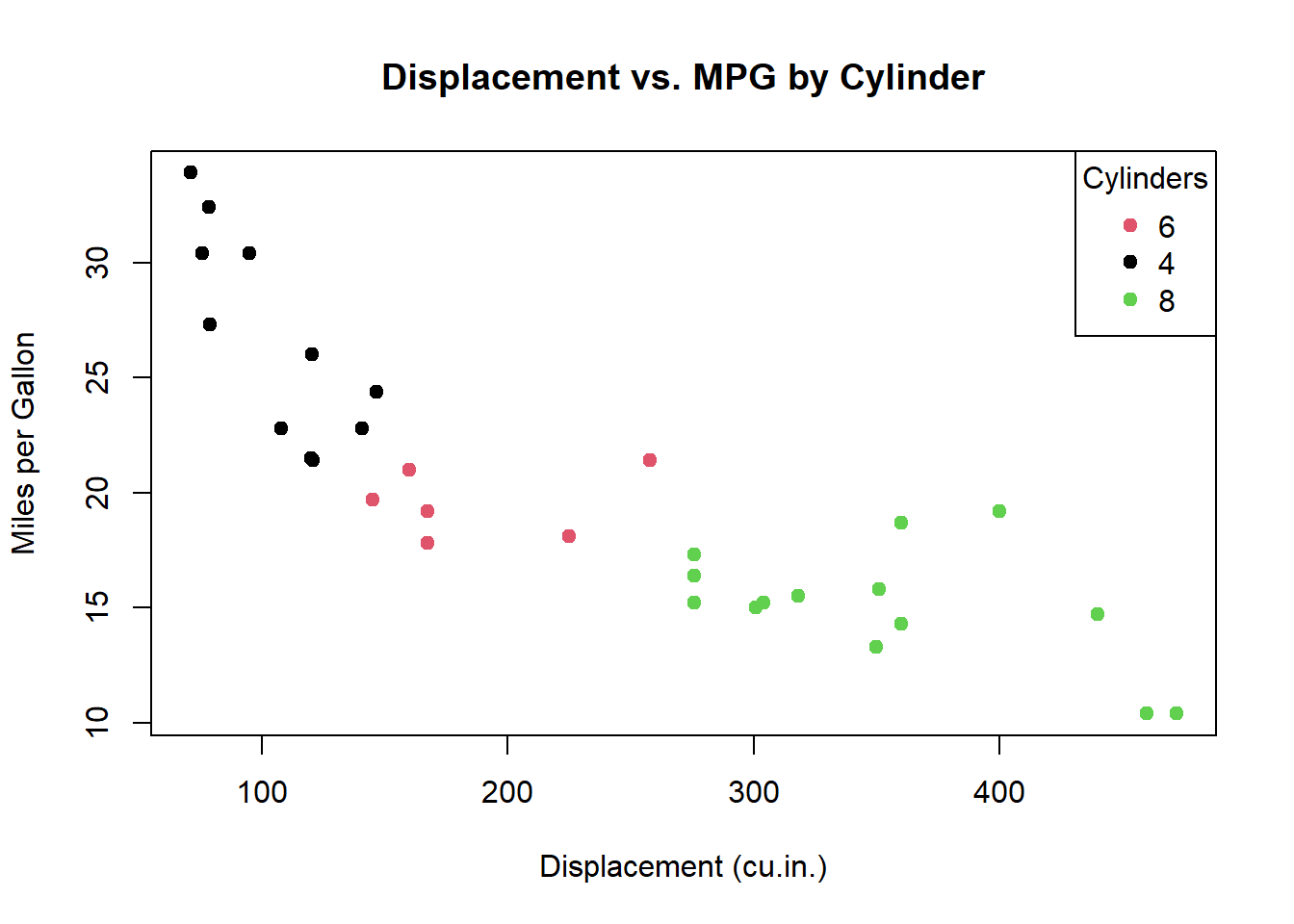
For example, to distinguish between cylinder groups, you can map variable cyl to colour:
ggplot(data = mtcars, aes(x = disp, y = mpg, color = cyl)) +
  geom_point(size = 3) +
  labs(
    title = "Engine Displacement vs. MPG by Cylinder Count",
    x = "Displacement (cu.in.)",
    y = "Miles per Gallon",
    color = "Cylinders"
  ) +
  theme_classic()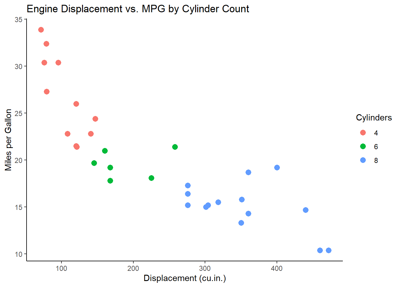
Tip
The color aesthetic maps the number of cylinders (cyl) to different colors, allowing you to distinguish groups within the data.
7.8.4.2 Incorporating Regression Line
To add a regression line to a scatter plot, you can use geom_smooth():
ggplot(data = mtcars, aes(x = disp, y = mpg)) +
  geom_point() +
  geom_smooth(method = "lm", se = FALSE, color = "blue") +
  labs(
    title = "Linear Regression of MPG on Displacement",
    x = "Displacement (cu.in.)",
    y = "Miles per Gallon"
  ) +
  theme_bw()
#> `geom_smooth()` using formula = 'y ~ x'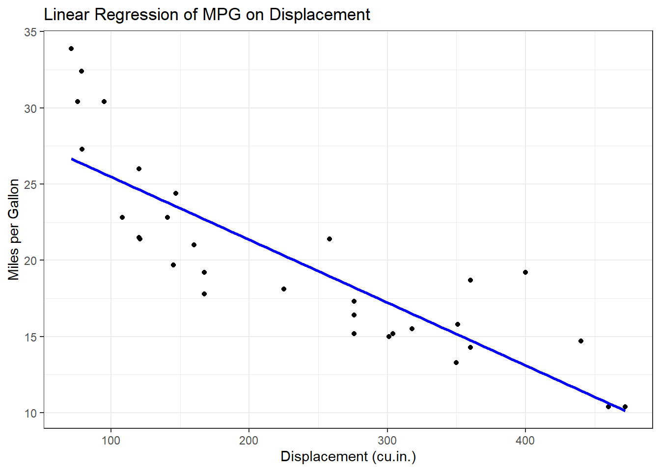
Tip
The geom_smooth() function adds a linear regression line to your scatter plot, offering valuable insight into the overall trend.
7.8.4.3 Faceting for Multi-Panel Plots
Faceting enables you to split data into subsets, displaying each in its own panel. For example, the following code facets the scatter plot by gear:
ggplot(data = mtcars, aes(x = disp, y = mpg)) +
  geom_point() +
  facet_wrap(~gear) +
  labs(
    title = "Engine Displacement vs. MPG Faceted by Gear Count",
    x = "Displacement (cu.in.)",
    y = "Miles per Gallon"
  ) +
  theme_light()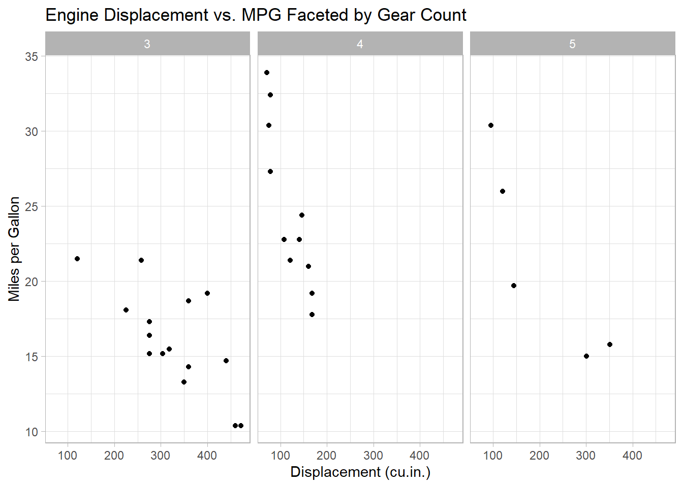
Tip
This code creates a scatter plot for each unique value of gear, allowing for easy comparison across groups.
7.8.5 Creating Boxplots
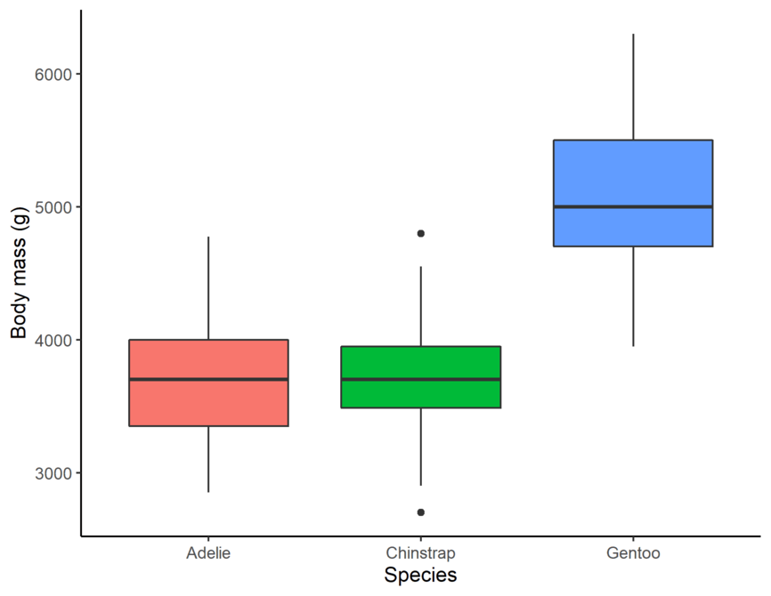
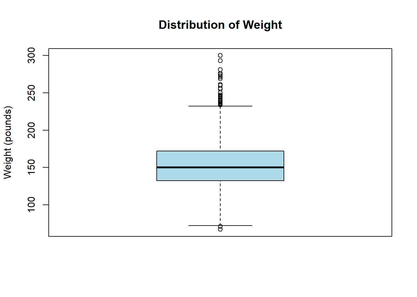
Suppose you wish to examine the distribution of weight in the heart dataset using a boxplot. You can create it as follows:
# Boxplot of a single continuous variable
heart |>
  ggplot(aes(x = "", y = weight)) +
  geom_boxplot(fill = "lightblue", width = 0.3) +
  labs(
    title = "Distribution of Weight",
    x = NULL,
    y = "Weight (pounds)"
  ) +
  theme_minimal()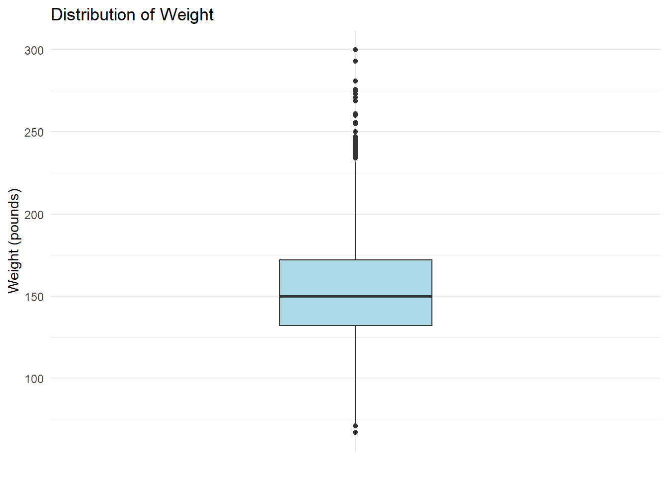
In this example::
Data:
heartdataset.Aesthetic:
y = weightdefines the continuous variable.Geometric Object:
geom_boxplot()draws a boxplot showing the median, quartiles, and outliers.Labels:
labs()adds a title and y-axis label.Theme:
theme_minimal()simplifies the background for readability.
Interpretation
The majority of participants weigh between approximately 130 and 190 lbs, with a median weight near 160 lbs. Multiple outliers above 220 lbs indicate a right-skewed distribution, suggesting that a subset of participants weighs substantially more than the central range.
You can also use a grouped boxplot to compare weight across different blood pressure statuses:
# Boxplot of a continuous variable grouped by a categorical variable
heart |>
  ggplot(aes(x = bp_status, y = weight, fill = bp_status)) +
  geom_boxplot(show.legend = FALSE) +
  labs(
    title = "Distribution of Weight by Blood Pressure Status",
    x = "Blood Pressure Status",
    y = "Weight (pounds)"
  ) +
  theme_bw()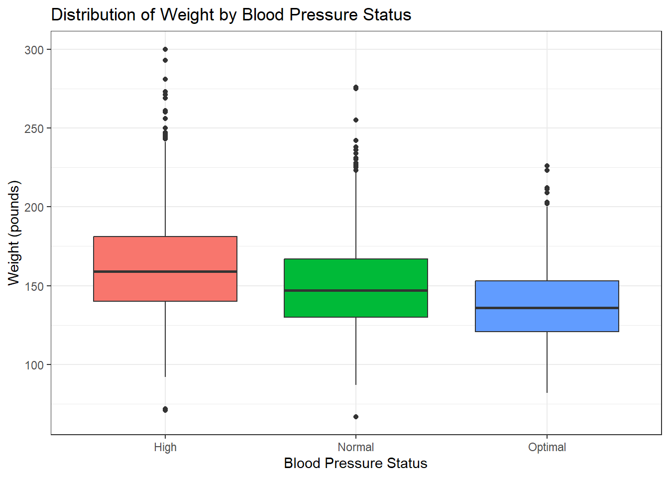
In this example:
Data:
heartdataset.-
Aesthetics:
x = bp_status: Categorical grouping variable.y = weight: Continuous variable to analyze.fill = bp_status: Colours boxes by blood pressure status.
Geometric Object:
geom_boxplot()creates separate boxplots for each species.Labels:
labs()clarifies the title and axes.
Interpretation
Based on the box plot, weight varies within each blood pressure status (High, Normal, Optimal), as shown by the spread of each box and whiskers; however, the location of these distributions are different, visually suggesting weight is not the same across all blood pressure statuses, with ‘High’ status tending towards higher weights and ‘Optimal’ status towards lower weights.
Note
Consider using geom_violin() instead of geom_boxplot() when you wish to display the full distribution of the data.
heart |>
  ggplot(aes(x = bp_status, y = weight, fill = bp_status)) +
  geom_violin(show.legend = FALSE) +
  labs(
    title = "Distribution of Weight by Blood Pressure Status",
    x = "Blood Pressure Status",
    y = "Weight (pounds)"
  ) +
  theme_bw()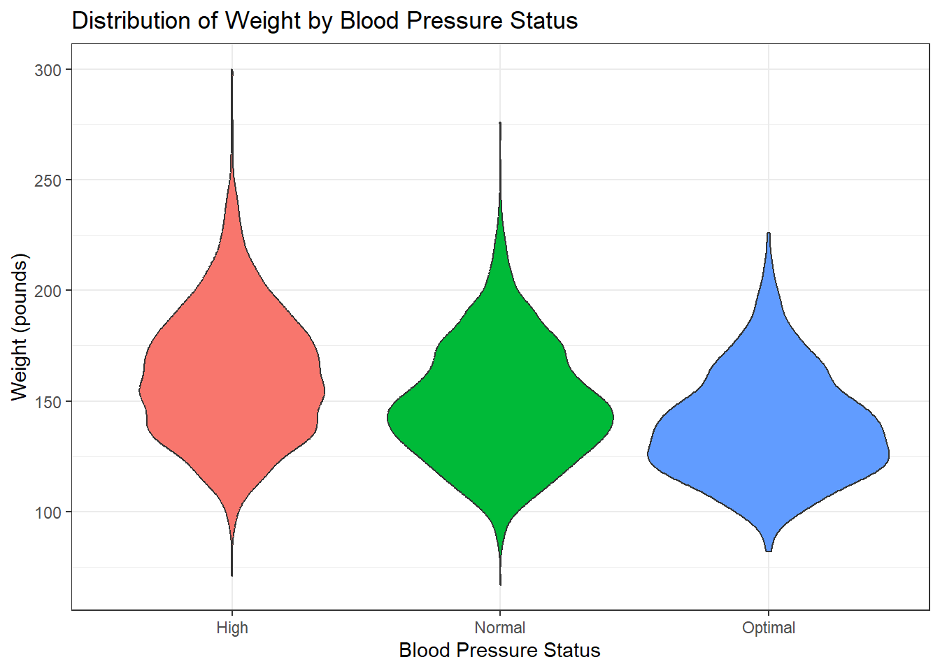
Violin plots not only summarise the quartiles and median but also reveal the density of the data, highlighting features such as multimodality or skewness, which can offer deeper insights into the underlying distribution.
7.8.6 Creating a Histogram
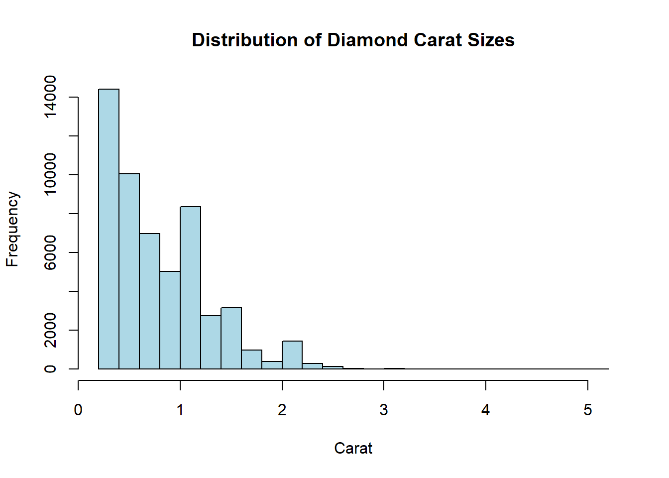
Suppose you want to plot the distribution of diamond carat sizes in the diamond dataset:
# Create a histogram of carat values
diamonds |>
  ggplot(aes(x = carat)) +
  geom_histogram(
    fill = "lightblue",
    color = "darkblue"
  ) +
  labs(
    title = "Distribution of Diamond Carat Sizes",
    x = "Weight of the diamond",
    y = "Count"
  ) +
  theme_minimal()
In this example:
Data:
diamondsdataset.Aesthetic:
x = caratmaps the continuous carat values to the x-axis.-
Geometric Object:
geom_histogram()bins the data and plots frequencies.fillandcolorcustomise bar appearance.
Labels:
labs()adds a title and axis labels.Theme:
theme_minimal()simplifies the background.
Interpretation
The histogram reveals a right-skewed distribution, indicating that smaller carat sizes (e.g., 0.2–1.0) are more common, while larger diamonds (e.g., >2.0 carats) are rare. Peaks around common sizes (e.g., 0.3, 0.7 carats) reflect market preferences or production trends.
Note
Adjust binwidth to balance detail and clarity. For example:
geom_histogram(
    binwidth = 0.1,
    fill = "lightblue",
    color = "darkblue"
  )
7.8.7 Creating Frequency Polygons
Frequency polygons are ideal for overlaying multiple distributions. For example, to compare diamond price distributions by cut:
diamonds |>
  ggplot(aes(x = price, colour = cut)) +
  geom_freqpoly(binwidth = 500) +
  labs(
    title = "Price Distribution by Diamond Cut",
    x = "Price (USD)",
    y = "Count",
    colour = "Diamond Cut"
  ) +
  theme_minimal()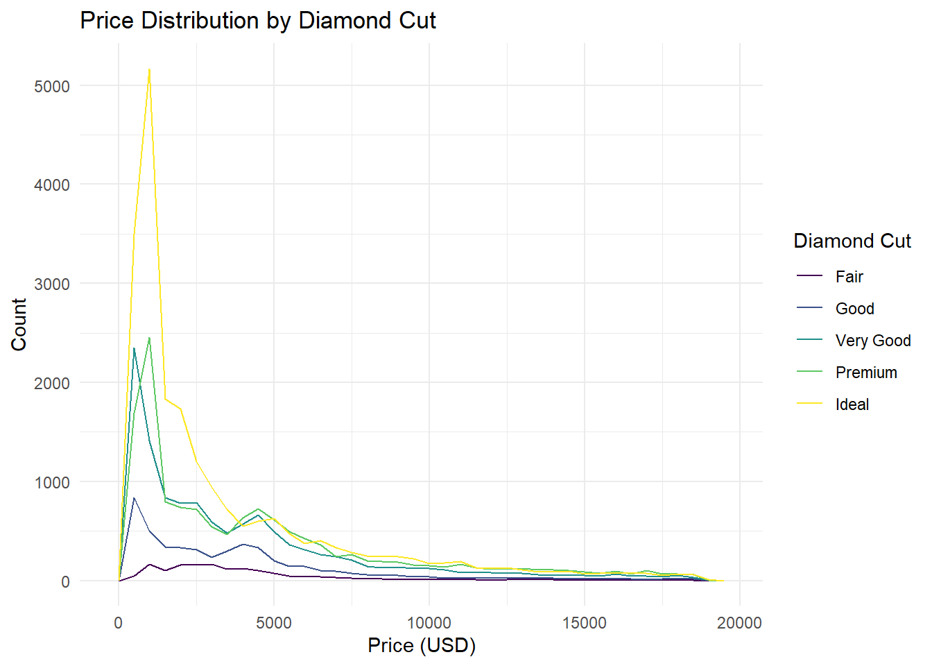
In this example::
Data:
diamondsdataset.-
Aesthetics:
x = price: Maps price to the x-axis.colour = cut: Colours lines by diamond cut (Fair, Good, etc.).
-
Geometric Object:
-
geom_freqpoly(binwidth = 500)creates smoothed frequency lines.
-
Labels:
labs()clarifies axes and legend.
Interpretation
The frequency polygon highlights:
Price trends: Higher cuts (e.g., Ideal, Premium) dominate mid-to-high price ranges.
Overlap: Lower-quality cuts (Fair, Good) cluster in lower price brackets.
Granularity:
binwidth = 500balances noise and trend visibility.
Note
Use frequency polygons instead of stacked histograms when comparing subgroups—overlaid lines reduce visual clutter and improve comparability.
7.8.8 Creating Bar Charts
There are two primary geoms for creating bar charts in ggplot2: geom_bar() and geom_col().
7.8.8.1 Bar Charts with Observation Counts
To create a bar chart where each bar represents the count of observations in a category, use the geom_bar() function. It automatically counts observations in each category and scales the bar heights accordingly. For example, to visualise the distribution of carburetor counts in the mtcars dataset:
mtcars |>
  ggplot(aes(x = carb, fill = carb)) +
  geom_bar() +
  labs(
    title = "Number of Cars by Carburetor Count",
    x = "Number of Carburetors",
    y = "Number of Cars"
  ) +
  theme_minimal()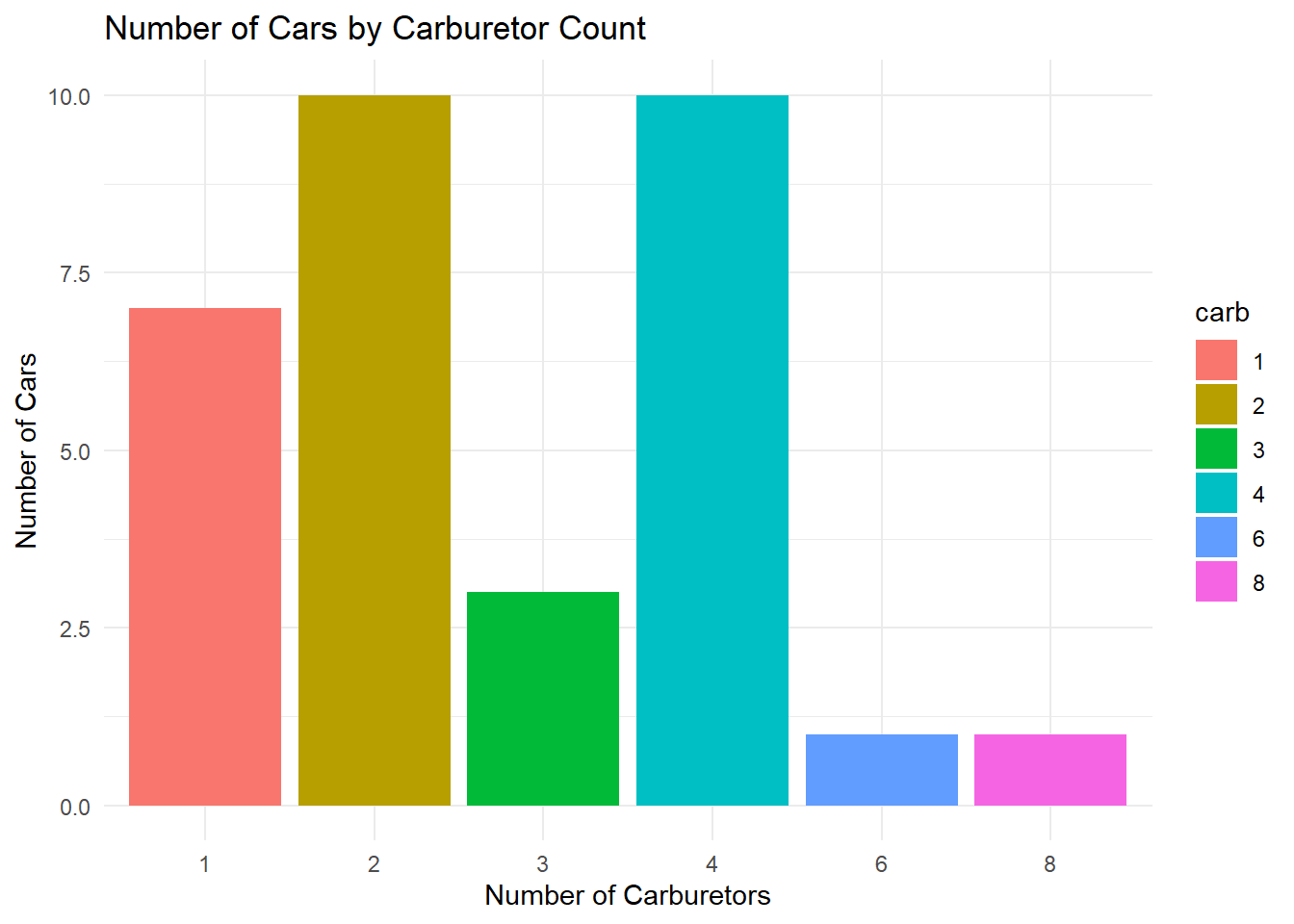
In this example::
Data: The
mtcarsdataset.Aesthetics:
x = carbdefines categories;fill = carbcolors bars by carburetor count.Geometric Object:
geom_bar()generates bars with heights proportional to counts.show.legend = FALSEremoves redundant legend.Labels:
labs()adds descriptive titles and axis labels.Theme:
theme_minimal()simplifies the background for readability.
7.8.8.2 Stacked and Clustered Bar Charts
Stacked bar charts are useful for showing subgroup distributions. For example, to visualise engine type (vs) distribution across cylinder counts (cyl):
mtcars |> ggplot(aes(x = cyl, fill = vs)) +
  geom_bar() +
  labs(
    title = "Engine Type Distribution by Cylinder Count",
    x = "Number of Cylinders",
    y = "Count of Cars",
    fill = "Engine Type"
  ) +
  scale_fill_discrete(labels = c("V-shaped", "Straight"))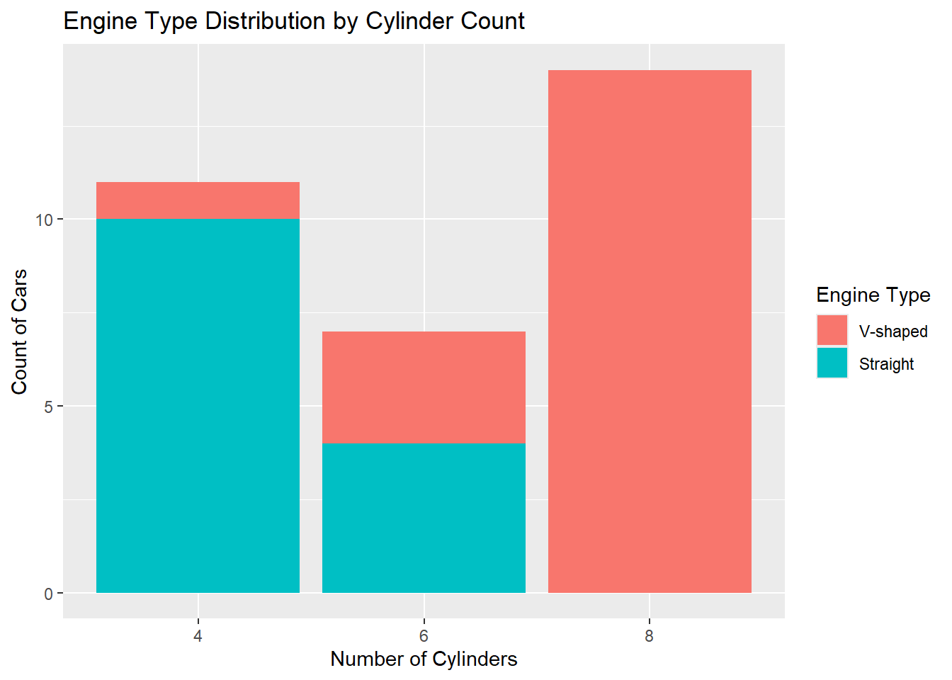
In this example::
Stacking:
geom_bar()automatically stacks subgroups when afillaesthetic is mapped (here,vs).Labels:
scale_fill_discrete()clarifies the engine types (“V-shaped” for0, “Straight” for1).
Tip
Clustered bar charts enable direct comparison of subgroups across categories by placing bars side-by-side. For example, to visualise engine type (vs) distributions across cylinder counts (cyl) with grouped bars:
mtcars |> ggplot(aes(x = cyl, fill = vs)) +
  geom_bar(position = position_dodge(preserve = "single")) +
  labs(
    title = "Engine Type Distribution by Cylinder Count (Clustered)",
    x = "Number of Cylinders",
    y = "Count of Cars",
    fill = "Engine Type"
  ) +
  scale_fill_discrete(labels = c("V-shaped", "Straight"))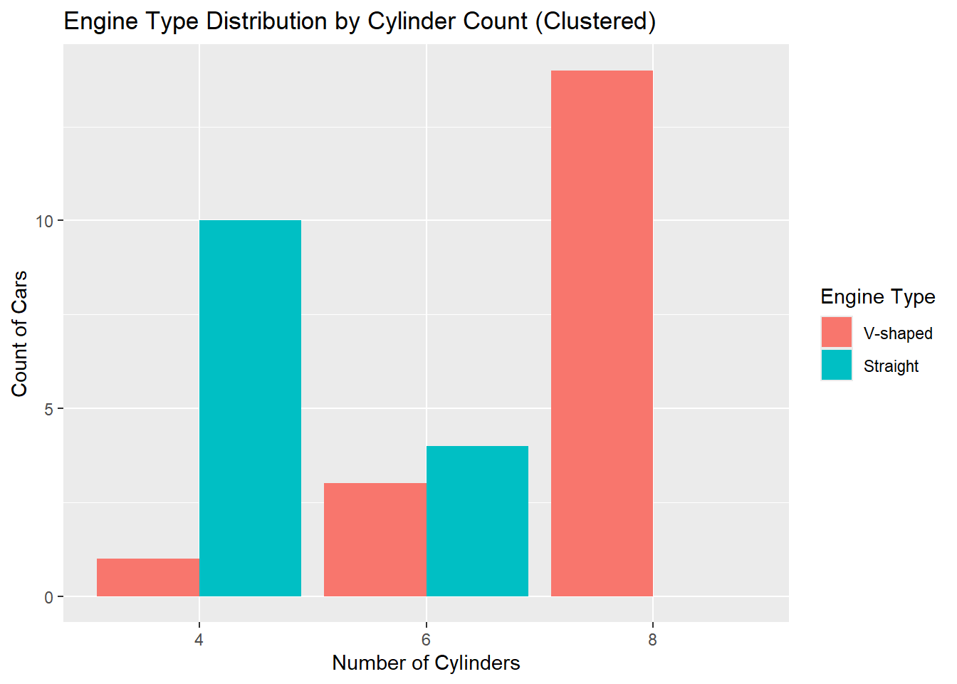
In this example::
Data:
mtcarsdataset.Aesthetics:
x = cyldefines cylinder groups;fill = vscolours bars by engine type.-
Geometric Object:
geom_bar(position = position_dodge(...))groups bars side-by-side instead of stacking.-
preserve = "single"ensures consistent bar widths even if some subgroups are missing.
-
Labels:
scale_fill_discrete()clarifies engine type labels.
Note
Clustered bars make it easier to directly compare V-shaped vs. straight engines within each cylinder group.
7.8.8.3 Bar Charts with Precomputed Values
When the bar heights represent explicit values in your dataset (rather than counts of observations), use geom_col(). This function requires both x and y aesthetics, where y corresponds to precomputed values (e.g., sums, averages, or other aggregated metrics). For example, to visualise the total carat weight of diamonds grouped by cut quality:
diamonds |>
  ggplot(aes(x = cut, y = carat, fill = cut)) +
  geom_col() +
  labs(
    x = "Quality of the Cut",
    y = "Total Carat Weight"
  ) +
  theme_bw()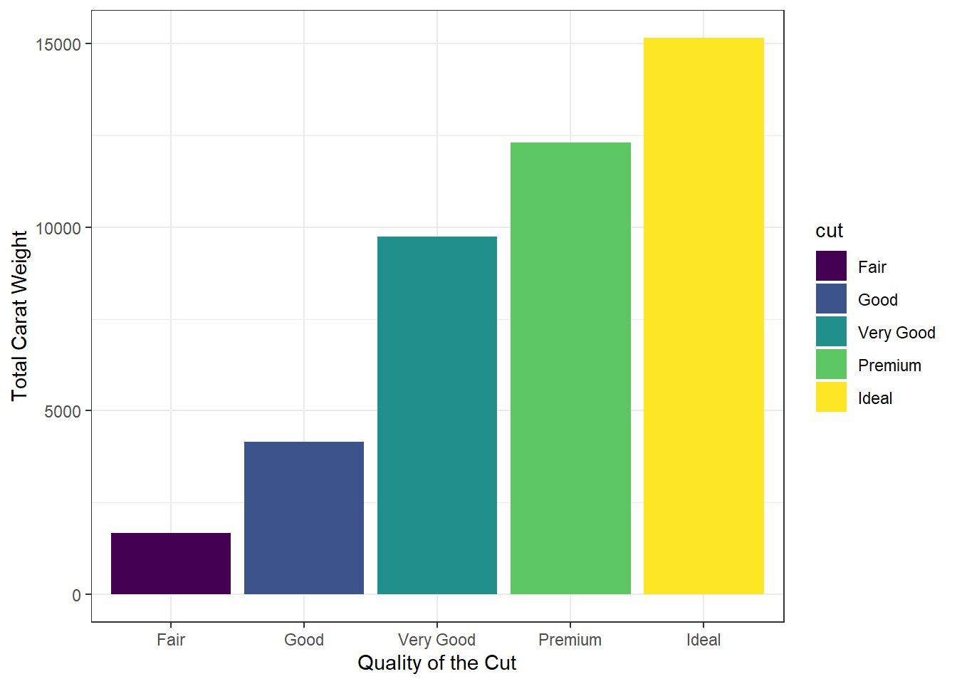
In this example::
Data:
diamondsdataset (requires aggregation ifcaratis not pre-summarised).-
Aesthetics:
x = cut: Categorises bars by diamond cut quality.y = carat: Uses raw carat values (summed automatically per group).fill = carat
Geometric Object:
geom_col()plots bars with heights proportional toy.Labels:
labs()clarifies axis titles.
Interpretation:
This chart shows the total carat weight of diamonds per cut. For example, “Ideal” cuts have a higher total carat weight because they are more prevalent in the dataset.
Data preparation
geom_col() assumes y values are precomputed. To plot group means, summarise data first:
# Precompute total carat weight for each cut
diamonds_summary <- diamonds |>
  group_by(cut) |>
  summarise(mean_carat = mean(carat))

# Create the bar chart with labels
diamonds_summary |>
  ggplot(aes(x = cut, y = mean_carat, fill = cut)) +
  geom_col(show.legend = FALSE) + # Remove legend
  labs(
    title = "Average Carat Weight by Diamond Cut",
    x = "Quality of the Cut",
    y = "Average Carat Weight"
  ) +
  theme_bw()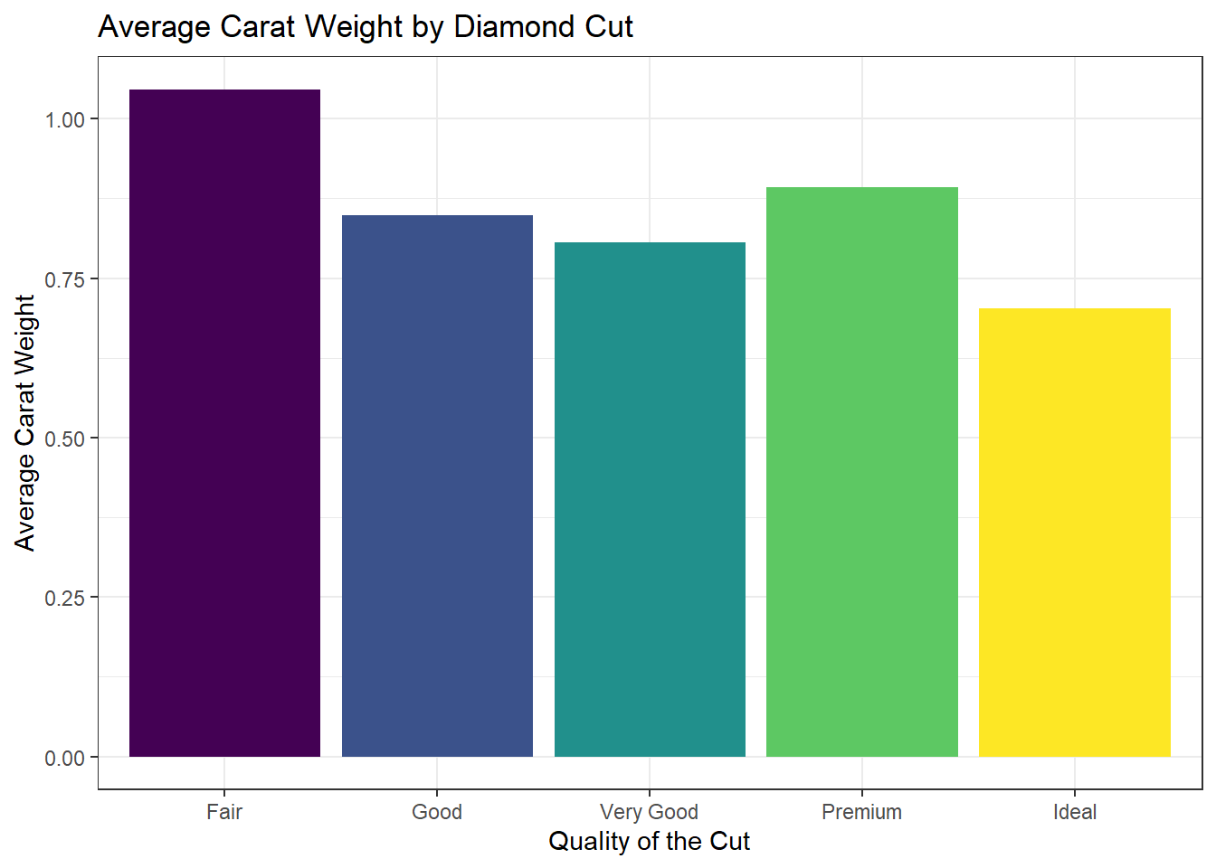
For grouped comparisons with precomputed values, for example, comparing diamond carat weights across cuts and subdividing by diamond colour:
diamonds |>
  ggplot(aes(x = cut, y = carat, fill = color)) +
  geom_col(position = position_dodge()) +
  labs(
    x = "Quality of the Cut",
    y = "Total Carat Weight",
    fill = "Diamond Colour"
  ) +
  theme_bw()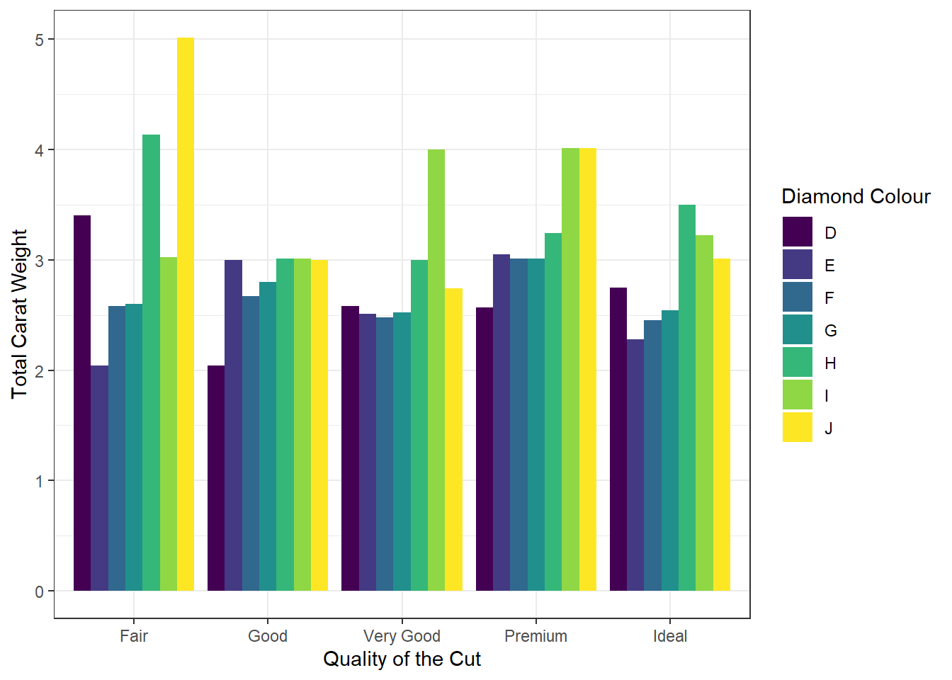
In this example::
-
Aesthetics:
-
fill = color: Subdivides bars by diamond colour (D–J).
-
-
Positioning:
-
position_dodge()places bars side-by-side for direct subgroup comparison.
-
Interpretation:
The clustered bars reveal that carat weight distribution varies across diamond colour grades (D–J) within each cut category. Higher-quality cuts such as “Ideal” and “Premium” correlate with lighter colour grades (D–F), which contribute disproportionately to total carat weight, while lower-quality cuts (“Fair”, “Good”) show a broader representation across mid-range colours (G–J).
7.8.8.4 Bar Charts for Data Presented in a Table
Imagine you are a data analyst for a retail company that accepts multiple payment methods. The following Table 7.1 shows the average transaction amount for each payment type:
| Payment Type | Average Transaction |
|---|---|
| Check | 46.861 |
| Credit Card | 36.681 |
| Debit Card | 28.860 |
| Digital Wallet | 18.900 |
| Cash | 4.802 |
To visualise this, you can create a column plot with geom_col():
# Create a data frame with the payment data
payment_data <- data.frame(
  payment_type = c("Check", "Credit Card", "Debit Card", "Digital Wallet", "Cash"),
  avg_transaction = c(46.861, 36.681, 28.860, 18.900, 4.802)
)

payment_data |>
  ggplot(aes(x = payment_type, y = avg_transaction, fill = payment_type)) +
  geom_col(show.legend = FALSE) + # Remove legend
  geom_text(
    aes(label = avg_transaction), # Add bar labels
    vjust = -0.5, # Position labels above bars
    colour = "black"
  ) +
  labs(
    title = "Average Transaction Amount by Payment Type",
    x = "Payment Type",
    y = "Average Transaction Amount ($)"
  ) +
  theme_minimal()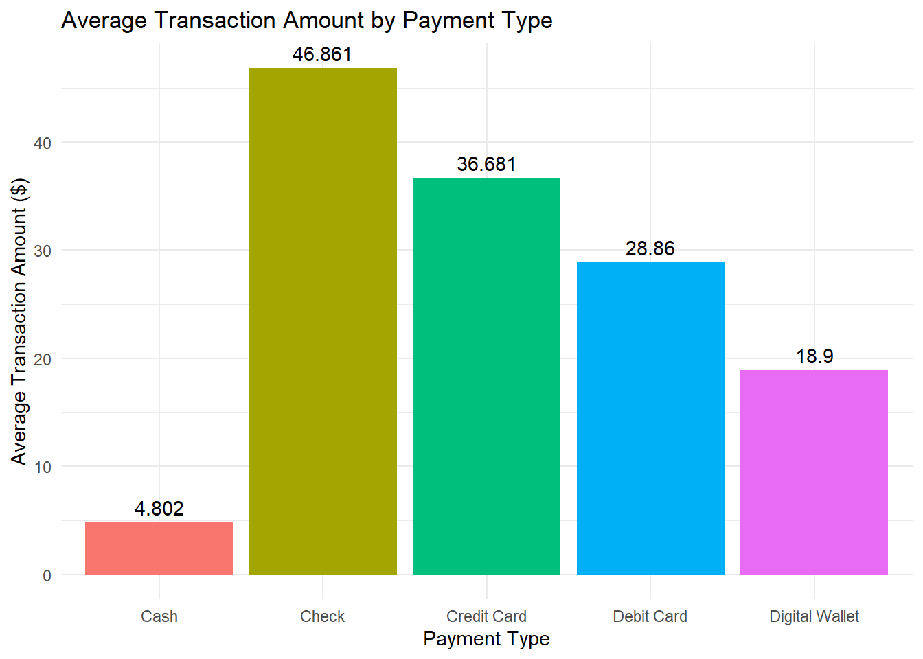
In this example::
Data: A custom data frame (
payment_data) containing payment types and their corresponding average transaction amounts.-
Aesthetics:
x = payment_type: Categorises bars by payment method.y = avg_transaction: Uses precomputed average transaction values.fill = payment_type: Fills bars with different colours for each payment method.
Geometric Object:
geom_col()plots bars with heights proportional to the provided average transaction values.-
Bar Labels:
geom_text(aes(label = avg_transaction)): Adds average transaction values above each bar.vjust = -0.5: Positions labels slightly above the bars.colour = "black": Ensures labels are visible against the bars.
Labels:
labs()provides a descriptive title and axis labels.
Interpretation
This chart clearly shows that customers using checks have the highest average transaction amount, while cash transactions are the lowest—offering valuable insight into customer spending habits.
Tip
Additional customisation options include adjusting label positioning with vjust or manually setting bar colours using scale_fill_manual(). For example:
Adjust
vjustto fine-tune label positioning (e.g.,vjust = 1.5for labels inside bars).Use
scale_fill_manual()to assign specific colours to bars. For example:
payment_data |>
  ggplot(aes(x = payment_type, y = avg_transaction, fill = payment_type)) +
  geom_col(show.legend = FALSE) +
  geom_text(
    aes(label = avg_transaction),
    vjust = -0.5,
    colour = "black"
  ) +
  labs(
    title = "Average Transaction Amount by Payment Type",
    x = "Payment Type",
    y = "Average Transaction Amount ($)"
  ) +
  # Assign custom colours for each payment type
  scale_fill_manual(values = c(
    "Check" = "#E69F00",
    "Credit Card" = "#56B4E9",
    "Debit Card" = "#009E73",
    "Digital Wallet" = "#F0E442",
    "Cash" = "#0072B2"
  )) +
  theme_minimal()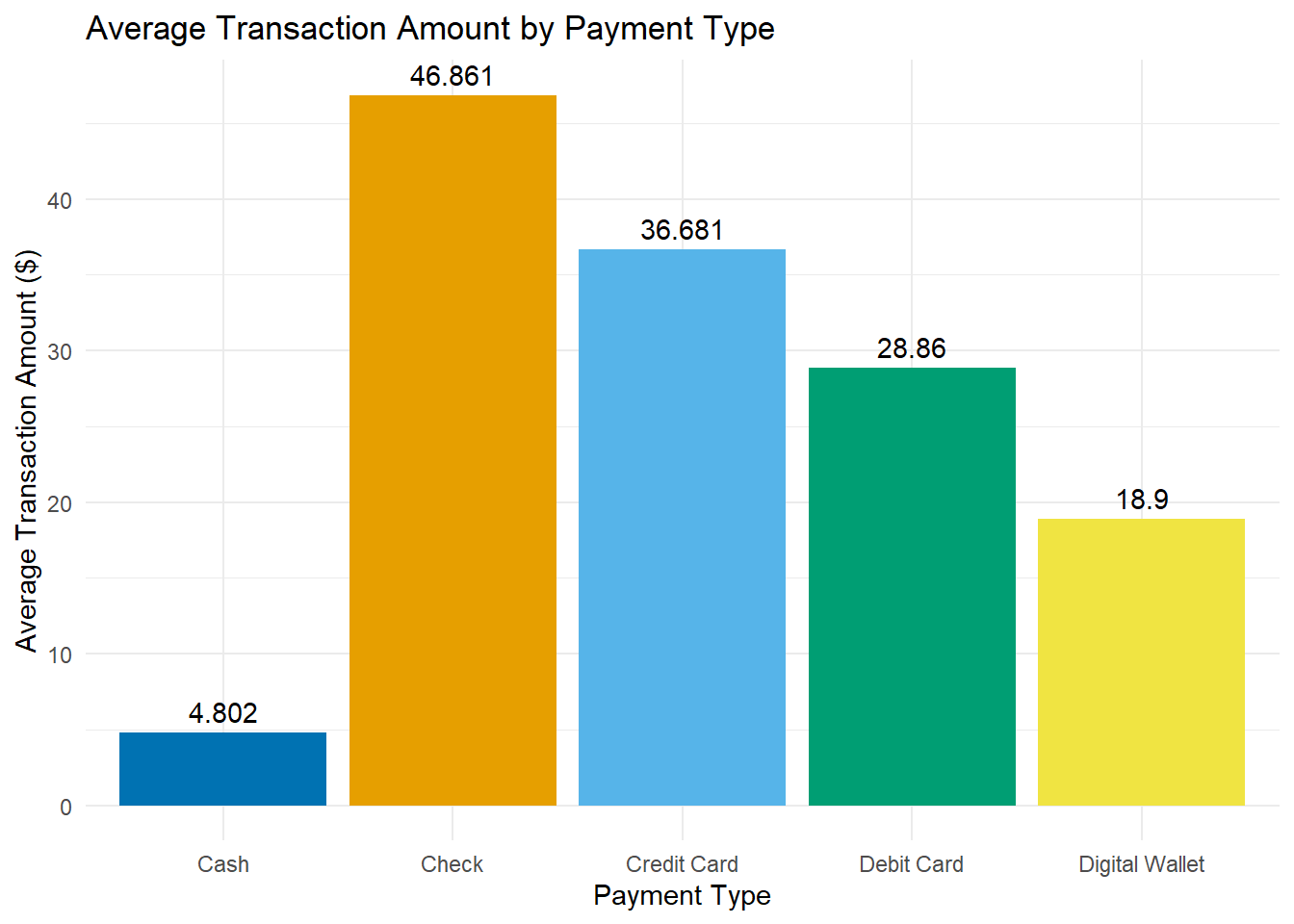
7.8.8.5 Faceting for Multi-Panel Plots
Faceting enables you to split data into subsets, displaying each in its own panel. For example, the following code facets the barchat plot by gender in the heart data:
avg_age_death_by_smoking_sex <- heart |>
  filter(!is.na(smoking_status)) |>
  group_by(smoking_status, sex) |>
  summarise(avg_age_at_death = mean(age_at_death, na.rm = TRUE))
#> `summarise()` has grouped output by 'smoking_status'. You can override using
#> the `.groups` argument.avg_age_death_by_smoking_sex |> ggplot(aes(x = avg_age_at_death, y = smoking_status, fill = smoking_status)) +
geom_col(show.legend = FALSE) +
facet_wrap(~sex) +
labs(
title = "Smoking, Gender, and Lifespan: Comparing Average Age at Death",
x = "Age at Death",
y = "Smoking Status",
caption = "Data from Framingham Heart Study",
) +
theme_light()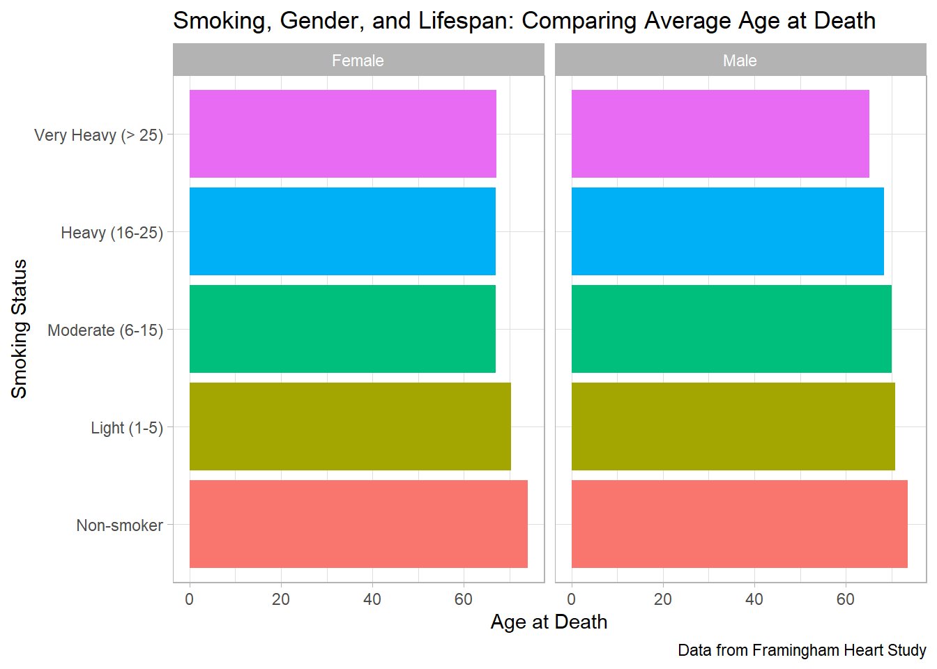
Tip
This code creates a scatter plot for each unique value of gear, allowing for easy comparison across groups.
To summarise, the key differences between geom_bar() and geom_col() are illustrated in the following Table 7.2:
geom_bar() vs. geom_col()
| Function | Use Case | Aesthetics Required |
|---|---|---|
geom_bar() |
Count observations per category |
x only |
geom_col() |
Plot precomputed values per category |
x and y
|
7.8.9 Creating a Line Chart
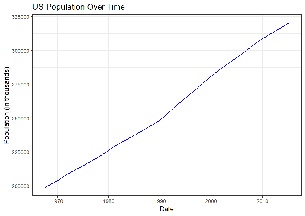
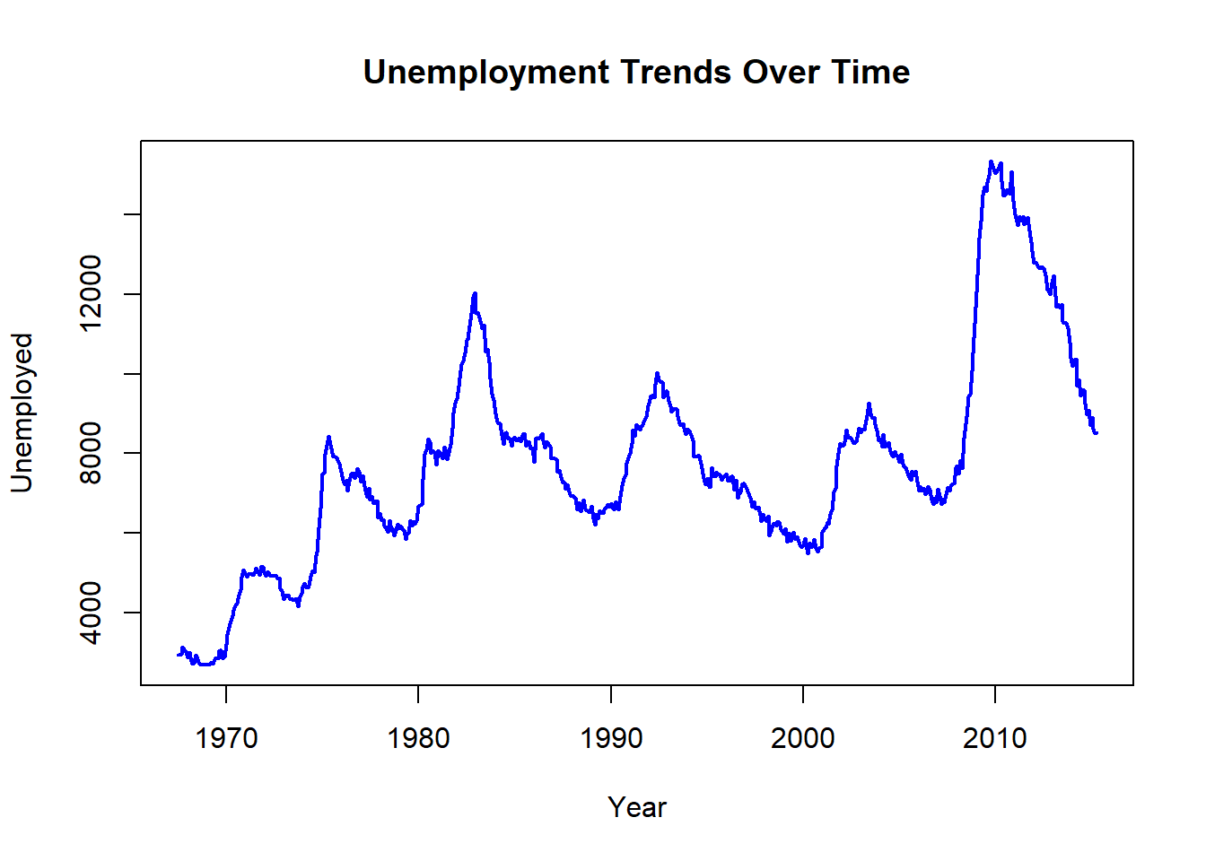
Using the economics dataset, we can plot unemployment trends:
economics |>
  ggplot(aes(x = date, y = unemploy)) +
  geom_line(color = "blue") +
  labs(
    title = "Unemployment Trends Over Time",
    x = "Date",
    y = "Number of Unemployed Individuals"
  ) +
  theme_bw()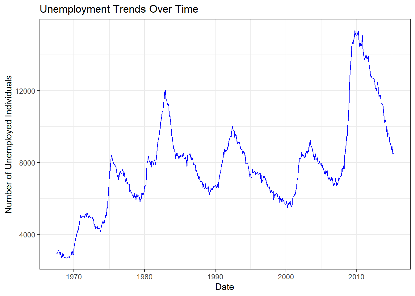
In this example:
Data: US economic time series data.
-
Aesthetics:
x = date: Maps time to the x-axis.y = unemploy: Maps unemployment counts to the y-axis. -
Geometric Object:
geom_area()fills the area under the line, emphasising cumulative magnitude.fill = "lightblue"sets the area colour.
Labels:
labs()adds a title and axis labels.Theme:
theme_bw()applies a black-and-white theme for a clear, classic look.
Tip
This line chart displays the trend in unemployment over time, allowing us to observe how the number of unemployed individuals changes across different periods.
7.8.10 Creating an Area Chart
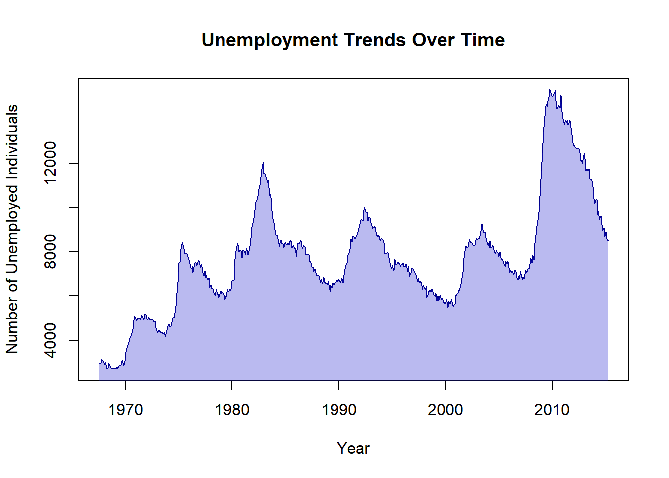
Using the same economics data, create an area plot using the geom_area() function to display the number of unemployed individuals over time.
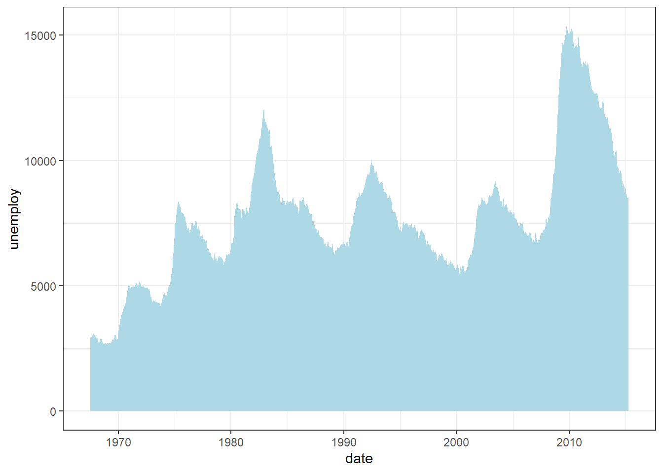
In this example:
Data:
economicsdataset (US economic time series)Aesthetics:
x = date: Maps time to the x-axis.y = unemploy: Maps unemployment counts to the y-axis.Geometric Object:
geom_area()fills the area under the line, emphasising cumulative magnitude.fill = "lightblue"sets the area colour.Labels: None are explicitly added here, so the default axis labels (
dateandunemploy) will be used.Theme:
theme_bw()applies a clean black-and-white background.
Interpretation
The area chart not only illustrates long-term unemployment trends but also highlights economic cycles—peaks during recessions and troughs during recovery periods.
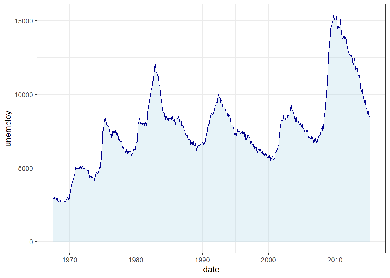
You can further customise the chart by:
Adjusting the
alphaparameter to control area transparency (e.g.,alpha = 0.5for semi-transparency).Overlaying
geom_line()ongeom_area()for dual emphasis:
7.8.11 Saving Your Plots
Once you have created a visually appealing plot with ggplot2, you may wish to save it as an image file for use in reports or presentations. The ggsave() function makes this simple:
diamonds |>
  ggplot(aes(x = cut, y = carat, fill = color)) +
  geom_col(position = position_dodge()) +
  labs(x = "Quality of the cut", y = "Weight of the diamond") +
  ggthemes::theme_economist()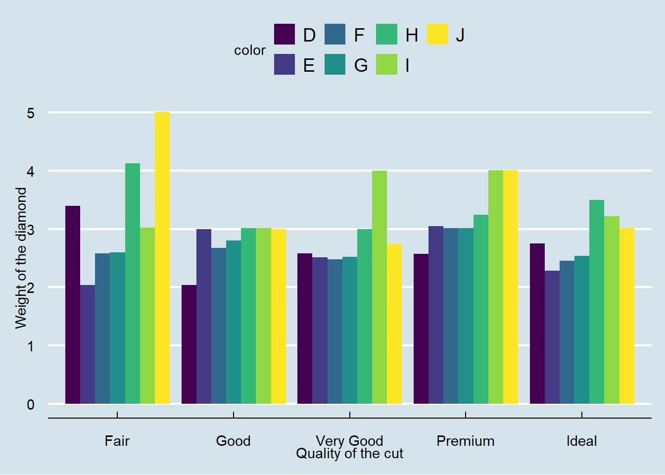
ggsave(filename = "diamonds-plot.png")
Tip
filename = "diamonds-plot": Specifies the name and format of the output file.By default,
ggsave()saves the most most recently created plot in your working directory.
Customizing the Output:
For reproducible results and consistent dimensions, always adjust dimensions and resolution to ensure your plot meets publication or presentation standards.
ggsave(
  filename = "diamonds-plot.png",
  width = 8, # Width in inches
  height = 6, # Height in inches
  units = "in", # Units for width and height (can be "in", "cm", or "mm")
  dpi = 300 # Resolution in dots per inch
)
Tip
widthandheight: Set the size of the image.units: Specify the units of measurement.dpi: Controls the resolution; 300 dpi is standard for high-quality images.
The ggsave() function lets you export your plots to formats such as PNG, PDF, or JPEG. For more advanced options, consult the official documentation:
?ggsave7.8.12 Practice Quiz 7.1
Question 1:
Which principle is the foundation of ggplot2’s structured approach to building graphs?
- The Aesthetic Mapping Principle
- The Facet Wrapping Technique
- The Grammar of Graphics
- The Scaling Transformation Theory
Question 2:
In a ggplot2 plot, which of the following best describes the role of aes()?
- It specifies the dataset to be plotted.
- It defines statistical transformations to apply to the data.
- It maps data variables to visual properties, like colour or size.
- It sets the coordinate system for the plot.
Question 3:
If you want to display the distribution of a single continuous variable and identify its modality and skewness, which geom is most appropriate?
Question 4:
When creating a boxplot to show the variation of a continuous variable across multiple categories, what do the “whiskers” typically represent?
- The median value and the mean value.
- The full range of the data, excluding outliers.
- One standard deviation above and below the mean.
- The maximum and minimum values after applying a 1.5 * IQR rule.
Question 5:
You have a dataset with a categorical variable Region and a continuous variable Sales. You want to compare total sales across different regions. Which geom and aesthetic mapping would be most appropriate?
-
geom_bar(aes(x = Region)), which internally counts the occurrences of each region.
-
geom_col(aes(x = Region, y = Sales)), which uses the actualSalesvalues for the bar heights.
-
geom_line(aes(x = Region, y = Sales)), connecting points across regions.
-
geom_area(aes(x = Region, y = Sales)), to show cumulative totals over regions.
Question 6:
If you want to add a smoothing line (e.g., a regression line) to a scatter plot created with geom_point(), which geom should you use and with what parameter to fit a linear model without confidence intervals?
-
geom_smooth(method = "lm", se = FALSE)
-
geom_line(stat = "lm", se = TRUE)
-
geom_line(method = "regress", se = FALSE)
geom_smooth(method = "reg", confint = FALSE)
Question 7:
Consider you have a factor variable cyl representing the number of cylinders in the mtcars dataset. If you want to create multiple plots (small multiples) for each value of cyl, which ggplot2 function can you use?
-
facet_wrap(~ cyl)
-
facet_side(~ cyl)
-
group_by(cyl)followed by multiplegeom_point()calls
geom_facet(cyl)
Question 8:
Which of the following statements about ggsave() is true?
-
ggsave()must be called before creating any plots for it to work correctly.
-
ggsave()saves the last plot displayed, and you can control the output format by specifying the file extension.
-
ggsave()cannot control the width, height, or resolution of the output image.
-
ggsave()only saves plots as PDF files.
Question 9:
What is the purpose of setting group aesthetics in a ggplot, for example in a line plot?
- To change the colour scale of all elements.
- To ensure that discrete categories are grouped together for transformations like smoothing.
- To define which points belong to the same series, enabling lines to connect points within groups instead of mixing data across categories.
- To modify only the legend titles and labels.
Question 10:
When customizing themes, which of the following options is NOT directly controlled by a theme() function in ggplot2?
- Axis text size, angle, and colour.
- Background grid lines and panel background.
- The raw data values in the dataset.
- The plot title alignment and style.
7.8.13 Exercise 7.1.1: Data Analysis and Visualization with Medical Insurance Data
For this exercise, you will use Rstudio Project, call it Experiment 7.1 and medical insurance data. These questions and tasks will give you hands-on experience with the key functionalities of dplyr and ggplot2, reinforcing your learning and understanding of both data manipulation and visualization in R.
1. Data Manipulation using dplyr:
Locate the
medical_insurance.xlsxfile in ther-datadirectory. If you don’t already have the file, you can download it from Google Drive.Import the data into R.
How many individuals have purchased medical insurance? Use
dplyrto filter and count.What is the average estimated salary for males and females? Use
group_by()andsummarise().How many individuals in the age group 20-30 have not purchased medical insurance? Use
filter().Which age group has the highest number of non-purchasers? Use
group_by()andsummarise().For each gender, find the mean, median, and maximum estimated salary. Use
group_by(),summariseand appropriate statistical functions.
2. Data Visualization using ggplot2:
Create a histogram of the ages of the individuals. Use
geom_histogram().Plot a bar chart that shows the number of purchasers and non-purchasers. Use
geom_bar().Create a boxplot to visualize the distribution of estimated salaries for males and females. Use
geom_boxplot().Generate a scatter plot of age versus estimated salary. Color the points by their “Purchased” status. This will give insights into the relationship between age, salary, and the decision to purchase insurance. Use
geom_point().Overlay a density plot on the scatter plot created in (d) to better understand the concentration of data points. Use
geom_density_2d().
3. Combining dplyr and ggplot2:
Filter the data to only include those who haven’t purchased insurance and then create a histogram of their ages.
Group the data by gender and then plot the average estimated salary for each gender using a bar chart.
For each age, calculate the percentage of individuals who have purchased insurance and then plot this as a line graph against age.
7.8.14 Exercise 7.1.2: Reproducing the Smoking, Gender, and Lifespan Chart
In this exercise you will use the heart dataset from the Framingham Heart Study (located in the r-data directory) to replicate a chart that compares the average age at death by smoking status for both males and females.
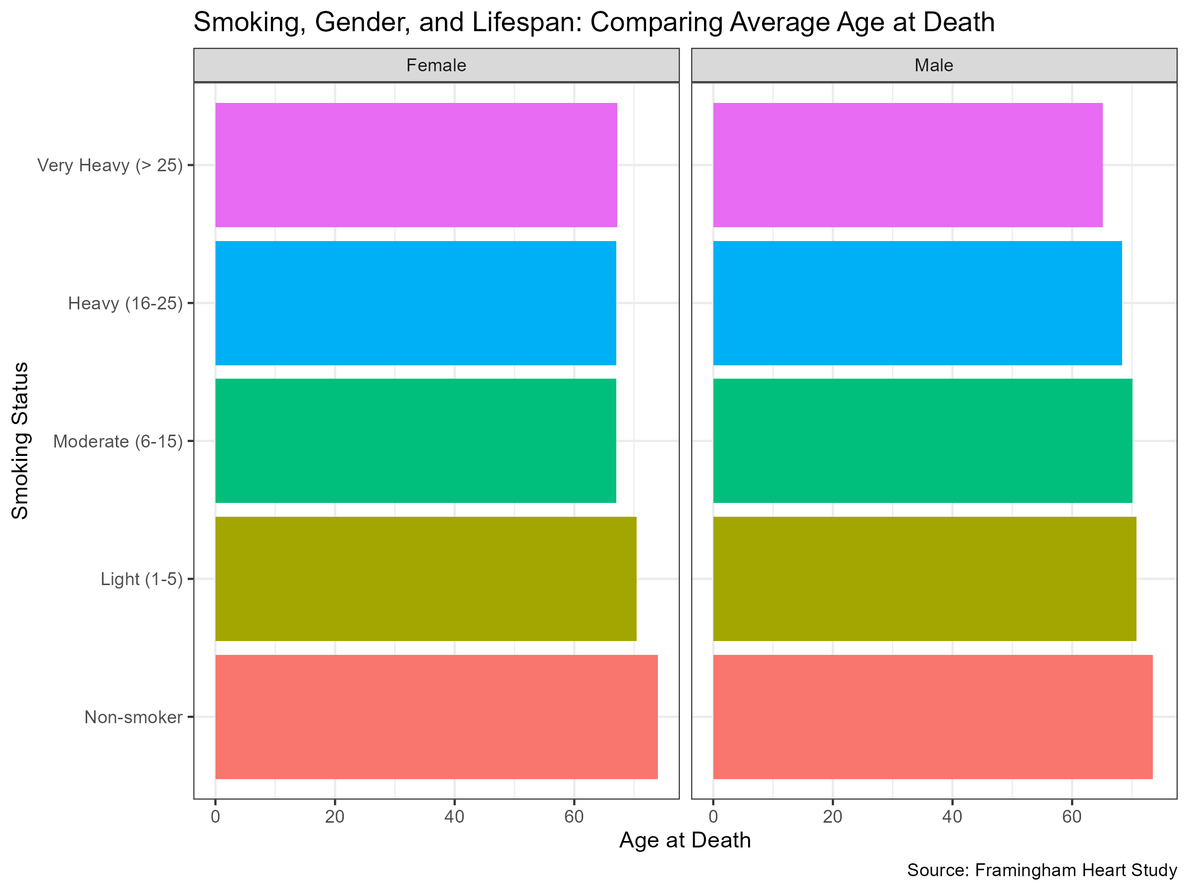
The example chart is a horizontal bar chart, divided into two panels—one for each sex. In each panel, individuals are grouped by their smoking intensity, which is classified into the following categories: Non-smoker, Light (1–5), Moderate (6–15), Heavy (16–25), and Very Heavy (>25). The x-axis shows the average age at death, and the data source is the Framingham Heart Study.
1. Data Description
The
heartdataset contains cardiovascular health data from the Framingham Heart Study, including variables such assex,age_at_death, andsmoking_status.The smoking status is classified into the following categories: Non-smoker, Light (1–5), Moderate (6–15), Heavy (16–25), and Very Heavy (>25).
Note that some variables (for example,
smoking_status) may contain missing values.
2. Objective
Filter the dataset to remove any rows with a missing
smoking_status.Group the data by
smoking_statusandsex.Calculate the mean
age_at_deathfor each group.-
Visualise the results using ggplot2 by creating a bar chart that:
- Displays the average age at death on the x-axis.
- Shows the smoking status on the y-axis.
- Uses faceting to create separate panels for females and males.
- Utilises colour/fill to differentiate between the smoking categories.
- Includes a clear title and appropriate labels for both axes.
3. Deliverables
Provide a brief description of your approach (no code is required here, just an explanation of your rationale).
Produce a bar chart that closely replicates the example above, and save it as an image file (PNG or PDF).
Write a short summary of what the chart reveals about the relationship between smoking status, sex, and average age at death.
Tip
To complete this exercise, you will need to use both dplyr (for data manipulation) and ggplot2 (for visualisation). Focus on computing the mean of age_at_death for each group defined by smoking_status and sex.
Good luck, and enjoy exploring the data!
7.9 Experiment 7.2: Data Visualisation Using Base R Graphics
Data visualisation using Base R graphics offers a built-in, efficient approach that requires no additional packages. Although ggplot2 offers extensive flexibility and elegance, Base R graphics remain indispensable for quick and exploratory analyses, especially when producing simple or preliminary plots.
Base R uses a function-based approach that gives you direct control over graphical elements. Unlike ggplot2’s layered grammar, each plot type in Base R is created with a dedicated function, making it ideal for rapid exploratory analysis or for producing simple static plots.
7.9.1 Advantages of Using Base R
Let us explore the key benefits that make Base R a practical choice for data analysis in R:
No Dependencies: Base R plotting functions are part of the core R installation, so there is no need for additional packages.
Quick and Simple: These functions are ideal for exploratory data analysis or when a fast visualisation is required.
Full Control: You have direct access to low-level graphical parameters, allowing for highly customised plots.
7.9.2 Core Plotting Functions
Base R provides a suite of primary functions that offer a straightforward and flexible method to create and customise graphics. These include:
plot(): a generic function for creating scatterplots, line graphs, and more.hist(): for displaying data distributions in the form of histograms.boxplot(): for creating box-and-whisker plots to summarise and compare data.barplot(): for generating bar charts of categorical data.pie(): for illustrating proportions using pie charts.
Tip
These functions form the backbone of many data visualisation tasks in Base R and can be easily combined with customisations to enhance your analysis.
7.9.3 Customising Plots in Base R
A major strength of Base R plotting is its extensive customisation through built-in graphical parameters. Unlike specialised libraries that employ layered functions and themes, customisations in Base R are applied directly within plotting functions or via the par() function to control global settings.
Some key graphical parameters include:
Colour (
col):
Thecolparameter sets colours for plot elements, including points, lines, bars, and text. You can specify colours by name (e.g."blue","red"), numeric codes, or hexadecimal codes ("#FF0000"). For instance, specifyingcol = "blue"inplot()sets points or lines to blue. You may also supply a vector of colours to differentiate groups.Point Symbols (
pch)
Thepchparameter defines the style of points in scatterplots or line plots. It accepts numerical codes (0–25), each corresponding to different symbols (circles, triangles, crosses, etc.). For instance,pch = 19creates solid circular points, which are often used for clarity. Alternatively, character symbols (e.g.,pch = "*") to add more stylistic customisation.Line Width and Type (
lwdandlty)
Thelwdparameter controls the thickness of lines (e.g., in line charts or regression lines), with higher numeric values creating thicker lines. The default is typically 1, but you can adjust this for visibility or emphasis. Meanwhile,ltycontrols line patterns—solid lines (lty = 1), dashed (lty = 2), dotted (lty = 3), or combinations thereof (1 through 6).Scaling of Element Sizes (
cex)
Thecexparameter scales the size of plot elements such as points, labels, and text annotations. A value greater than 1 increases element size for enhanced visibility, while a value less than 1 reduces it, ensuring that plots remain readable in presentations or printed reports.-
Axes and Text Labels (
main,xlab,ylab)
Meaningful and clear labelling significantly improves plot readability. The parameters include:main: Sets the main title at the top of the plot, summarising its purpose.xlabandylab: Define the labels for the horizontal and vertical axes, providing essential context for the numeric scales.
Adjusting Margins and Layout (
par())
For more extensive customisation, thepar()function adjusts global graphical settings, such as margins (mar), axis text orientation (las), font sizes (font), and layout arrangements (mfrow). For example, settingpar(mfrow = c(2, 2))divides your graphical device into a 2x2 grid, allowing multiple plots in a single output.
Note
Customising these parameters directly within Base R plotting functions offers precise control over your visualisations, ensuring that your plots are both informative and aesthetically pleasing.
We will reproduce the visualisation examples from Experiment 7.1 to demonstrate how similar plots can be constructed using R’s built-in graphics functions and to highlight the available customisation options.
7.9.4 Creating a Scatter Plot with Base R
Using the mtcars dataset, we can visualise the relationship between engine displacement and miles per gallon:
plot(mtcars$disp, mtcars$mpg, # X-Y plotting style for scatter plot
  main = "Engine Displacement vs. Miles per Gallon",
  xlab = "Displacement (cu.in.)",
  ylab = "Miles per Gallon",
  pch = 19, col = "darkblue"
)
Adding a Regression Line:
You can further enhance the scatter plot by adding a regression line:
# Base scatter plot using a formula interface
plot(mpg ~ disp,
  data = mtcars,
  main = "Linear Regression of MPG on Displacement",
  xlab = "Displacement (cu.in.)",
  ylab = "Miles per Gallon",
  pch = 19
)

# Adding a linear regression line
abline(lm(mpg ~ disp, data = mtcars), col = "blue", lwd = 2)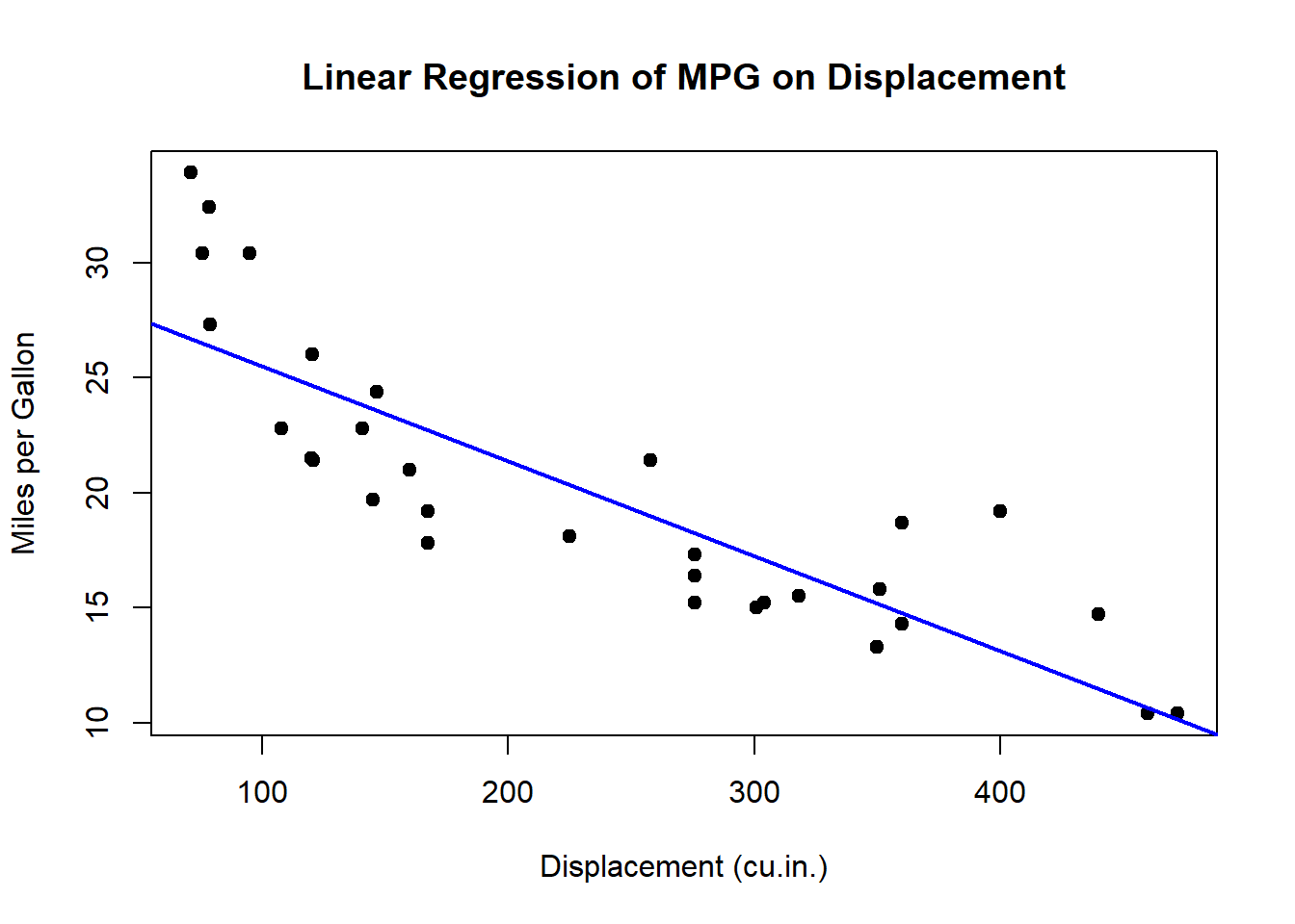
For a scatter plot that incorporates a categorical variable (e.g. cylinder) to distinguish colours:
plot(mpg ~ disp,
  col = cyl, data = mtcars, pch = 19,
  main = "Displacement vs. MPG by Cylinder",
  xlab = "Displacement (cu.in.)",
  ylab = "Miles per Gallon"
)
legend("topright",
  legend = unique(mtcars$cyl),
  col = unique(mtcars$cyl), pch = 19, title = "Cylinders"
)
Tip
Experiment with different pch and col values to improve the clarity of your scatter plots, especially when dealing with overlapping data points.
7.9.5 Creating Boxplots in Base R
Boxplots are invaluable for visualising the distribution of a variable. For instance, using the heart dataset, we can examine the distribution of weight.
boxplot(heart$weight,
  main = "Distribution of Weight",
  ylab = "Weight (pounds)",
  col = "lightblue"
)
We can also visualise weight by blood pressure status:
boxplot(weight ~ bp_status,
  data = heart,
  col = c("#D73027", "#FEE08B", "#1A9850"),
  main = "Distribution of Weight by Blood Pressure Status",
  xlab = "Blood Pressure Status",
  ylab = "Weight (pounds)"
)
Note
When comparing groups using boxplots, ensure that your grouping variable is appropriately formatted (e.g. as a factor) for clear interpretation.
7.9.6 Creating a Histogram in Base R
To display the distribution of diamond carat sizes, we use the hist() function:
hist(diamonds$carat,
  breaks = 30, col = "lightblue",
  main = "Distribution of Diamond Carat Sizes",
  xlab = "Carat",
  ylab = "Frequency"
)
Adjusting Bin-width
Base R utilises the breaks argument to control bin-width. For example, to use a bin-width of 0.5 carats, ensure the breaks span the entire range of your data:
hist(diamonds$carat,
  breaks = seq(0, max(diamonds$carat) + 0.5, by = 0.5),
  col = "lightblue",
  xlab = "Carat Size",
  main = "Histogram with Custom Bin Width (0.5 Carats)"
)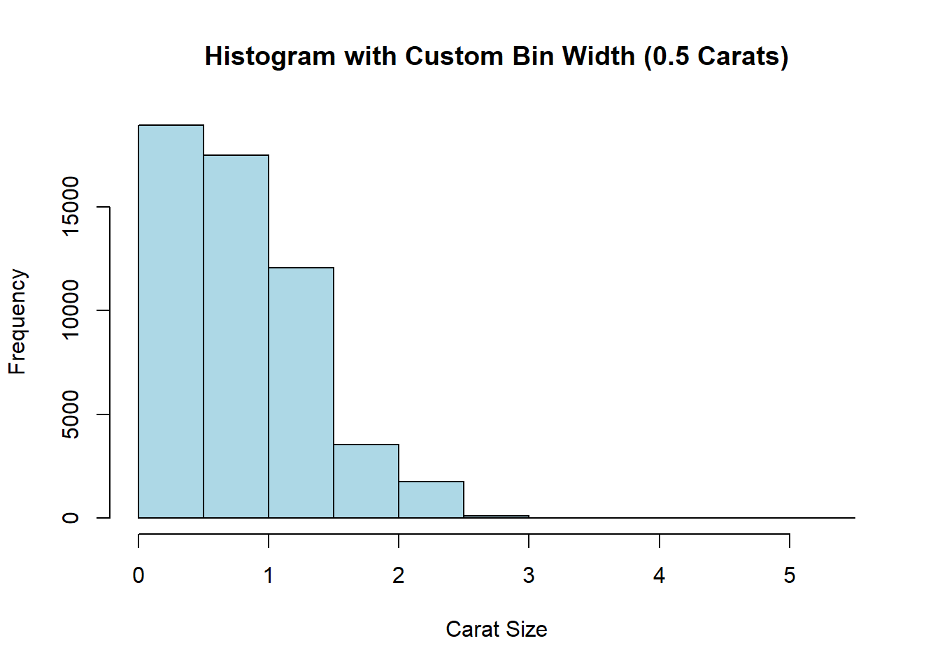
Tip
Adjust the breaks argument to fine-tune the granularity of your histogram and capture the nuances in your data distribution.
7.9.7 Creating Bar Charts in Base R
A simple bar chart can be created to display the number of cars by carburettor count:
barplot(table(mtcars$carb),
  main = "Number of Cars by Carburetor Count",
  xlab = "Number of Carburetors",
  ylab = "Count",
  col = "skyblue"
)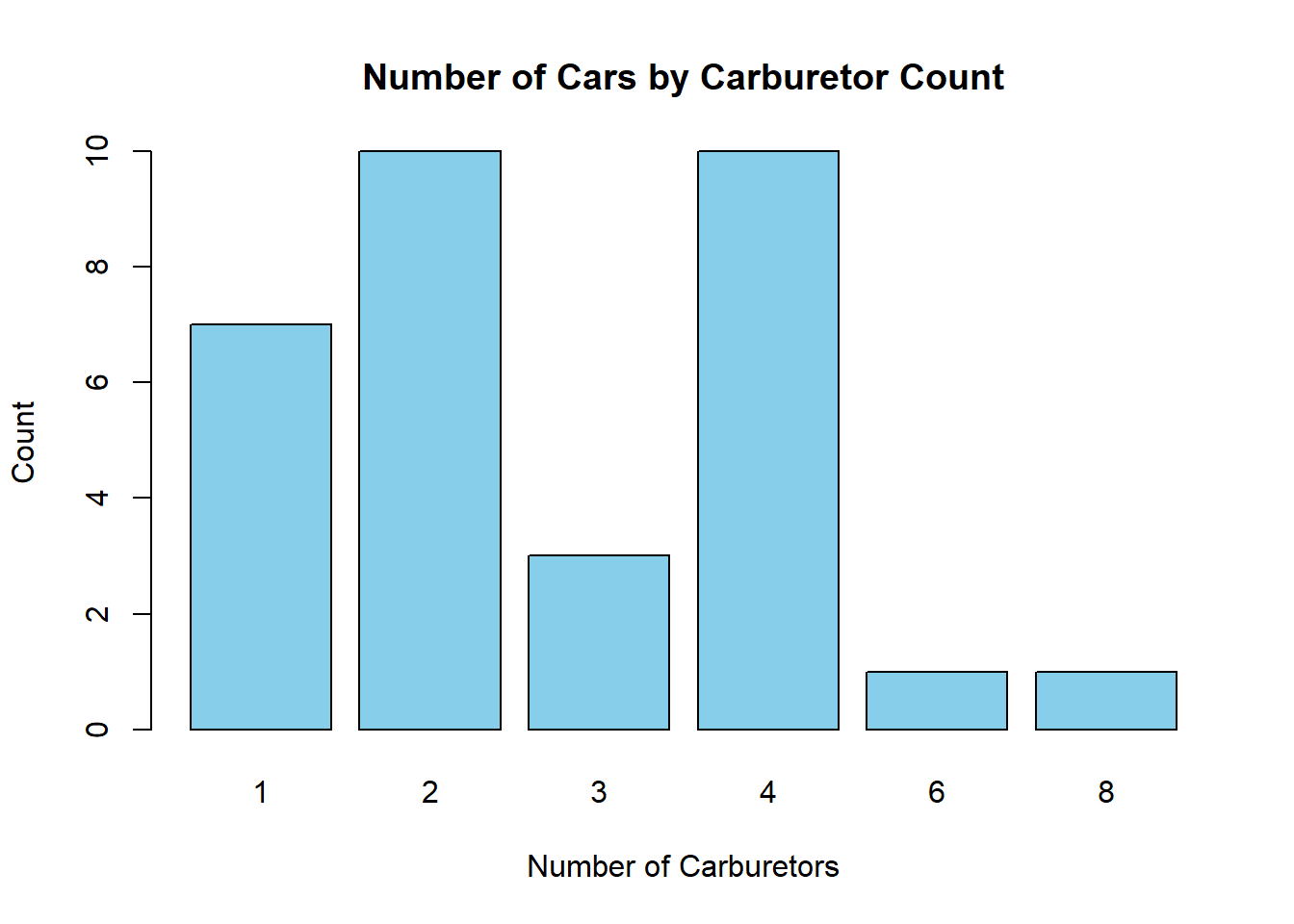
You can also add value labels above each bar to indicate the count:
# Create a table of counts for each carburetor count
counts <- table(mtcars$carb)

# Generate the bar plot and store the midpoints of the bars
bar_midpoints <- barplot(counts,
  main = "Number of Cars by Carburetor Count",
  ylim = c(0, 12),
  xlab = "Number of Carburetors",
  ylab = "Count",
  col = "skyblue"
)

# Add value labels above each bar
text(
  x = bar_midpoints, y = counts,
  labels = counts,
  pos = 3, # Position text above the bar
  cex = 0.8, # Adjust text size as needed
  col = "black"
)
Tip
The ylim() parameter sets the lower and upper limits of the y-axis so that the value labels are clearly visible, particularly for the bars representing 2 and 4 carburettors.
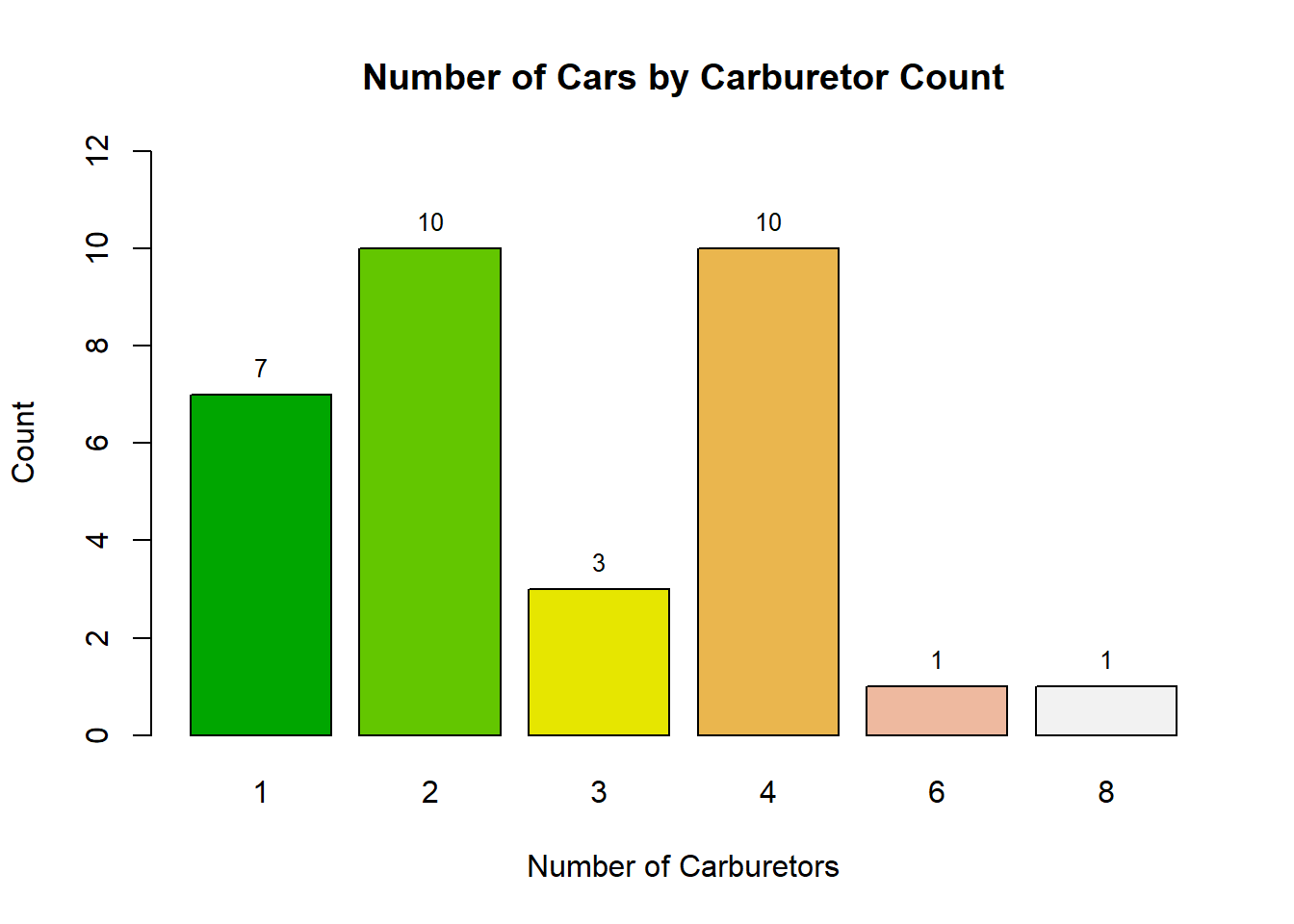
If desired, you can colour each bar differently by using a vector of colours. For example, you might use terrain.colors(n) or rainbow(n), where n is the number of colours required:
bar_midpoints <- barplot(table(mtcars$carb),
  main = "Number of Cars by Carburetor Count",
  ylim = c(0, 12),
  xlab = "Number of Carburetors",
  ylab = "Count",
  col = terrain.colors(6)
)
text(
  x = bar_midpoints, y = table(mtcars$carb),
  labels = table(mtcars$carb),
  pos = 3, cex = 0.8, col = "black"
)
Grouped bar charts allow you to visualise relationships between two categorical variables. For example:
counts <- table(mtcars$cyl, mtcars$vs)
barplot(counts,
  beside = FALSE,
  col = c("orange", "steelblue", "purple"),
  legend = rownames(counts),
  main = "Grouped Bar Chart by Cylinders and Engine Type",
  xlab = "Engine Type",
  ylab = "Count of Cars"
)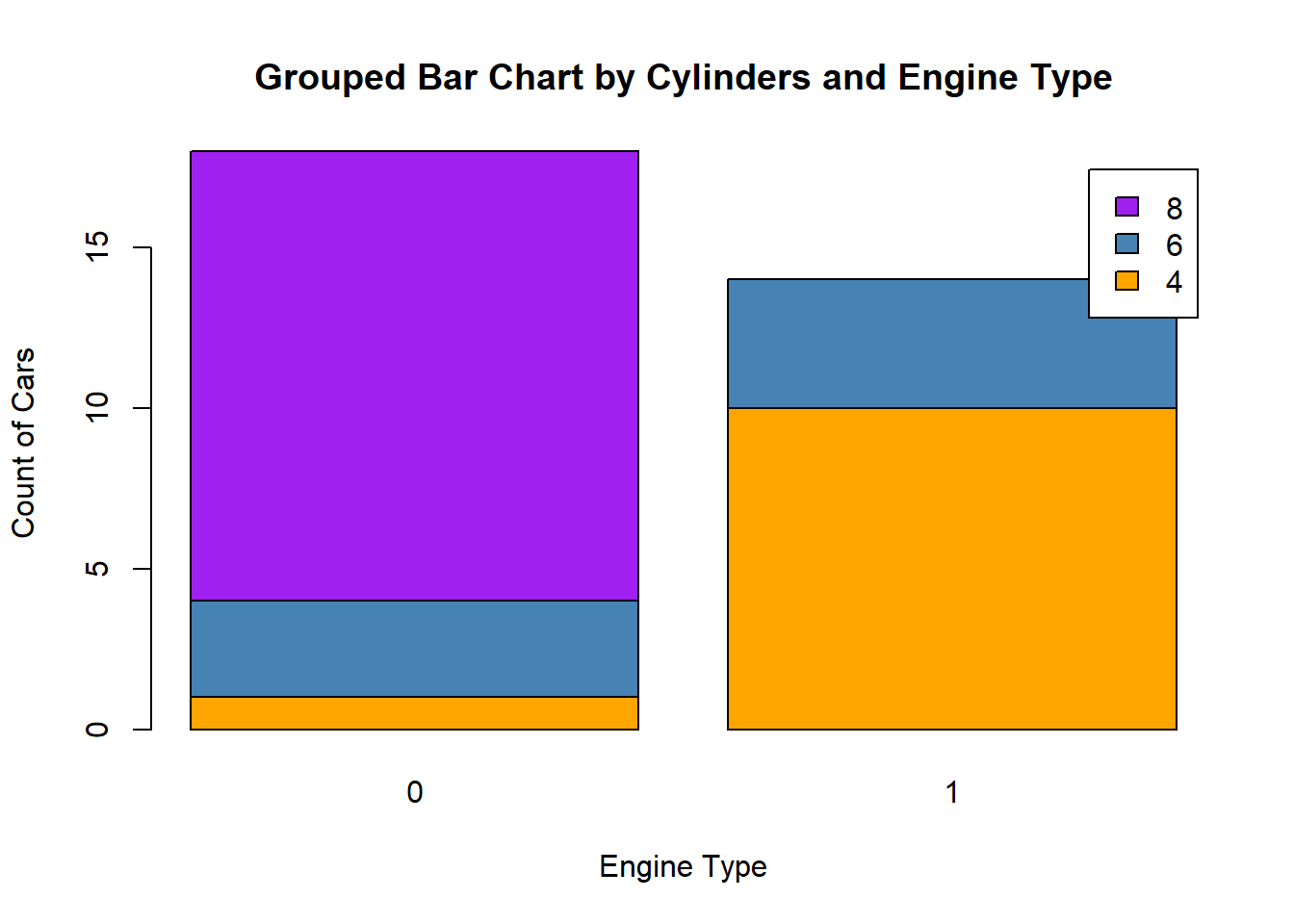
Tip
Set beside = TRUE to create a clustered bar chart, which makes it easier to compare subgroups directly.
7.9.8 Creating Pie and Doughnut Charts in Base R
Using the payment method dataset presented earlier in Table 7.1, we can visualise the distribution of average transaction amounts with a pie chart:
payments <- c(
  Check = 46.861, CreditCard = 36.681, Debit = 28.860,
  Digital = 18.9, Cash = 4.802
)

pie(payments,
  main = "Average Transactions by Payment Type",
  col = rainbow(length(payments))
)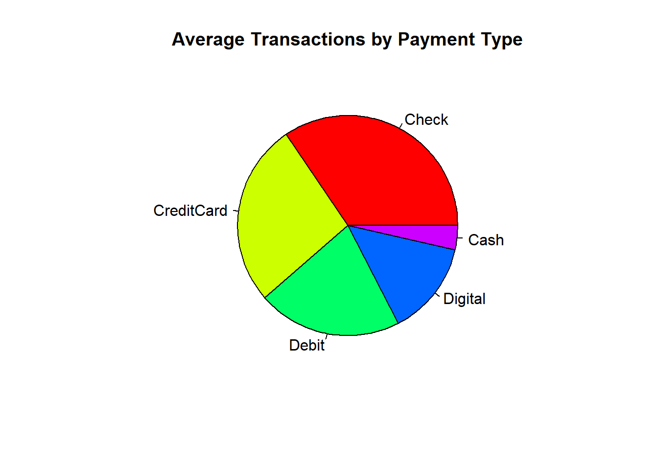
Tip
ou can enhance the clarity of this visualisation by adding value labels to each sector of the pie chart. This is done by specifying the labels argument; for instance, combining each payment method’s name with its corresponding value creates informative labels for each slice.
payments <- c(
  Check = 46.861, CreditCard = 36.681, Debit = 28.860,
  Digital = 18.9, Cash = 4.802
)
# Create labels combining the payment method and its value
pie_labels <- paste(names(payments), round(payments, 1), sep = ": ")

pie(payments,
  main = "Average Transactions by Payment Type",
  col = rainbow(length(payments)),
  labels = pie_labels
)
Note
Doughnut charts are not directly supported by Base R graphics. However, you can create them using custom functions or additional packages, such as plotrix.
7.9.9 Creating Line and Area Charts
Using the economics dataset, we can display unemployment trends over time with a line chart:
plot(unemploy ~ date,
  data = economics, type = "l",
  main = "Unemployment Trends Over Time",
  xlab = "Year",
  ylab = "Unemployed",
  col = "blue", lwd = 2
)
To create an area chart, we fill the area beneath the line:
plot(unemploy ~ date,
  data = economics, type = "l",
  main = "Unemployment Trends Over Time",
  xlab = "Year",
  ylab = "Number of Unemployed Individuals",
  col = "darkblue"
)

polygon(c(economics$date, rev(economics$date)),
  c(economics$unemploy, rep(0, length(economics$unemploy))),
  col = rgb(0.1, 0.1, 0.8, 0.3), border = NA
)
Tip
The polygon() function is a powerful tool for filling areas under curves, which can help emphasise trends in your data.
7.9.10 Saving Plots
To save your Base R plots, wrap your plotting code with a graphics device function like png(), jpeg(), or pdf(). For example:
png(filename = "scatterplot.png", width = 800, height = 600)

plot(mpg ~ disp,
  data = mtcars,
  main = "Linear Regression of MPG on Displacement",
  xlab = "Displacement (cu.in.)",
  ylab = "Miles per Gallon",
  pch = 19
)

# Adding a linear regression line
abline(lm(mpg ~ disp, data = mtcars), col = "blue", lwd = 2)

dev.off()
Caution
Always remember to close the graphics device with dev.off() to finalise the output file.
7.9.11 Practice Quiz 7.2
Question 1:
Which of the following is a key advantage of using Base R graphics for exploratory data analysis?
- They require additional packages.
- They offer a quick, function-based approach with no dependencies
- They utilise a layered grammar for complex plotting.
- They automatically produce interactive visualisations.
Question 2:
Which function is the generic function in Base R for creating scatterplots, line graphs, and other basic plots?
Question 3:
Which function in Base R is specifically used to display data distributions as histograms?
Question 4:
What is the purpose of the breaks argument in the hist() function?
- To set the colour of the bars.
- To determine the bin width for the histogram
- To label the axes.
- To specify the main title.
Question 5:
Which graphical parameter in Base R is used to specify the colour of plot elements?
-
pch
-
lty
-
col
cex
Question 6:
The pch parameter in Base R plots is used to control:
- The type of point symbol displayed
- The line thickness.
- The overall scaling of plot elements.
- The arrangement of multiple plots.
Question 7:
Which function in Base R is used to adjust global graphical settings, such as margins and layout arrangements?
Question 8:
In a Base R scatter plot, which function is used to add a regression line?
Question 9:
What is one of the main reasons Base R graphics are considered advantageous over ggplot2 for certain tasks?
- They require no additional packages since they are built into R
- They offer more extensive theme options.
- They are better suited for interactive visualisations.
- They automatically manage data transformations.
Question 10:
When saving a Base R plot using the png() function, what is the purpose of calling dev.off() afterwards?
- To display the saved plot.
- To open the saved file in a new window.
- To close the graphics device and finalise the output file
- To reset all graphical parameters.
7.10 Reflective Summary
In Lab 7, you have acquired essential data visualisation skills that enable you to transform raw data into compelling visual narratives:
Building Complex Visualisations with ggplot2:
You learned how to harness the power of the Grammar of Graphics to create layered, professional plots—from scatter plots to histograms and boxplots—that effectively communicate trends and patterns. You now understand how to map data variables to visual properties, adjust themes, and add annotations.Quick and Efficient Plotting with Base R Graphics:
You explored R’s built-in plotting functions, such asplot(),hist(),boxplot(),barplot(), andpie(), which are ideal for rapid exploratory analysis. Customisation through graphical parameters likecol,pch,lwd,lty, andcexenables you to fine-tune your visualisations for clarity and impact.Customising Visual Elements for Clarity and Impact:
Mastering both ggplot2 and Base R graphics has equipped you to tailor visual elements—such as colours, labels, scales, and themes—so your plots are not only informative but also visually engaging.Integrating Data Manipulation and Visualisation:
You practiced combining data transformation techniques with visualisation tools to create seamless analytical workflows, empowering you to extract meaningful insights from complex datasets.
What’s Next?
In the next lab, we will delve into statistical fundamentals, where you will build on these skills by exploring core statistical concepts, distinguishing between qualitative and quantitative data, understanding scales of measurement, and calculating descriptive statistics to further empower your data analysis and interpretation.